
What the Snapchat logo means and how it came to be
Even those who are too old or don’t know enough about technology to use it have heard of “Snapchat.” It’s a multimedia messaging app and a 24-hour “Story” teller. It started as a way for people to share photos and has become one of the biggest hits of the digital age. How much of its success is due to its famous logo is unclear. However, a globally recognized logo is good for a business, especially if it is almost as famous as the brand.
Some people say that the vague shape looks like a bell. Some people say that the blind object is an illusion. Because Evan Spiegel, co-founder and CEO of Snapchat, has said more than once that Wu-Tang Clan member Ghostface Killah inspired the logo, we will believe that it represents a ghost. That being said, every great spirit hides a great story. So, what is the story behind Ghostface Chillah (yes, this is a character with its name)? Hold on where you are while we tell the story of Ghostface Chillah.
Story of Snapchat’s Logo
Before we get too excited about the image, it’s a good idea to take a moment to think about the brand’s history. In 2011, some brave Stanford students (who else?) came up with the idea of making an app that would temporarily let people share pictures and videos without saving them to the cloud’s permanent storage. Most people agreed with the “my eyes only” idea because it made people feel better about how long private information stored on social media sites like Facebook would last.
As of November 2012, less than a year after its initial release, more than a billion pictures had been shared through the Snapchat iOS app, which is about twenty million photos per day. After the app was released, many updates let users share “stories” that cover 24 hours. By the end of 2019, Snapchat had been downloaded five times more than any other app of the decade. Bobby Murphy and Evan Spiegel’s owners are now worth a billion dollars.
Snapchat logo
How the Logo Came to Be
Evan Spiegel, who created Snapchat, says that the mysterious logo showed up in his mind before the site was even created. It was called “Picaboo” when it was first released, the disappearing picture messaging app that became Snapchat. It still needs to be clarified if the logo came from the name or the name came from the image. According to Medium, Spiegel chose the picture to represent the intangible quality of the photos taken with the app. When first looked at, they disappear without a trace, just like the friendly ghost in the logo.
Spiegel came up with the idea for the logo in just one evening. After looking at many symbols for other popular apps to see what worked and what didn’t, he realized that all of the logos for that app had one thing in common.
It wasn’t even one that was done in yellow. Because of this, which colour would be better for his creation? He made the final piece of art on the computer in his bedroom once the happy yellow and white colour scheme was chosen. Because of this, a logo text was made. When Snapchat beat Picaboo in 2011, some of its features were switched out, and the focus shifted from branding effects to usability and technical elements. The only thing that did survive, though, was the image that looked like a ghost.
Relaxation for Ghostface
How many brands have names that are all their own? There aren’t many, but what do you expect from a company started by twenty-two-year-olds? Undoubtedly, the Snapchat image, “Ghostface Chillah,” was based on Ghostface Killah from the hip-hop group Wu-Tang Clan. Since then, this name has become a symbol for the business.
Snapchat logo means and how it came to be
The history of Ghostface Chillah
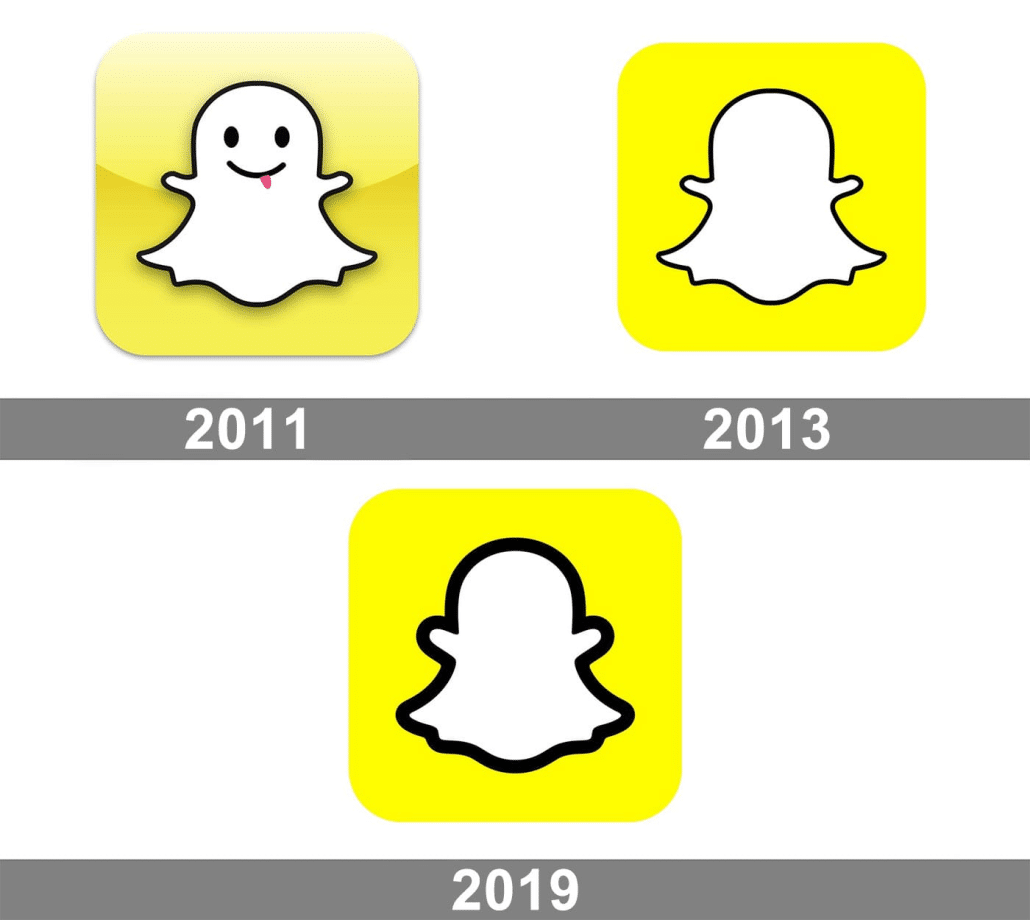
From 2011 to 2013, Ghostface Chillah was a person. A cute little face with two button eyes, a grin, and a pink tongue sticking out for extra fun. If you ask logos-world.net, this is the perfect classic Halloween ghost costume. Still, nothing lasts forever. By 2013, Ghostface Chillah had lost its face, if not its personality.
Some people think the choice was made so that Snapchat users could imagine themselves as brand ambassadors for the app. According to a different point of view, the change happened after Reggie Brown, an early Picaboo collaborator and a friend of Evan Spiegel and Bobby Murphy, who made the app, filed a copyright case.
Given that Brown eventually got $157.5 million and became a co-creator, we will let you decide which theory makes the most sense. Since then, the image has undergone one more change that would take a very close eye to notice. As of 2019, the apparition picture is still there, but the black line around it is thicker to make it stand out more. Other than that, the little ghost has stayed the same since 2013.
A picture is worth a lot of words.
There was a time not too long ago when it was common for logos to have the brand name next to the logo in a big, bold style. The words can appear below, above, to the left, or to the right of the shape. They did show up, though, no matter where they were placed. The situation has changed, though. Right now, putting text in your image is the same as showing that you voted for Trump in the last election.
Young brands have mostly given up on letters and base their marketing strategy on pictures. Something that shows this is Snapchat. There is no direct reference to the company name in the brand image. A visible product is unnecessary to get your name out there, though. The idea has done its job since more than forty per cent of American adults now regularly use Snapchat. Also, what else could a person want from a ghost?


Leave a Reply
Want to join the discussion?Feel free to contribute!