
What is the purpose of a Company’s Logo?
Elena Wheeler once said – “Design is intelligence made visible”
A logo is your company’s identity and should not just be limited by any language alone. A logo should be attention grabbing leaving an everlasting impression in the customer’s minds.
What is a LOGO?
Always remember – “Your Logo is NOT your Brand”. Since I have heard it innumerable times I am sure there are those who think that a ‘logo’ and ‘brand’ are one and the same.
Logo, in simple words, is a graphic representation of a person or a firm. Here is a little diagram that illustrates what and where is the position of Logo in its Brand Identity and Brand.
![]()
Has a Logo design ever left an everlasting impression on you?
Did you ever realize while walking in a theater that the person behind you knows that you are wearing ‘Nike’ just by the shape of the glowing sign on your shoes showing the most memorable logo? Have you observed a 3-year-old snatch towards his mother’s iPhone as soon as he spots the all too familiar YouTube logo – his doorway to watch cartoons and animation videos? Have you ever come back from a long holiday and after hours of driving on the road feel elated just by noticing the all too familiar Yellow Colored ‘M’ (McDonald Logo) peeping from the building top.
A logo is an identification, not an explanation. It identifies by using a flag, symbol, mark or signature. A logo never describes a business nor does it sell the firm. It is more important to understand what a LOGO ‘Means’ than to understand what is ‘Looks’ like.
Let us for an instance think that logos are like people. Don’t we all ‘people’ like being called by names so that we are easily remembered and there is no confusion between a James, Jimmy, and John. How would it feel if we were addressed by the description “the little boy whose hair stands up when he runs” Or “the boy who has a scar on his forehead” or worse “the girl who cries every time she sees a lizard”.
A logo is a way to identify that makes it recognizable and memorable at the same time rather than a description. A logo can function once it starts having recall value in people’s minds – very similar to learning names of people in order to identify them.
Let us take a look at the example of Olympic Logo unveiled as a bid by the City Of Lights to host 2024 Olympic Games. Check out the Logo.
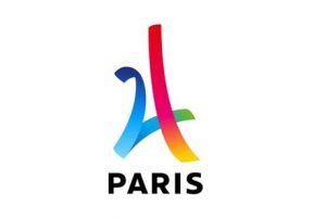
The first thing you notice is Eiffel Tower. Look at the logo design – Is it really number 24 – denoting the year 2024? Yes!! Let us look closely at the colors – it has the colors red, blue and white as well. Floating Ribbons create a sense of fun, sports, excitement and anticipation. The logo design speaks volumes of being an excellent design – clear, meaningful, simple and scalable.
Robert Browning rightly said in a phrase that “Less is More” and it is clearly felt in this Logo where all is said and felt just for it Logo design.
5 Reasons why Logo is so important for a company’s identity?
1. First Impression is the last impression – A logo can be detrimental to the success of your firm or you. If the logo is poor in its design it passes the wrong message. It may be identified as a brand who is casual, inexperienced or new in the business. A well-designed logo is always impressive in a manner that it leaves an impression of a firm or person being professional, reliable and having stability.
2. Logo is the face of the Company – A sophisticated design cannot be used for a company who want to be identified as honest and simple. Therefore in any logo – the colors, font, and design are the way to identify the personality of the company. This is similar to the way one can identify the personality of a person by looking at the colors and styling of his clothes and the way he carries them.
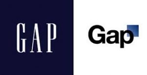
3. Brand Value – Logo is the visual reminder of what the brand actually stands for. It not only gives and identity to the firm, it also gives an identity to the customer . Haven’t you seen a customer wearing a brand logo printed in big bold letters on a tee – especially with the brand ‘GAP’.
4. Consistency – By using the same brand logo and design – once can be sure that the brand is here to stay. It leaves a recall value and also a sign of stability in the mind of the consumer. The consumer knows that every time they sue the brand they will have the same experience.
5. Relatable – A logo holds no value no matter how expensive or how good a design it is – if it is not identifiable with the product or service or person. The bottom line is that a logo design has to be relatable.
It is important to understand the do’s and don’ts when you select a Logo Design ?
Place it Strategically:
The logo should not be placed in between a text or a header as it will loose its value as it may not get notices at all. Place it strategically so that it stands out.
Size does matter:
A logo size is critical as it should not be overbearing and take away space for information. Yes, it is important for branding – yet is not to be more important than purpose of the brand. A customer should be able to see what else is there in a brand other than a Logo.
Aspect ratio should be kept in mind when the logo has to be reproduced. Some also call it footprint. A lot of times aspect ratio tends to be ignored and causes issues later on. Remember the final printed version should reproduce an image equal in quality and maintaining its integrity regardless of size.
Style of font:
Logos especially when they are in letters or numbers – should have fonts that match the feel of the firm pr product or person. A busy or unreadable font with too many elements is distracting and one looses attention from it sooner than you realize. Make the font in sync with what are you trying to say through the logo design.
Design :
Do not change the design for every literature used. It is suggested that you should not change the colors, fonts and style – the customers get used to the usage of a certain kind of design and the moment they see it feel comfortable as they have used it or seen it before. It is paramount to make your customer feel that there is consistency and reliability by these little unsaid messages a Logo sends across.
Good Quality Photo :
Many Logo designs have photos. Be careful over while choosing the photo resolution . Choose your images carefully with at least 300 DPI. Do not use less than that – to avoid the user to think it as a low quality photo.
Be simple and write less:
Do not oversell yourself. If you keep writing and selling your company it makes the reader bored if he has to read too much. Keep it simple and attention grabbing. Only write what is relevant – if the customer is really interested – he will surely check you out in detail. Too much written matter has all chances of making him loose interest too soon for your liking. Keep the sense of mystery and anticipation on.
![]()
A simple design will help you edit the size and color easily to print it whenever you have to use the logo for promotions. It is cost effective in the long run and having a logo in one color is a huge benefit.
Keep is Simple:
The logo should be spacious with white space around it. Make sure the reader does not get a feeling of clutter at any point – once the user is comfortable he will automatically come back to you.
Be Unique:
It is very easy to be influenced by the peers and one always has a tendency to follow ones competitor. Remember that you should be unique and will only stand out if you have something outstanding and different to offer. So never copy your competitor.
Starbucks logo is not of any coffee farming , neither does Apple look even remotely similar to a computer. The company’s logos are unique and stand out amongst thousands of logos across the world.
Look out for our next article on Evolution of Apple Logo and what we learnt from it?
Keep your suggestions coming in …Would love to receive topics from you on Brand and Logo design written on your requests…!

Leave a Reply
Want to join the discussion?Feel free to contribute!