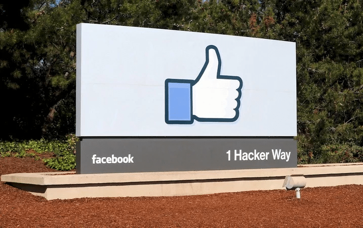
The Facebook logo and the history of the company
Look at the Facebook design and the history of the company. The Facebook name and image are some of the most well-known around the world.
The Facebook logo has a blue background and a white uppercase font, which helps make it look simple. As mentioned, Mark Zuckerberg’s vision issues influenced his blue and white color scheme. However, the color scheme is important because blue and white symbolize purity and hope.
Origins of Facebook
In 2003, Mark Zuckerberg was in his second year of college at Harvard. Zuckerberg admitted to drinking in one of his first blog posts. He quickly made “FaceMash,” a website that let Harvard students see two pictures of their friends next to each other and vote on which one they liked better. The university quickly took down the website, and Zuckerberg almost got kicked out. But things that were needed for Facebook to work were already in place.
In 2004, Mark Zuckerberg chose to create “The Facebook,” an online list of Harvard students. Just six days after the site went live, Zuckerberg got into more trouble when three of his friends said he faked helping to build a HarvardConnection.com site while using their ideas to make a different one. The students called the university newspaper Crimson, which led to a probe. The Facebook at Harvard University was a huge hit, even though it caused a lot of trouble. About half of the first-year students at Harvard had made accounts on the website within the first month.
How the Facebook logo came to be
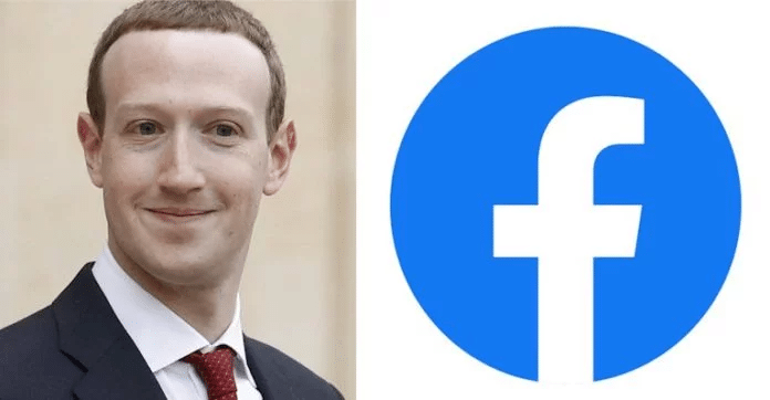
After going from being a college networking site to a worldwide hit, Mark Zuckerberg and Sean Parker bought Facebook. They then hired Mike Buzzard of the Cuban Council to design the group’s image.
The Buzzard logo is almost the same as the modern Facebook logo since the company has only made minor changes to the original design over the years. When asked to explain some of the logo’s design choices, Buzzard says, “It was an alteration of Eric Olson’s Typeface.”While I was in charge of the project, my close friend and fellow graphic artist Joe Kral, who was working closely with the Cuban Council at the time, made the final changes to the type and created the wordmark.
One interesting fact about the image is that the blue colour scheme was chosen with Mark Zuckerberg’s deuteranopia in mind. A type of colour blindness called deuteranopia makes it hard to tell the difference between colours. Deuteranopia, on the other hand, means that a person can only easily see the colour blue.
How much people want to see the Facebook logo
When most people see a logo every day and 2.19 billion people around the world see it at least once a month, it’s clear that the logo is famous. But even so, not many Facebook users think about the image when they sign up for the site.
In contrast to most businesses, Facebook has no trouble at all getting people to know about its brand. So, the Facebook logo is less of a marketing tool and more of a symbolic portrayal of the company. This is something that Facebook has kept up over the years.
Some people might think that Facebook’s decision to keep the logo’s simple design is less valuable, but it actually shows how the company feels about the issue. A lively, eye-catching logo isn’t necessary for Facebook to get people to visit their site. They need a simple, unchangeable image that Facebook users all over the world can recognize and connect with the whole company, which has become a synonym for the brand.
2003-2004
Facemash is the idea that made Facebook what it is today. It is said that Mark Zuckerberg made the popular beauty comparison app Facemash in 2003 when he was still a student at Harvard. The app was supposedly taken down within two days.
The logo had a modern, well-spaced, all-caps design set against a red background.
2004-2005
In the first version of the mark, “The Facebook” was enclosed in square brackets as the text since that name still knew the company.
In this famous scene from The Social Network, Justin Timberlake plays Sean Parker, Facebook’s first president and co-founder of Napster. Parker is blamed for starting the name change that would forever mark Facebook’s place in history.
In 2005, a year after it started, “TheFacebook” changed its name to Facebook and got a new image.
2005-2015
The first version of the Facebook image was the standard for a good ten years. The angled ascenders of the previous version, which was a lowercase version of the Klavika font with rounded corners and placed inside a blue rectangle, give the simple design movement and life.
A classic that will never go out of style, it has inspired a vast number of wordmark-only tech logos over the years.
Colours of the Facebook logo
There is a lot of interesting speculation about why the group chose that colour scheme. It is said that Mark Zuckerberg, the CEO of Facebook, has deutronopia, which is also known as colour blindness and red-green blindness. Still, he can see tiny differences between different shades of blue that most people would miss.
The New Yorker was the first newspaper to say that this disorder played a role in choosing a blue-toned colour scheme. And even though the logo’s style has changed over the years, only the blue background colour and the font have been changed.
It’s interesting that the names of many social media sites, like Discord, MySpace, Telegram, and Skype, are all different shades of blue.
Font for Facebook Logo
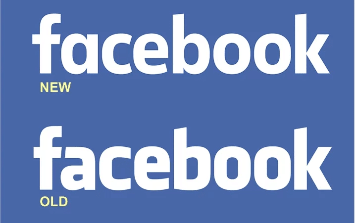
A custom-designed sans-serif font is used in the Facebook wordmarks and logos as a symbol. The lowercase letters look like letters from well-known typefaces, like the Fact Bold and the Nuber Next Heavy.
The modern Facebook mark, on the other hand, is made up of a changed version of the Klavika Bold font. The present style, on the other hand, looks like the old one. The “A” form and the shapes of a few letters are the only parts of the design that are different from Klavika.
Eric Olson made this typeface, and the great graphic artist Joe Kral made some changes to it.
How Facebook is changing as a business
The business was officially set up in late 2004. Sean Parker, a developer for Napster and advisor to Zuckerberg, was named president of the new company. In 2005, the word “The” was taken out of the image, making the name simple and easy to remember.
The company that bought the domain name for $200,000 planned to make the tool available all over the world.
The company, which used to be private, went public for the first time in 2012 by selling its stock to buyers who were ready to buy shares. Since the company’s stock went public for the first time, it has done very well because it is so famous.


Leave a Reply
Want to join the discussion?Feel free to contribute!