
What Do The Netflix Logo’s Colors, Font, And Meaning Mean?
Over the past decade, numerous internet-based corporations have emerged as global powerhouses. Our consumption patterns have shifted because of them. Others have facilitated our comfort. Netflix stands up as a company that has been invaluable during the pandemic, serving as a platform for the distribution and production of movies and television shows. But what about the company’s reputation? Let’s trace the development of the Netflix logo from its inception to the present day.
A Few Netflix-Related Thoughts
Reed Hastings and Marc Randolph started Netflix back in 1997. We certainly had a different level of service back then than we do now. Back then, you could rent DVDs from Netflix for a monthly fee. Back then, people relied on the mail to get their goods. The American corporation finally permitted computer-based movie rentals in 2007. This fundamental service would eventually roll out to the rest of the globe during the subsequent years.
In the decade that followed, Netflix began to provide original television series, many of which became massive hits. In this category were such shows as Stranger Things, The Crown, 13 Reasons Why, The Umbrella Academy, Orange Is the New Black, and Peaky Blinders. It should be noted, however, that these original series represent just a tiny fraction of the total content available on this platform, the vast majority of which consists of movies or series produced by other studios. More than 200 million people are currently subscribed to Netflix. Furthermore, some reports claim that in countries like France and the United States, nearly 15% of Internet use is devoted to this distribution giant.
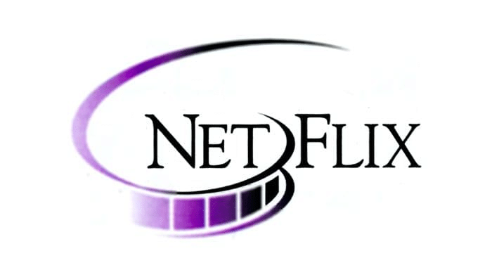
The original Netflix logo
Did you realize that the Netflix logo has evolved over the years? The American firm’s original logo was a hybrid, featuring both the firm’s name and an emblem. When Netflix first launched in 1997, its logo featured the company name in a serif typeface and a separate film reel. The Netflix logo was purple and black, giving off an air of simplicity and professionalism. For barely three years, this logo was used.
How the Netflix symbol developed over time
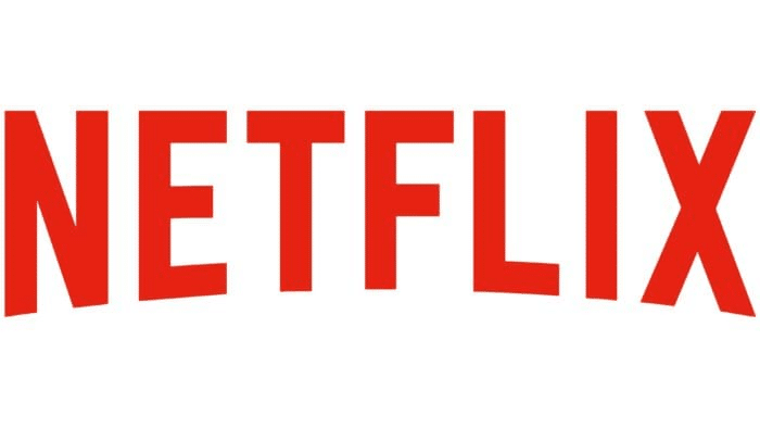
The original Netflix logo looked a lot like the current one. They changed from purple to red and white throughout this overhaul. The setting was a vibrant shade of crimson. The company’s name was also included in white with a black outline. The result effectively used contrast to grab the audience’s attention. It should also be noted that a sans-serif font was employed. For the next 14 years, Netflix would use this logo.
Previous logo for Netflix
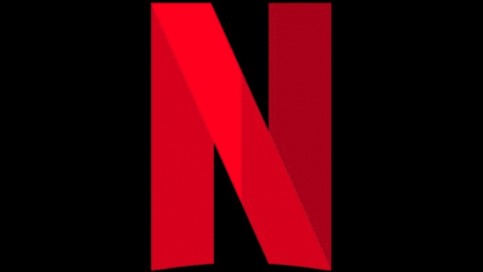
Current logo trends emphasize minimalism, as we’ve discussed at length on our site. The modern logo is minimalistic, with no extraneous elements. This version of the Netflix logo debuted in 2014. Even though red, black, and white are still the brand’s signature colours, only two colours were employed in each generation. Bebas Neue, a sans-serif, was used as the font. In addition, the latest Netflix logo was distinguished by its adaptability, making it suitable for use across all platforms. When space for the logo is at a premium, for instance, just the N could be used. Sometimes, a dark background would work better than a white one, and vice versa.
Taking cues from Netflix in Logo Design
So, how do you design a logo that can rival Netflix’s? Here are some suggestions. To begin, it’s vital to consider colour schemes. Netflix is a corporation that has changed the way people watch television and movies; thus, it requires a solid brand identity. Netflix accomplished this by using contrast, which is known to grab people’s attention. If you want people to take notice of your logo, it should use contrasting or even complementing colours.
The next step is to design a primary logo. Adding extra complexity to your logo will make it more challenging to replicate. It also makes your logo look more jumbled. Try experimenting with different colours or fonts to achieve the desired look. Netflix’s logo is a stark departure from the norm. Also, remember that your logo needs the flexibility to undergo periodic updates. A primary logo is more flexible than a complex one. With an adjustable logo, you can put it wherever from your app to your social media to your promotional materials. You may also choose to embellish your logo with a shape similar to the one used by the Amazon company.
Also, think about whether or not a logo makeover is in order in light of recent or planned company or product developments. If the company is evolving, a new logo may be in order. Netflix did this when it abandoned the DVD rental market in favour of expanding its presence on the web. A logo befitting their exciting new enterprise was required.
In whose hands did the Netflix logo rest?
Gretel, a New York-based design firm, created the current logo. They decided on a spare yet easily recognizable layout using a modern font, and they zeroed in on Netflix’s most essential elements and received an excellent response to the company’s primary objectives. Priority was given to an endless catalogue and hand-picked recommendations in this way. The team aimed to produce an interactive but organized and long-lasting design that would be instantly memorable and adaptable to any medium or platform.
Who created the music for the Netflix logo?
Hans Zimmer, a Grammy Award–winning composer, created the music for the Netflix logo. The original Sonic logo was only 0.4 seconds long. However, the corporation has now included a longer extended version that is 0.17 seconds long. The fact that the Netflix aural emblem got more melodious and continuous likely reflects the fact that theatregoers didn’t have enough time to respond and plunge into the film. This revised rendition of the tune immediately became an international phenomenon.
Can you describe the Netflix logo’s redesign?
Netflix has rebranded and introduced a new worldwide identity as it expands into new territories. While the new Netflix logo still features the same red letters on a white backdrop and Netflix Sans (their trademarked font), the black stroke and shadow have been eliminated. The result was a new logo that was less complicated and easier to remember. Brand recognition remained the same after the rebrand. In contrast, a design studio’s visual system dubbed “the Stack” combined the roles of catalogue and curator in the ongoing process of selecting and creating custom options for consumers. They also used an extreme crop to introduce a new logo that is still very recognizable even in its reduced form.
The “Ta-Dum” opener, which plays before each episode of Netflix, clocks in at a mere 0.4 seconds. Todd Yellin supervised the development of the sounds. The trademark music of the firm is accessible on the ears and really well executed, making for a delightful experience all around. It’s a great approach to get the brand’s message out to consumers of all backgrounds through sound and sight.


Leave a Reply
Want to join the discussion?Feel free to contribute!