Uber Logo Development and Impact: From UberCab to Now
In this exploration of the Uber logo development and impact, we trace its evolution from its early days as UberCab to its contemporary designs. Discover the story behind this iconic emblem and its significant influence on the company’s identity.Any new business that finds success does so because its founders recognize a need in the market. The world improves every time a fresh, brilliant idea shines a light on it. And people aren’t willing to pay for hypothetical future events. A genuine chance to improve their situation in the here and now, however, has them ready to part with cash.
That’s why we have yet to try to settle Mars. That’s why we can avoid getting drenched in the downpour by calling a cab instead. Although this may be a minor accomplishment, much work was put into realizing this concept in the past. Because of this need, the Uber firm emerged. Further innovations are on the horizon for the foreseeable future.
Definition of the Uber Logo
Two people have started this company from the ground up. And their proposal is a significant step forward. Uber was initially called UberCab to make it clear that it was a taxi service. The original Uber logo was also quite essential. The CEO of the company just utilized Photoshop to make a giant “U” in bright red and thick strokes. He then added the word “Uber” on the top. Also, it’s evolved into a condensed form of the original Uber logo. And he’s also altered the UberCab emblem. Two big “U”s and a “C” are all that’s been there so far. Nothing more, just this. When it became apparent that the company was headed in a serious direction, its owners realized that the logo needed to evolve as well.
Past Uber logo designs
In just ten years, a once-insignificant company grew into the world’s largest and most prominent cab service. Uber is thriving despite the fact that there are protests against the firm and attempts to shut it down. There are few options available to taxi drivers who are dissatisfied with the price decrease of their services. And up until recently, they were the ones setting the price. They were the only ones who could decide whether or not to accept an offer. Then why has their monopoly suddenly collapsed?
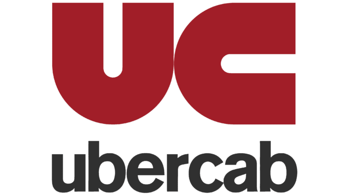
In 2010, while the company was still known as UberCab, the first Uber logo was unveiled. The logotype highlighted a red “UC” at the top of the logo. The “C” and “Cab” were eliminated from the emblem, and the name was changed.
Changes in the Uber Logo
The initial logo design by a professional looked like a standard “U” in width and height. Notches in a font are possible, and there have only been a few (black and white) colors thus far. Despite the gloominess, it was this color scheme that became instantly distinctive. On the other hand, the end effect is looking nothing short of magnificent. And that may be the point. The taxi industry needs a 21st-century makeover.
Some people really like the new twist. And in 2016, a one-of-a-kind monochrome inscription was made. The leadership at Uber thinks the emblem is classy without being ostentatious. Uber’s self and value-proclamation have helped bring the company to prominence. The brand’s name recognition and popularity have finally arrived.
Despite undergoing three logo redesigns in the company’s brief existence, each emblem was equally sleek and modern, keeping up with or even anticipating global design trends. All Uber logos share a commitment to simplicity, assurance, and laid-back elegance.
2009 – 2010
The Uber taxi service initially operated under the name UberCab, with a logo created in 2009. The uppercase lettering was set in a modern sans-serif font, in a very dark gray, almost black, and the lowercase lettering was placed under the graphical part. The emblem was dark red and comprised of two enlarged letters, “UC,” drawn in precisely the same way, but with the first character set vertically and the second — horizontally.
2009 – 2011
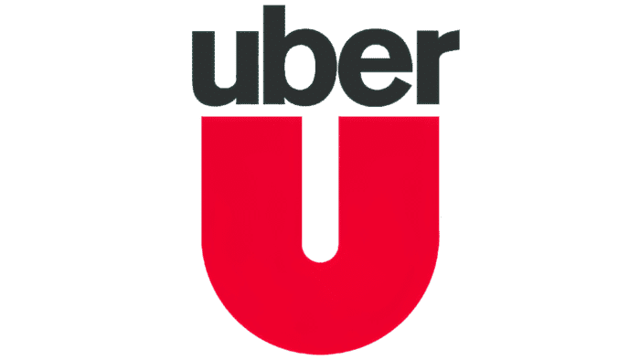
The first logo, designed in 2009, included a red and dark graycolor scheme, with the dark gray lowercase wordmark sitting atop a red “U” that was both unlatched and extra-bold. Both pieces appeared sturdy and authoritative when set against the blank white background.
2011 – 2016
In 2001, the brand’s logo was updated to reflect the change. The initials were set in an airy and sophisticated sans-serif typeface, which may look utterly ordinary if not for the tiny curve on the top of the “U”‘s left bar. The brand’s formerly severe and rigorous symbol was given a sense of harmony thanks to this minor adjustment.
The Uber logo created the same year, is a dark gray square with a silver “U” in the center and a silver double outline. The “U” had a powerful, assured appearance because of the way its ends were horizontally twisted to meet in the middle.

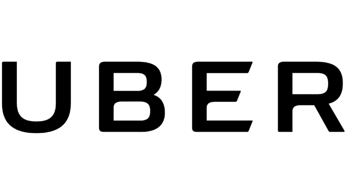
2016 – 2018
In 2016, the in-house team reimagined the logo. The black lettering was more pronounced and polished than before. The wordmark’s letters have thinner strokes, but they still exude self-assurance and chic. The diagonal cuts along the horizontal “E” bars gave the letter more energy and motion.
The same year, they also marked the debut of the now-iconic logo for apps on mobile devices. The deep blue square with rounded corners concealed a white abstract composition: a solid white circle was “cut” on the left, revealing a courtyard at its center. The company thinks that “atoms and bits” are the fundamental building blocks of the universe, and its logo represents that idea in a stylized way.
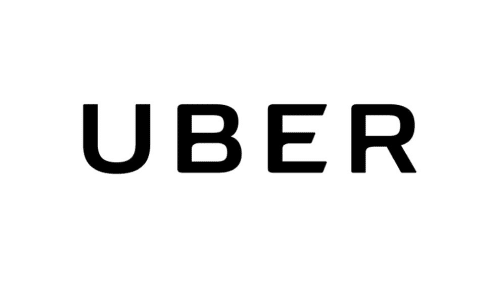
2018 – Today
The Uber logo was streamlined internally in 2018. Title case lettering is set in black ink using a classical sans-serif typeface with traditional letter shapes and crisp lines. “Uber Move” is a custom font created for the company.
Rebranding of the Uber logo
However, the corporation has already revealed plans to rebrand in even fewer than ten years. Many people have criticized it for being pointless. A slightly modified Uber logo caused even more significant backlash. An emotional whirlwind has followed the redesign because the new logo’s meaning is obscure even to trained eyes. More vibrant hues are being used in color schemes. However, a standard color scheme has yet to be established. It varies from country to country as it adjusts to local customs.
So, what does the Uber logo represent? Management at the corporation is optimistic that they are dealing with bits or atoms. The implication is that individuals commonly overlook such trivialities. Still, atoms, or whatever they may be, are ubiquitous. One day, Uber’s leadership will listen to its detractors more carefully and design a more effective logo as a result.

Font
The 2016 wordmark is more pronounced and compact than its predecessor, making it easier to see on mobile devices. The slight curl that adorned the former wordmark’s “U” is no longer present.
Inner curves on the lower halves of the letters “B,” “E,” and “R” are just a few of the new and improved typeface’s distinctive features. They are visually identical to the previous version, but the more robust typeface makes them stand out more. The last three letters have been given softened (or even elliptical) corners when formerly there were sharp ones.
Color
The designer team ditched the stark black, white, and blue color scheme in favor of 65 regional color schemes for the countries in which Uber is active. This new approach has given the company’s staff more leeway in terms of how they communicate with customers in their respective locations. The typical icons use either a combination of white, brown, and orange (the driver’s image) or white and two colors of blue (the rider’s emblem).


Leave a Reply
Want to join the discussion?Feel free to contribute!