Top 10 Brands of India with their Logo
A list of top 10 brands of India along with the hidden meaning of their logos.
1) TATA — Tata is the largest multinational brands of India firmly maintaining its position among the top 100 companies in the world. The logo of the TATA group has the alphabet ‘ T ‘ symbolizing the brand name TATA.
The identity has the hidden alphabet A in it. The global blue color used in the logo resembles the loyalty and trust of the members of the organization. It has a resemblance of a tree of knowledge and reliability.
2)SBI — The State Bank of India is the renowned and the most trusted bank of India. The very symbol of SBI was a banyan but was reformed to a blue circle with a key hole in 1971. There
There are basically two philosophy that ran behind the design of this logo.

One of the concept says the blue circle is a representation of the bank with the white line resembling a common man which means the common man being a part of the SBI bank.
If you look carefully at the logo, the white line seems to resemble a keyhole which is a sign of security and safety.
There is yet another analysis for the brand identity of SBI.The small white circle is the branch of the bank with the white lines reflecting the streets leading to the bank. The logo is said to be inspired from the Kankaria lake.
The logo is said to be inspired from the Kankaria lake.
3) HDFC–Housing Development Finance Corporation was started with the main motive of providing housing loans to the people.
The logo represents a building with four walls as boundaries with spaces left between each side. The red color was basically chosen to make the logo evident.
HDFC main focus was to connect with common people and to provide them with loans to build their dream home.
The blue square in the middle can be seen like the target in the case of the camera which is to provide housing loans with the four corners representing the focus section i.e, the common man.
4) Airtel — Airtel being one of the largest telecommunication brands in the world, redesigned its identity in 2010.
The brand new identity of Airtel is a symbol representing the alphabet ‘a’. This ‘a’ represents the boundless relationship between the customer and the company.
Since it is not confined in a box or circle, it is defined freedom for anyone to link with airtel to avail the services.
The company believes the worldwide success they have achieved is due to the passion among them, and to reflect the same red color has been used to define “passion.
Wipro–The rainbow colored sunflower of the multinational brand Wipro, is a clear depiction of the values, ethics, and principles, vibrancy of the company.
The logo takes it inspiration from the rainbow, which is simple but a rare and pleasing phenomenon. Wipro reflects its simplicity and its multi-faceted nature from this logo.
5)Hindustan Unilever– This is the largest brand of consumer goods serving people satisfactorily since 80 years.
The logo of Hindustan Unilever Limited consists of 26 icons which creatively combine together to form a ‘U’, representing the name of the brand. The icons resemble the products which directly or indirectly deals in .
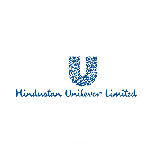
The icons resemble the products which directly or indirectly deals in .
7) Dabur — The logo of Dabur was reformed from a banyan tree to a new and colorful tree with the tagline of “celebrate life”.
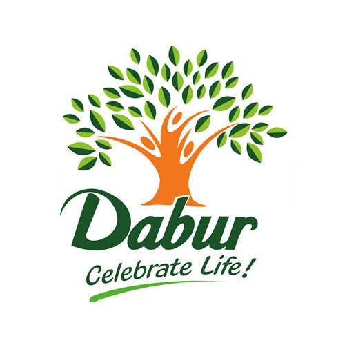
The tree with its broad trunk represents the stability of the brand. The branches are depicted by the three people of different sizes which mean different age groups. Dabur aims to cater to the health needs of all age groups.
8) Bank of Baroda — The brand identity of Bank of Baroda is a symbol with alphabet ‘B’ stating the name of the bank.
It is inspired from the illuminating and vibrant sun, which is the provider of light throughout the planet. In the same way, the bank will illuminate the life of its customer by providing financial services.
The orange color was chosen to reflect the zeal and vivacity of the bank.
9)DLF Limited — Delhi Land and Finance abbreviated as DLF contains a pyramid structure with the abbreviated name of the brand.
The pyramid is used as a representation of foundation which ultimately leads tp far-reaching success. The vision of the organization is shown the tagline that follows the logo” Building India”.
10)Hero Motors — The new identity of Hero Motors represents the new face of young India. It is a resemblance of Indian catapult which finds its basis in Indian values and is ready to achieve global growth.
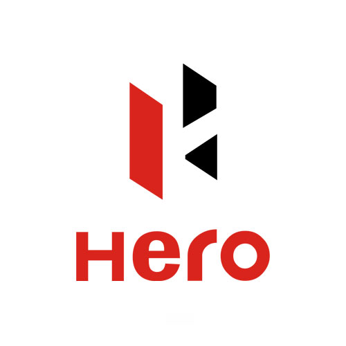
The alphabet ‘H’ is depicted in the logo inclined in some angle which clearly is a representation of the brand being self-dependent and self-focussed.
It does depend on foreign experts for any of the company needs. This self-confidence is reflected by the red color used in the identity.




Leave a Reply
Want to join the discussion?Feel free to contribute!