The All Story Behind The Engaging Logo Of Kawasaki
Since the company’s founding in 1896, the Kawasaki brand and its well-known logo have influenced people who love bikes.
At this point, motorbike fans see the Kawasaki logo as a sign of prestige and quality when looking for fast, efficient, and powerful bikes.
Where did Kawasaki’svlogo design come from, though? How did the makers develop the look of the “K” we see today? Were there other Kawasaki logos before this one?
Where did the Kawasaki logo come from
Before we look at Kawasaki’s marks from over the years, it’s essential to give a quick background on the group. A well-known brand in the motorcycle business, Kawasaki was started by Shozo Kawasaki, who gave the company his name correctly.
Shozo started working as a professional pretty young. Before starting his own company, he was simultaneously involved in two offshore disasters.
Kawasaki was sure that the modern features of the ships were what kept him alive, which led him to make technical advances in the Japanese maritime industry.
After having trouble getting customers for a while, Kawasaki got his first order in 1878. The business had moved from Tokyo to Hyoka by 1986.

Kawasaki first played around with motorcycles in the 1960s.
At the moment, Kawasaki bikes are just one part of the more giant “Kawasaki Heavy Industries” group known for selling shipbuilding, aerospace, and defence equipment.
Kawasaki’s bikes have been made to appeal to many customers over the years. They include the fantastic “Ninja sports bike” and many cruisers, dual-purpose, and motocross models.
Where the Kawasaki mark came from in the past
In 1961, the first “vintage Kawasaki logo” was put on one of the well-known bikes made by the company. This old Kawasaki image was very different from the company’s current one, but it showed how the company came to make the design choices it did.
Interestingly, the Kawasaki motorbike logo hasn’t been changed as much as the logos of many other well-known car and motorcycle brands.
Many small changes have been made to the organization’s visual brand over the years.
For example, look at the first version of the Kawasaki logo.
1961
The original Kawasaki logo was only linked to the business for six years, from 1961 to 1967. The company got this logo just before the B8 125 two-stroke, the brand’s first motorbike, came out.
The mark was curved with a flag, and the word “Kawasaki”, in a big sans-serif font, was simple but powerful.
The Kawasaki logo’s background form was purposely made to look like a winding road and a motorcycle’s exhaust system. This gives it a solid double meaning.
The gold and white Kawasaki logo flag was the first to feature the “River” mark on one of the Kawasaki Shipyard’s ships in the 1870s. The last part of the mark was a white sans-serif font with all capital letters.
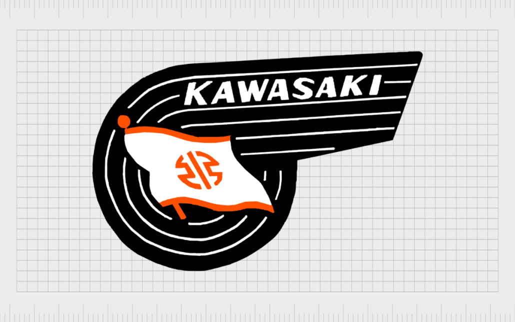
Kawasaki logo 1961
1967 – 2021
The group still used the second iteration of the Kawasaki mark before 2021. “Kawasaki” was often shown in black or red in the company’s wordmark for making motorcycles. The reworking of this part has been used to make the new logo’s black version.
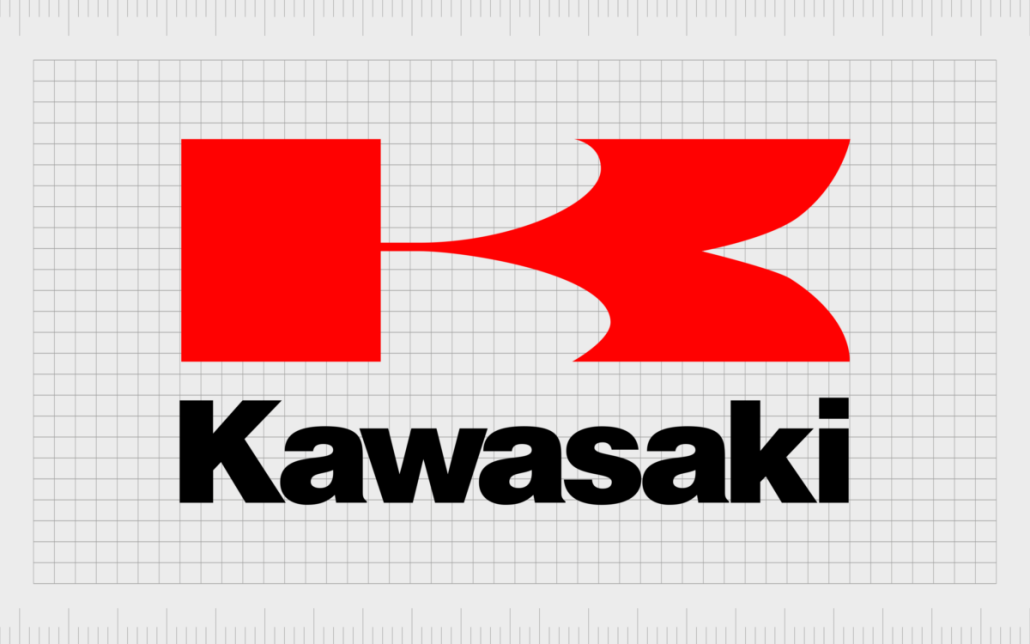
Kawasaki logo 1967 – 2021
The new Kawasaki symbol is the Kawasaki badge.
In 2021, Kawasaki changed their logo. It was the first time in a few years that the “K” mark replaced the River sign in the original Kawasaki logo.
The Kawasaki company says that a lot has changed in the 120 years since the name was first created.
Aside from the letters being closer together, the style of the new Kawasaki logo is similar to that of the old one. When there is a combination name, the wordmark may appear below the symbol or next to it (on the right). This depends on the branding asset.

Kawasaki logo Symbol
What colour is the Kawasaki logo?
The Kawasaki logo’s colour style has changed from red and black to black and white.
Black and white are striking colours representing a brand known for having a long history and being important to people. People often think of these colours when considering modern grace and sophistication.
What kind of font does the Kawasaki brand use?
Beautiful sans-serif The Kawasaki logo is a Helvetica-style font that was carefully made to go with the logo and help build the company’s brand. Using a sans-serif, bold, and evocative font draws attention to how modern and friendly the brand is.
The Kawasaki mark has been around for a year today.
There have only been minor changes to the look of the Kawasaki mark over the years. Widely known Kawasaki images, which widely feature the letter “red K,” helped to emphasize the brave and passionate spirit of the brand. The modern Kawasaki mark is easy to remember and has a lot of meaning.


Leave a Reply
Want to join the discussion?Feel free to contribute!