The YouTube logo and its development throughout time
Let’s look at YouTube’s remarkable origin story and iconic logo. Millions of people all across
the world recognize their logo and brand.
The evolution of the YouTube logo is a fascinating journey through time. Starting in 2005 with a design reminiscent of vintage TV screens, the logo has undergone significant transformations. In 2011, a ‘Play’ button was introduced, enhancing the logo’s relevance to its video-sharing platform. Further refinements in 2013 and a sleek, modern design in 2017 solidified the logo we now instantly associate with YouTube. This evolution mirrors the platform’s growth and its impact on the digital world.
YouTube: What Is It?
The millions of people worldwide who have not yet discovered the marvels of the internet
may find this question ridiculous, but those of us who use this platform regularly may find it
hard to believe. The video-sharing website YouTube has been a major force in the online
world for over a decade.
Half of all internet users visit it every day, and it has inspired a new breed of internet
entrepreneurs in the form of “Youtubers,” who provide much of the material for other
businesses.
The red and white color scheme and distinctive script of the original YouTube logo are
instantly recognizable to millions of people worldwide. Today, though, we’ll be looking back
at the origins of the most popular video-streaming website online and the logo that has
become synonymous with the brand.

YouTube’s Rich Past
Three former PayPal workers and friends, Steve Chen, Chad Hurley, and Jawed Karim,
established the most popular video hosting service in the world: YouTube. The business
started in the year 2005. The three coworkers developed the concept while brainstorming a
new dating website, where users would be required to post videos of themselves in addition
to traditional profile images.
There had never been anything like it on the internet, making the idea innovative. YouTube
started as a simple dating website idea, but when the site was built, the code was written, and
the videos were uploaded, it became clear that the concept had far more potential. With
millions of users and content producers, they might have hosted the largest video streaming
platform in the world. The internet was forever changed when YouTube decided to aim
higher and concentrate on video sharing rather than dating.
Following Google’s acquisition of YouTube
Google acquired YouTube for $1.65 billion in Google stock on October 9, 2006, and the deal
closed on November 13, 2006. The acquisition of YouTube by Google sparked renewed
interest in this social media category.
Sixty ICC Premier League matches were among the first internet broadcasts made freely
available by YouTube in March 2010. YouTube debuted a completely redesigned interface
and visual style on March 31, 2010. The goal was to make the user’s visit to the site more
enjoyable so that they would click around and watch more content.
comScore, an analytics firm, reports that YouTube commanded a 43 percent share of the U.S.
internet video market in May 2010 with over 14 billion video views.
There are currently 30 million daily active users on YouTube, and an astounding 5 billion
videos are watched daily throughout the globe. The logo has significantly influenced the
website’s meteoric rise to prominence.
Logo of YouTube
The YouTube logo is instantly recognizable due to its distinctive style. However, the logo has
gone through several iterations. An earlier logo for YouTube combined the words “You” and
“Tube” in various font sizes and colors. The ‘You’ was printed in bold, black lettering, and the
‘Tube’ was created in white as a red, rounded triangle.
Most YouTube viewers are clueless about the origin of the moniker. Cathode ray tubes,
utilized in earlier versions of televisions and computer displays, inspired this idea. YouTube
promptly had that epiphany and revised the logo accordingly. The newer YouTube logo,
emphasizing the ‘Play’ button, is much more modern in appearance. Although VHS players
have become obsolete, the button layout has endured time and the advancement of science
and technology. Half or more internet users go there at least once a month, generating
massive annual revenue.

The YouTube Logo Design Process
YouTube’s founders originally used the term “minimalism” to describe the ethos of their
organization. The company’s logo has mostly stayed the same over the years (which is to be
expected, given that it was only founded 15 years ago), yet this sparing approach may have
been crucial in facilitating the company’s rapid growth and evolution. Many people look to
the YouTube logo as an example of how effective minimalism can be in branding a product.
Despite the logo’s consistency during its brief existence, it has seen a few changes:
The First YouTube logo
In 2005, YouTube debuted its first official logo, which remained in use until 2011. Both the
‘You’ and the ‘Tube’ portions of the logo were designed to look like they were placed inside
the screen of an old-fashioned television set, complete with rounded corners (a play on the
word “Tube,” which means “television screen”). The ‘ screen’ of the TV is red, and the word
‘Tube’ is inscribed in white for easy readability. Originally, the caption “Broadcast Yourself”
would appear underneath the image, but it was removed.
The logo used from 2011-2013 is similar to the previous one, but the rectangle is now darker
and more reliable. ‘Broadcast Yourself’ was an abandoned tagline in or around 2012. The
following variant didn’t debut until 2013 and lasted until 2015. There was a slight brightening
of the rectangle’s ‘Tube’ portion, while the black of the ‘You’ portion became significantly
darker.
YouTube’s New Logo
Here we are at the logo’s current iteration. It’s much like the one before, but the ‘TV Tube’ has
brighter colors and a more defined image. This design, like all the others, features the words
“You” and “Tube” in black and white, respectively, on a red “vintage TV screen.” The screen
in this photograph no longer has any of the rounded shadings that were there before.
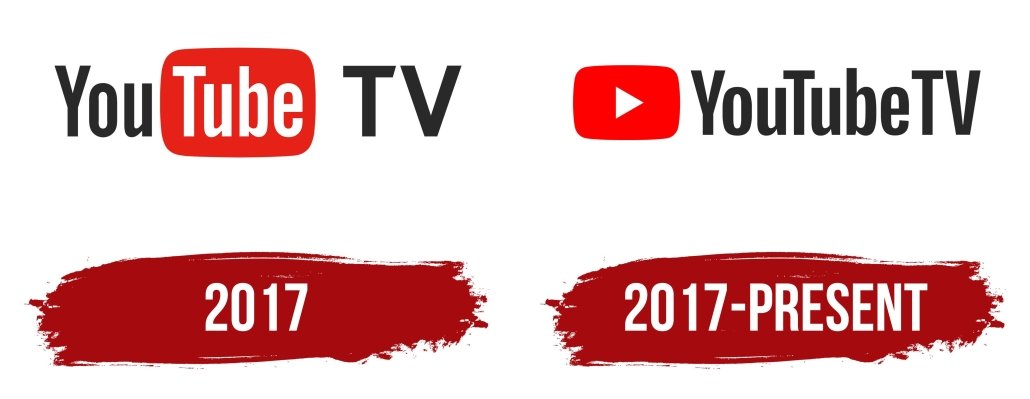
There have been a few minor logo redesigns, the most recent of which occurred towards the
end of summer 2017. The white triangle on the red ‘Play’ button is new to the logo. The word
“YouTube” was positioned to the right of the logo in a slightly altered typeface, and the logo
was red. Black lettering was used only for this edition.
The Logo for YouTube
There have been a few iterations of the now-iconic YouTube logo. Although it was part of the
icon in earlier iterations, a play button was added in 2011. The square and the triangle both
went through proportional changes in 2013. Numerous others replaced the original red before
the switch was finally redesigned in 2017 with a solid red face.
Colors
White, black, and red are the logo’s major colors, and together, they make for a striking
design. Optimism, perfection, purity, passion, elegance, and perseverance are just a few of the
qualities that YouTube hopes to convey to the world through its color scheme. The success of
YouTube and its logo can be attributed largely to using a simple color palette that is instantly
recognizable.
Font
The logo for YouTube uses the distinctive and easily recognizable Helvetica font, which was
commonly used in television shows in the 1950s.
YouTube provides entertainment for billions of people worldwide and a means of income for
thousands of artists. We should remember how important the YouTube logo was in the
company’s rise to prominence as it continues to expand.


Leave a Reply
Want to join the discussion?Feel free to contribute!