
Minimalist Logos: The Art of Simplicity in Brand Identity
Introduction
Today, simplicity is more highly valued than ever before. Many businesses opt for a
minimalist design when seeking a plain yet memorable logo. These logos master the art of
minimalism by keeping elements as basic as possible while still conveying a powerful
message. This article explores the design philosophy and methodology of minimalist logos in
depth.
What is a Minimalist Logo?
A minimalist logo is one in which the designer has omitted all unnecessary elements in favor
of an elegant and straightforward brand representation. These logos typically accomplish
their visual impact through simple geometric designs, monochromatic color palettes, and
clean typography. Due to their emphasis on minimalism, minimalist logos are contemporary,
streamlined, and refined.
Less is more.
Minimalist design is characterized by pure lines, geometric shapes, and deceptively simple
appearance. A minimalist logo can be just as effective as a more intricate design, if not more
so, by eliminating unnecessary details and colors.
Minimalism is not synonymous with an incomplete design. Despite their apparent simplicity,
minimalist logos are still bright. Minimalism is an option if you want a logo with few
elements that deliver a powerful punch. Or, if you’re seeking to modernize your brand’s logo
with a minimalist design, you may find some helpful inspiration there.
Why go minimal?
Complex type treatments and elaborate embellishments are extra for a minimal logo’s uccess. Their effectiveness is a direct consequence of their superior design.
Due to their basic shapes and single-tone color schemes, minimalist logos are readily
adaptable to various sizes and layouts. Whether on a business card or a billboard, a company’s logo must be legible and effective in both contexts. The more straightforward your design, the quicker it will be recognized.
Minimalism is an excellent starting point for any design for these reasons, even if a
minimalist logo is not the ultimate objective. Compelling logos should adhere to the principles of minimalism so that their fundamental structure can be relied upon regardless of how far the design evolves.
Tips for making a minimal logo design.
Keep it simple.
Given the limited space available for a logo, minimalism is a natural aesthetic choice. If you
attempt to include too much information in the design, it will become ambiguous when
shrunk.
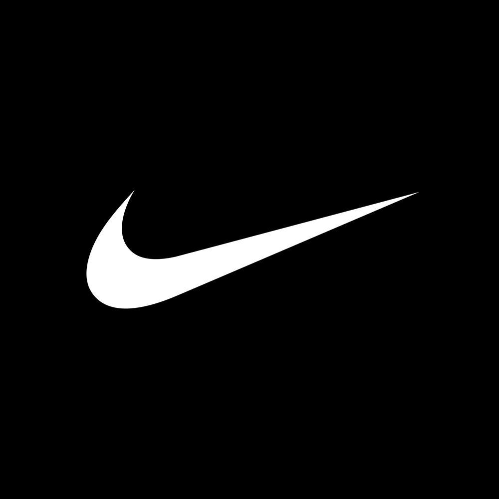
Those who wish to maintain a minimal public profile frequently employ a “flat” logo design
(a two-dimensional graphic without adding perspective). Consider the well-known Swoosh
logo for Nike. Although the shape is neither complicated nor three-dimensional, its strength
and simplicity have made it one of the world’s most recognizable emblems.
Additionally, the use of color should be kept simple. Monochromatic color schemes are
commonplace in minimalist interior design and logo design. Use only black, white, or the
primary color of the brand.
Stick to geometric shapes.
Unlike logos that rely primarily on illustration, minimalist logos emphasize order and
proportion. To create uncomplicated, proportional logos, graphic designers use rectangles,
triangles, and ellipses. You can effortlessly create aesthetically pleasing artwork using
guidelines such as the golden ratio.
Use space wisely.
Due to the limitations imposed by a minimalist aesthetic, negative space is crucial. Pay as
much attention to the voids and emptiness as you do to the content to optimize meaning and
freedom. The internationally recognized yin-yang symbol exemplifies the use of negative
space in design.
Choose simple and stark typography.
When creating a custom logo, typography is crucial and can make or ruin the design.
Typically, a wordmark or lettermark (consisting solely of the company name) is included in
the branding bundle for most businesses. The typeface of your brand should also be instantly
recognizable.
Most minimalist designs opt for sans-serif typefaces because serifs typically provide detail
and grant the brand a more conventional appearance. However, serif typefaces are acceptable
when they complement the brand’s identity. Adjusting the space between characters or
altering the shape of individual letters can make a standard font appear distinctive.
Master the art of minimalism.
Still, you should investigate existing logos to generate concepts for your own. Consider
Behance for logo design inspiration and to see how some of the most recent logo design
trends have been implemented.
Developing an enduring logo takes effort. Expect to exert considerable effort, conduct
extensive research, and go through multiple drafts to create a remarkable piece. Nevertheless,
the action is worthwhile. The objective is to ensure that people remember your brand, and the
best way to achieve this is with a primary, straightforward logo.

The Creative Process of Designing Minimalist Logos
A lot of consideration and attention to detail are required to design an effective minimalist
logo. Following is a comprehensive description of the creative process:
Understand the Brand Identity
Before sketching, knowing who you are designing for and what they care about is essential.
Before commencing the design process, it is necessary to have a firm grasp of the company’s
values and ideals, which should be reflected in the logo.
Embrace Simplicity
Your logo’s concept should revolve around minimalism’s defining characteristic: simplicity.
To create a refined and enduring aesthetic, it is essential to use simple shapes and colors.
Choose the Right Typography
Typography is essential for minimalist logo design. Choose a legible typeface that
complements the brand’s personality. Choose a typeface that communicates with your
audience by being transparent, refined, and current.
Utilize Negative Space
Negative space, or the vacant space between and around graphic elements, is a crucial
component of minimalist logos. Utilizing negative space to conceal concealed meanings or
introduce new visual elements can enhance the logo’s depth and charisma.
Experiment with Shapes and Symbols
Consider various configurations of basic geometric figures such as circles, squares, and
triangles as a starting point for your logo. These forms contribute to the appearance of
minimalism and evoke feelings of balance and harmony.
Limit the Color Palette
In minimalist logos, monochromatic or restricted color schemes are utilized. Use no more
than one or two colors to maintain a pristine appearance. Selecting colors that evoke specific
emotions and associations can strengthen your brand’s identity.
Iterate and Refine
Creating a minimalist logo frequently involves multiple revisions. By experimenting with
different layouts, fonts, and formats, find the optimal balance between readability and visual
impact. Develop your idea until you have a logo that accurately represents your company.
Conclusion
Reduce your logo’s complexity by reducing it to its essential elements. In addition, learn the
fundamentals of logo design, from ideation to completion.


Leave a Reply
Want to join the discussion?Feel free to contribute!