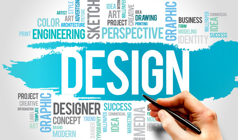
Key elements for Logo Designers
It is a challenge for logo designers to come with something fresh and appealing every time they design a logo. Here are some the key elements for logo designers to keep in mind while designing the logo.
Simple— “Simplicity is the ultimate sophistication.” With modernization, people prefer to opt for simplicity rather than tackiness.
![]()
Using too many elements in the logo might be a more easy task for the designer but the real success lies in being simple. A simple logo has the power of “less is more” and is easy for the customers to recognize.
Color— Each color that is used in the brand identity has its individual significance. Colors play with emotions. It is the first which is noticed by the viewer.
![]()
Study the color psychology well to know the impact of each color.
Fonts — The way the text is represented in the logo leaves a definite impression on the viewers. Incorrect use of fonts can hinder the appeal and purpose behind the logo.
![]()
Icons or symbols — Using symbols in logo becomes an advantage for customers to relate with the brand. Each symbol symbolizes a different meaning.
![]()
Designers need to select the symbols intelligently to convey the message to the viewers in the most suitable way.
Shapes— A certain types of shapes like square, circle, triangle are generally used in the logo which provides a logical impact on our brains.
Circles are used as a symbol of unity, friendship, and love. It represents a sense of unity and emotions.
![]()
Triangles relate to religion and science. They are mostly used to represent masculine power.
![]()
Square has the capability to represent stability and balance. The sharp corners of square give a sense of accuracy and practicality.
![]()
Creativity — Including something fresh and unusual(in a positive way)is always an advantage. Widen your thinking to come out with new ideas and inspiration to design a logo that is unique and impressive.
But it is always vital to remember to maintain a consistent balance among all the elements in the logo.
Versatile— The logo has to be used in a number of places for marketing and on other official documents. A logo is said to be versatile when emerges out perfectly whether increased or decreased in size.


Leave a Reply
Want to join the discussion?Feel free to contribute!