Evolution of Apple Logo Design and What should we learn from it?
If you think money can buy any LOGO – yes, you are right. But if you think money can buy the most ‘impressive’ logo you are wrong. Ladies and Gentlemen – we are presenting to you the history of the most iconic Logo in the world APPLE. Apple is the richest company in the world is not surprising for anyone. Apple is the company that has brought a revolution in the world by giving it iPad, iPhone, iPod, and MacBook. There are people who cannot imagine their lives without Apple products and sometimes queue up for days outside Apple stores when a new product is brought in the market.
Apple is the World’s highest valued company – and you can check it out yourself to know facts and the reason behind the choice of the fruit Apple and the why was it bitten. Read the full story to know what we can learn from the Apple Logo.
Apple Inc.
You will be amazed to know the history of Apple logo that emerged as one of the most iconic logos of modern times. Steve Jobs while discussing the logo design with Steve Wozniak was laughed at, when we suggested that an Apple should be the logo. Steve Wozniak laughed and replied, “It’s a computer company, not a fruit store.”
![]()
The journey of Apple Logo and Design:
Ronald Wayne, third co-founder of Apple Company in 1976 was the one to design its first logo. The logo was a black and white sketch with Sir Isaac Newton sitting under an apple tree where an apple was falling on his head. The words on the border read: “Newton… A mind forever voyaging through strange seas of thought… alone’. He was the one who brought a revolution to the law of gravity.
This logo lasted only a year and was soon changed.
There was another theory behind the origin of the Apple logo – as the biblical story of Adam and Eve.
![]()
1976 to 1980 – Apple Logo
Steve Jobs colored the Apple Logo since he wanted every individual to think differently. He kept the top color green because the leaf is always in green in color. This logo lasted for 22 years from 1976 to 1998. In 1980 the Apple logo was shut down because it was very expensive.
Steve Jobs appointed Rob Janoff to explore a new logo design. There have been stories around the iconic Apple logo bitten on one side was inspired by the Alan Turning’s death who was a computer scientist and a groundbreaking mathematician who committed suicide as he ate a cyanide-laced apple in the year 1954.
![]()
In 2009 in an interview with Rob Janoff, the man who drew the Apple logo in a reflection about his work and the theories behind him dismissed Sir Isaac Newton or the Bible as his inspiration. He said that he was charmed when people linked the logo with the Turning story that he was not aware of when he drew the Apple logo.
Steve Job said that the Apple logo was to make the people aware that it was not a cherry. The bite was significant of the term ‘byte’ used for a unit of digital information in the world of telecommunication and computer.
Former Executive and founder of BeOS Be Operating system Jean Louis Gassee said “ One of the deep mysteries to me is our logo, the symbol of lust and knowledge, bitten into, all crossed with colors of the rainbow in the wrong order. You couldn’t dream of a more appropriate logo; lust, knowledge, hope and anarchy.”
It was later in 1981 that Steve Jobs replied in a press conference “I like apples and love to eat them. But the main idea behind the Apple was to bring simplicity to the people, in the most sophisticated way and that was it, nothing else.”
![]()
Steve Jobs and his computer company called Apple named after the same fruit. Jobs rarely spoke about the origin of the name Apple. In Walter Isaacson’s biography of Steve Jobs – he has revealed that the name Apple was kept during the phase of his fruit diets. Steve Jobs said, “on one of my fruitarian diets”. Jobs thought that since he just went on a fruit diet the name Apple felt like “fun, spirited and not intimidating.”
In 1998 to date – The Monochrome Logo
The reason to come up with the monochrome Apple logo was the launch of the new Mac computer. This computer had a metal casing and not a plastic one. When the rainbow logo did not suit the metal casing the logo was changed to a monochrome. The new Apple logo was embossed on the Mac Book and Mac Power Book G3. Even today, after almost 20 years the same logo is active. The logo has a huge recall value. You will be surprised to know that some think it is just the logo that has made Apple one of the richest companies in the world.
The Apple logo in 1967 saw a phase when The Beatles launched a new multimedia company and called it Apple Corps Ltd. There arose a conflict between the two companies due to this followed by major tension and lawsuits amongst the two. There was a huge settling offer Apple Inc. paid to Apple Corps Ltd in the year 2007.
What have we Learnt from Apple Logo?
Apple Logo design has a lot of lessons hidden in it. We are going to discuss what we have learned or are still learning from the Apple Logo design.
Studying graphic design or selecting a design for your company’s logo can be a tedious task. The iconic Apple logo has many lessons to offer which can be applied when you are designing your own logos.
Even though there are several myths behind the evolution of the Apple Logo, there is a straightforward truth as per Rob Janoff who designed the Apple Logo in 1977. He was working with PR and Advertising Agency McKenna.
![]()
Logo Design should be scalable
As all Logo designs this one too should scale down and Janoff realized that the apple looked like a cherry on scaling down. Then came the brainy idea of the ‘iconic’ bite that was added to the apple so that it would not be confused for a cherry. This, the scalability of a logo is important and more so in the ever-changing world of technology.
Logo may not have a literal meaning
The very fact that Apple is not a fruit company clarifies that logos need not be literal. Apple is a computer company is nowhere specified in the logo. If you look at the logo of a Jaguar – it does not represent an automobile neither does Dominos logo’s graphic image shows a pizza.
Pictorial Logos
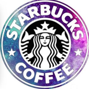
A logo like Apple transports the meaning of a brand yet does not have a meaning of its own. Pictorial logos are symbols well known and have a meaning imprinted in our minds. Other examples of pictorial logos as Twitter and Starbucks.
Which means that any logo can start looking good provided the brand it belongs to is strong.
![]()
Easily Recognizable
A logo should always be very easy to recognize. Apple is the first letter and word studied by every child who reads, writes or speaks English. Apple is the fruit that is eaten the world over and also highly recommended by doctors around the globe. The logo is easy to draw by bare hands.
Whatever shape or size or font a logo has it should be very easy to recognize it. For visual brand recognition – one can take a logo and do a small test by making people draw it in a short span of 10 seconds proving that the logo has a brand recognition.
Color of logo and its impact
The monochrome color suits the Apple logo as it represents technology and computer. The logo’s color is easily associated with as it belongs to a computer company.
Colors have a huge effect on the emotions of people. To understand customer’s attachment to specific colors and your usage of these colors can easily raise the impact it has on the customers. Color sis logo is a very effective strategy to build brand identity.
Long Lasting
A logo like an apple should be able to bear the test of time. A logo like an Apple Logo should be relatable for generations to come. Its meaning and impression should last continue to have an impact even after more than 50-60 years.
Two other logos that have had an impact on people over the years are Shell and McDonalds. they have changed and evolved over the years – yet their impression is everlasting.
Be Simple
“Simplicity is the ultimate sophistication.” as rightly said by the greatest artist Leonardo Di Vinci. Three biggest brands Nike, Apple and GE have the simplest of logos. A logo should be de-cluttered and simple at the same time.
If we go back to the history all the three brands have become simpler every time they have evolved by tweaking their logos.


Leave a Reply
Want to join the discussion?Feel free to contribute!