Kodak New Logo Meaning
It has been a rebirth of the logo of Kodak. The company has relaunched its 1970’s logo updating the positioning of the brand’s name. Having a long and trusted connection with the customers since the year of foundation in 1888, the company has been associated with the imaging technology, tools of graphics, print system, displays, software solutions, commercial films etc.

Having a long and trusted connection with the customers since the year of foundation in 1888, the company has been associated with the imaging technology, tools of graphics, print system, displays, software solutions, commercial films etc.
The brand updated its logo last in 2006.
After the gap of a decade, Kodak new logo is a revival of its logo used between 1971 to 1987 which was designed by Peter Oestreich.
The philosophy of photography is mentioned in the logo with the brand’s name inscribed on it. The red and yellow colored logo with the two arms of ‘K’ representing the rays of light surrounded by a rectangle red camera shutter.
The company has brought back the 70’s logo with the change in the positioning of the brand’s name from horizontally to vertically.
According to Keira Alexandra, the Work-order partner, in order to focus on the name of the brand more, a vertical positioning was opted rather than a horizontal one. It is a way of giving a better digital outlook to the logo.
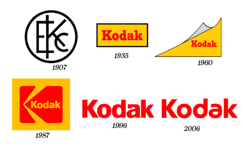
If you look at the history of Kodak’s logo, it is a colorful journey from 1907 to 2016. The first symbol was assigned in 1907 as Circa which remained as the logo for almost 27 years.

The present red and yellow color combination began in 1935. In 1960, the symbol was an inclined plane with the brand’s name on it.
The current design which is inspired by the design of Peter Oestreich came into its existence in 1971 and was there for 34 years till 1987. Next modification was carried out as the sans serif logo in 2006 still maintaining the dual color combination.
The organization seems to maintain its legacy through this revival.
“We wanted to let the logo new again. We were extremely careful to be respectful to the legacy of the brand, honoring the science and the creative vision of Kodak”, says Keira Alexandra.


Leave a Reply
Want to join the discussion?Feel free to contribute!