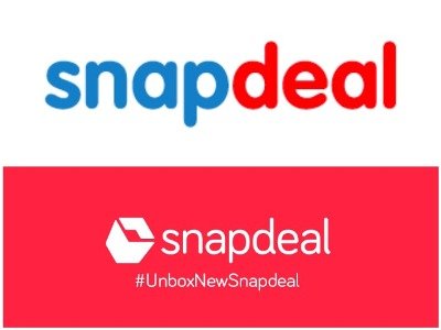
Brand New Snapdeal logo
A B2C online retailing brand, Snapdeal has recently unveiled its trendy new identity along with their campaign Unbox Zindagi.
The Snapdeal users seem to be really pleased with this fresh look of the brand. The hallmark has created an extreme hype even on the social media websites. The brand new Snapdeal logo is a modernized version of the previous one.

The brand seems to have revised their approach through the dynamic red or Vermelho, (color as mentioned by Snapdeal) as the background color with white text.
On this revamped, the Snapdeal co-founder has clearly stated,
“Our new logo is visualized from the perspective of the happiest moment for an online buyer i.e. when she receives her ‘box’.We understand that every box that we deliver contains not just a product but represents a new opportunity, an aspiration or the start of a journey for our consumers.
Our entire new brand identity right from the brand mark to its extensions reflects the box- a representation of untold potential and possibilities.”

The makeover of Snapdeal has been designed by Prasoon Joshi. It includes a box formed with two oppositely facing arrows representing the progress of the organization.
However, the revised sign of Snapdeal does not include anything like the significant ‘f’ of Flipkart, the adorable ‘a’ of Amazon or the chromatic ‘m’ of Myntra.
According to the following statement given chief executive of the Snapdeal, Mr.Kunal Bahl, the company seems to be full of zeal to revitalize its brand and multiply its consumers.
“We have to be ready for the next 100 million e-commerce buyers that are going to come in next five years.”
Through the brand new Snapdeal logo, the company aspires to deliver its user not just a parcel of the product instead present them a box of happiness.
With this logo as the turning point, the company is all set to make a turnover of 100 million users in the next five years.


Leave a Reply
Want to join the discussion?Feel free to contribute!