IBM Logo Meaning And History
The International Business Machines Corporation, or frequently known as IBM, is one of the world’s leading IT companies. Charles Ranlett Flint founded it over a century ago.
Their logo and services are known for their spotless services in IT computer consulting services, software, and hardware.
- The logo has evolved over the years since its beginning.
- The logo symbolizes efficiency and reliability.
IBM Logo Design Elements
The IBM logo has three main design elements that work well with one another. They currently have two versions of logos in use.
1st Logo (1972- Present)
The IBM logo that we are familiar with has been in place since 1972. It has the letters I, B, M, written in capital letters.

- Shape
The logo has a linear approach. The letters are equally spaced next to each other, and they have eight equal stripes running across it.
- The lines represent the speed and dynamics of their services.
- Color
The previous thirteen striped logo was difficult to reproduce. The photocopiers back then could not reproduce it properly. They hired Paul Rand to solve this problem.
- Rand loved the previous structure of the logo so much that he wanted to preserve as much of it as possible.
- He changed the thirteen lines of the old IBM logo to eight straight stripes.
- It efficiently solved the problem of the dripping.
- It became a trendsetter at the time.
- He retained the blue color of the logo.
Blue is often associated with stability, depth, loyalty, trust, and intelligence. The light blue color has a soothing effect on people. In the IBM logo, they convey a sense of strength, professionalism, and dominance. It is a highly effective logo that is symbolic of their professionalism.
2nd Logo (2018- Present)
Along with the blue and white striped version, they also have a strict grey and white version of the logo in use. They launched this 2nd version in 2018 and it still remains in use.

- Shape
In the 2nd logo, IBM has opted for a bold styled shape.
- The company name, IBM, is enclosed in a thick, black rectangle.
- The letters themselves are in a white, bold style.
- Color
- The 2nd logo has only two colors- black and white, in place of the blue and white logo.
The bold visual reflects the stability and responsibility that IBM provides to its customers.
Logo Font
The company’s font is very simple yet unforgettable. Both the logos in use have the same font, serif. It has a custom typeface print. The logo is extremely simple, yet bold, and stylish.
The letters I, B, M, are in simple, bold letters, with the top ends and bottom ends of the ‘M’ slightly extended.
The logo is workable and versatile.
- Both of the logos are workable on giant billboards and also on small product labels.
Logo Influence And Trivia
The IBM logo has changed very little after their partition with the globe IBM. The logo changed from the 13-stripe version to the current 8-stripe version. The minimum changes in the logo to the current version confirms that they were very close to developing the perfect emblem in 1956.
- One of the intriguing facts about the IMB logo is that the current logo has nothing in common with that of the 1889 version.
Slogan
The IMB’s slogan is simply, THINK. Their highly successful ‘ThinkPad’ series is named after it.
1889-1914
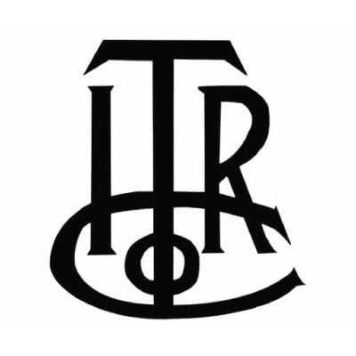
The debut emblem is a monogram with the company’s previous name’s capital letters- the International Time Recording Company.
- The ‘ITR’ is in one row, and the ‘Co’ is below that.
- The ‘Co’ forms a platform for the above letters.
- The ‘T’ is much larger than the adjacent characters.
Reason– They structured the logo in this way because they wanted a representation of International Time Recording Company (ITRCo)
1890- 1914
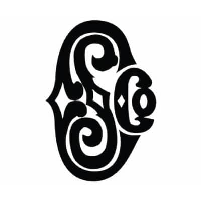
After the company renamed itself to the Computing Scale Company, they introduced a complex logo.
- It is a black colored monogram that combines the capital letters of the name.
- CSC has a streamlined design in the form of curls.
- The abbreviation has decorations with ornamental designs.
Reason– Since the company changed its name, it decided to come up with a separate logo representing its name Computing Scale Company (CSCo)
1910- 1924
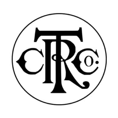
During the company’s acquisition, they underwent a major rebranding. They changed their name to Computer Tabulating Recording Company.
- The emblem has the letters ‘CTRCo’.
- It also has a large ‘T,’ behind which is an ‘R.’
- On the left of it lies the C, and on the right is ‘Co.’
- All the letters and the design is in solid black.
Reason– Since they went through a major rebranding, the company wanted to make a bold stance by recreating their logo with the new letters- CTRCo.
1924- 1946
The company again changed its name to International Business Machines. They did not use an abbreviation; instead, the developers took the full name and typed the words to represent a globe.
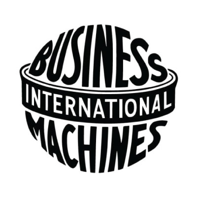
- ‘Business’ is at the top of the globe.
- ‘International’ forms the equator and ‘Machines’ below.
- The symbol is representative of their universal coverage.
- The entire design is in a bold black sans-serif font.
Reason– They shaped the logo like a globe since they wanted to expand their business worldwide. They changed the previous ornate logo to a simpler and modern font.
1946-1947
It was a time of fundamental change in the logo. They approached simplicity and used the abbreviation of the International Business Machines, IMB.
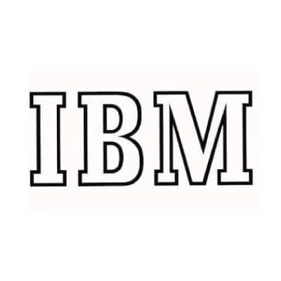
- The letters IMB are written side by side.
- The logo has a hollow, bold, serif font.
- The developers used the font serif in the logo.
Reason– The company went through a time of change and wanted to simplify their logo further than the previous version.
1947- 1956

- The designers made minimal changes to the logo.
- The rounded hollow in the B was converted to two white squares.
- The font remains the same, serif.
- The top and bottom ends of M are elongated.
Reason– Complicated logos were simplified to make it easier to understand, depicting their user-friendliness.
1956- 1967

- The simple block IMB evolved into a linear logo.
- The logo has stripes with equal width.
- The stripes are equal in width, and it represents equality among their workers.
- There were thirteen white stripes in the logo.
Reason– There were no other prominent companies that use an entire stripe-based logo. It made them stand out. The linear approach to their logo conveys their speedy services.
Hence, the currently used version has a long and exciting history behind it. With years of evolution, the IMB logo has become one of the most successful among IT companies worldwide.

Leave a Reply
Want to join the discussion?Feel free to contribute!