
Google Pay Logo in India Has Been Updated.
Google Pay is an online service that lets people with Android-powered phones and computers make electronic payments. It was made by Google creators in 2015 based on Google Wallet, which was started in 2011. When it first came out, the system was called Android Pay to stress that it worked with 70% of Android devices. In the end, the system was given the name GooglePay logo in February 2018.
Meaning and background
A mobile service called Google Pay lets people pay for things with an Android phone that has an NFC chip. Google Pay can also be used on watches and computers. Customers can use this online payment method and digital wallet to make purchases.
People can quickly flash their phones to get the NFC link. For modern businesses, this gives them more options when it comes to giving people the easiest ways to pay.
When Google updated its online and mobile payment options in 2018, putting them all under the Google Pay name, the service started in its current form.
Google Pay can be used to do many things, such as pay for things online, buy things without touching them, and buy things inside apps. You can even send money to other people, just like with PayPal. Additionally, Google Pay is an excellent way for businesses to give customers more payment choices.
You can use Google Pay to make mobile payments without a real Visa or MasterCard. To use your Google account, you don’t need to carry cash or remember your credit card number. You are good to go if your gadget has a card that works with it. To use Google Pay, all you have to do is download the app and sign in to your Google account.
The Google Play shop is where you can get Google Pay on your Android phone or tablet. You can link your chosen payment method to your Google Pay transactions once you’re logged in.
What exactly is Google Pay?
Google Pay, which used to be called Android Pay, is a mobile payment app that lets you use your phone to buy things in stores, online, and within apps. You can use Google Pay in all shops and other places with contactless payment terminals.
2017 – 2018
The original image is made up of two big, round lines, one that is straight and the other that is curved. They look like the letter “T” when put together. The first one is a dark blue color, while the second one is primarily turquoise. Last but not least, these two shapes share a soft green dot at the end.
2018 – Present
It looks like the colored letter “G” for “Google” and the word “Pay” in dark gray, all on a light blue and white striped rectangle. This Google Pay Logo first appeared when Google Pay replaced Android Pay at the beginning of 2018. It was slightly changed in November of that same year.
These are the usual Google colors for the letter “G”: red, yellow, green, and blue. However, the colors are brighter and more consistent. Using the shape of the letter “G” as a circle as a base, the colors are spread out using a tetradic color scheme, which spreads each of the four colors evenly around the circle. This color scheme was picked to give the image a positive and energizing feel, and it’s thought to have played a significant role in Google’s huge success.
A sans-serif font is used for the present GooglePay logo. The strong and smooth shape of the font was the deciding factor in this choice. It works well with pixels and any text size so that the wordmark can be read on a lot of devices, even smartphones with small screens.
2020 – Present
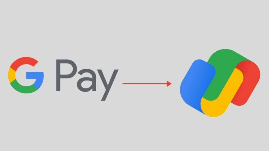
The GooglePay logo was updated in 2020, and the service looks wholly different and up-to-date after the changes made this year. The color scheme stayed the same—the new image still uses the famous Google color scheme of blue, yellow, green, and red—but the shapes were very different. The current mark was just a picture with no letters or numbers. Two flat, “bracket-like” shapes are joined together, and each of their parts is colored with one of four colors.
New Google Pay logo
The GooglePay logo has been fully redesigned for Indian users, as shown. The current logo has a multicolored “G” and “Pay,” but the new mark has two Google-colored squares that fit together. It doesn’t look like a Google Pay app badge because it doesn’t refer to the app in any way. The Google colors, on the other hand, strongly suggest a Google app.
For Android users, the change has already started to show up. A Twitter user told everyone about the change in a tweet. However, the Google Pay for iOS image has not changed. It still has the letters “G” and “Pay” on a white and blue background, respectively. This means that the change to the design is being made slowly and will eventually be offered to everyone.
Google has started to change the logos for its apps, such as Gmail, Google Docs, Google Drive, and more. It is now clear that other Google apps will use the new logo design.
Remember that Google Pay for iOS was just redesigned with a new user experience to make it easier to use. ‘New Payment’ is in the middle of the app, and ‘Code Scanner’ is in the top left corner. You can also use scrolling right to turn on the code reader.
Google also chose in September to use a Flutter rewrite for the Tez version of Google Pay. This will make it easier for the app to be used all over the world.
Font and Hue
The new GooglePay logo doesn’t have any letters on it. Instead, it’s a big, simple icon in the blue, green, yellow, and red colors that Google uses for its central image. The colors show the range of products the business sells and draw attention to its best features. At the same time, they make all the logos easy to spot and connect them to the parent company.


Leave a Reply
Want to join the discussion?Feel free to contribute!