
The Background and History of the Bose Logo
Explore the fascinating history and design evolution of the Bose logo. Since its inception in 1964 by founder Amar G. Bose, the American company has been synonymous with top-tier audio and sound tools. Learn how the Bose logo, representing ‘sound pleasure,’ was carefully crafted to reflect modernity, style, and a commitment to quality. Join us on a journey through the minimalist design elements that showcase strength and delve into the significance of hues, fonts, and the iconic slogan ‘Better sound through research.’ This is the story of the Bose logo’s evolution and its role in the brand’s nearly 60-year legacy in the audio technology industry. This is the story of how the Bose logo came to be.
The development of the Bose logo
The mark that was made for Bose is an exciting variation that includes the founder’s name. 1000 Bose logo says that the name Bose has come to mean “sound pleasure.” It was made so that the mark would look modern and stylish. To keep the idea of good quality alive, this had to be done. The most important part of the image is the business name. This modern design’s minimalist method intends to show strength.
A quick view of the Bose logo
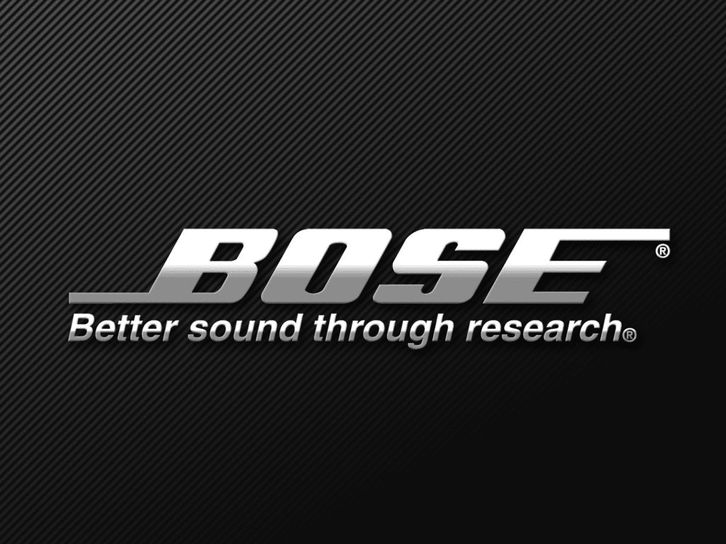
The Bose logo is shown on a square black background. Bright white letters spell out the name BOSE. They look great against the black background. The bottom of the first letter is longer than the rest of the letter and goes to the left of the picture. The end of the letter E is also longer than usual. There is a white background with the word “Professional” written in a thin black style with all capital letters.
This means that the grade of the goods meets the standards for professional use. It also talks about the company’s reputation for constantly researching new ways to improve music technology. It is meant that the Bose logo will always stand for the best quality and efficiency.
Significance Of The Hues of Bose logo
The shades are black and white. A black-and-white pattern is standard for showing confidence, power, and the tech business. In the world of technology, black stands for bravery, authority, and power. When it comes to the company’s beliefs and actions, white stands for honesty, openness, and purity; it makes you feel like you can trust it.
Only capital letters in bold are used in the font. The font has been changed to look more manly by making it thick and bold. Italics draw attention to the name, and it’s clear right away that this is what makes it different from others. This detail sets the company apart from other brands and lives up to its status as a top manufacturer. The company name and the slogan “Better sound through research” are in one version of the Bose logo.
This shows that the brand is forward-thinking and continues to look for new audio technology innovations to make its goods better. The emblem changes. The tails that protrude from both the B and E letters are evidence of Bose’s philosophy to constantly look to the future and produce new and better goods.
A changed form of Helvetica Neue is used for the wordmark. This makes the image look like it’s moving. Every part of the image is significant to how it makes people feel. There was a lot of thinking that went into making the Bose logo , even though it looks simple.
A Nontraditional Approach To Branding
It looks like a wordmark and is made of a transcendent type. There are no added symbols that would give the page a unique look. Color, texture, and the name of the brand are the only things that are part of the design. Making this choice was based on the idea of making a mark that could work without any extraneous symbols.
The central part of the design is the name Bose in the wordmark. This makes the name Bose stand out. It also makes it stick in the minds of everyone who sees it. It’s a great way to sell your business when you think about it. It only helped to make the brand’s name stronger. The simple wordmark was turned into a strong and unique design.
Each of the few things that were used in the design had a profound message behind it. The slogan that says “better sound through research” has made everyone think that this company is committed to always getting better. In other words, the goods will always be cutting-edge and up-to-date. That’s what Bose has done so far to keep its word to the public.
It’s been in business for almost 60 years. It has grown to become one of the most well-known names of audio and sound equipment in the world over the past fifty years or so.
Final thoughts
The fact that Bose has risen to the top of the audio/sound technology business is awe-inspiring. In the past, ads for Bose goods made it seem like they had better sound quality. Based on these early ads, people have made an opinion about the quality of the products. The Bose logo has met the marketers’ goals. It met this goal by having a simple rendering of the brand name that made it stand out on its own.
The height and width of the font make it stand out as a company that is looking to the future. It will keep looking into new and better technologies to stay on the cutting edge of sound technology. This helps the people have more faith. We were not able to find out who came up with the first Bose logo.
We think it was the result of marketing teams and business executives working together to come up with something new. This is, without question, one of the most accessible Bose logo designs that works the best right now. When you use the brand name as the main focus, people immediately understand what it stands for.


Leave a Reply
Want to join the discussion?Feel free to contribute!