
What does Logo Color reveal about a company?
“COLOR does not add a pleasant quality to design – it reinforces it.” Said Pierre Bonnard who was a painter and printmaker. His quote throws light on the truth that one should not completely rely on COLOR to make the design look pretty rather use COLOR to complement the design.
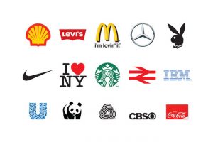
Try this simple experiment … Close your eyes and think of brands like Nike Or McDonalds
What is the First Color that comes to your mind when you think of these Brands?
As per research, it is revealed that the design of your Logo – especially it’s Colors have more impact on the customer’s opinions than you can ever imagine.
If you are in the process of writing your Brand’s tagline the most important aspect is to send to the target consumers the message behind your Logo.
Do you know that Colors are directly related to people’s emotions?
The implication of colors are deep and the manner in which your customers connect with certain colors makes the branding methodology more effective – if studied in advance.
Do you know that as per consumer research:
People tend to subconsciously judge a product within the very first 90 seconds after viewing and this assessment is mainly based on the color primarily.
Color is assigned 85% preference to be the reason for buying a product and customers believe that brand recognition increases 80% due to the color associated with it.

Neuroscientist Bevil Conway an artist since youth mostly studies perception and vision at Harvard Medical School and Wellesley College. Recently Conway devoted his research to the neural machinery behind colors.
“Knowing that humans might also be hardwired for certain hues could be a gateway into understanding the neural properties of emotion” revealed Conway recently.
Colors provoke strong feelings in people – especially if you take one color at a time. For example:
Green – Most arousing color to the senses
Blues and Purples – Pleasanter than yellow
In the quest to uncover the basic mechanisms for these feelings one could take the study backward.
Designers should use emotional connections in order to understand them and match them to color schemes and how they affect the mood of a website, or a brand or a room.

Whatever neural processes help us spot an orange tee in a crowd could grant access into the larger system of attention. Conway is right when he says that color could be an “a model system for something much more than color.”
Study of 9 Colors for Logo and the emotions they convey:
Can you imagine a life without color?
No, we continuously live in a colorful world and when we look around us we see how various companies use colors be it for their ads, logos, banners, walls in their stores. Colors you see around a brand are a conscious choice based on the mood that is targeted for the customers. Same theory is used for colors on a website
Here are the psychological effects of colors and the more you observe at the world around you – the more you will observe their impact.
If you are a clever Logo designer you will know that every color evokes a different and unique emotional response. Once you understand this connect it becomes easy to choose colors and know when and how to use each color.
RED
Important, Passionate, Aggressive
Red is a color to be used cautiously. This color has an innate knack to attract attention. The lighter shades of red symbolize youthfulness, however, the darker shades denote durability and power. It adds gravity to a brand and heightens awareness.
Let’s see two world’s famous brands that have used RED and subtly used the emotion of being ‘important’ in the minds of the people watching it. Both CNN and BBC are News Brands and the moment we see their logo – we think that the brands are powerful, bring forward ‘Important’ news useful to people worldwide, are responsible and reliable at the same time.

Red is a color associated with love and war – two opposites – yet it retains the fact that it is ‘important.’ How many of you have dreamed of walking on a Red Carpet to feel ‘Important’?
ORANGE
Energetic, warm, playful, cheap
Orange adds energy and excitement that is missing in a logo. It is also associated with being well and vibrant. Orange adds the fun element in a brand’s outlook. Orange has the same energizing aspect as red color.
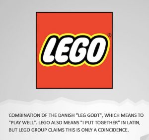
Lego’s Brand Values are: Imagination, Creativity, Fun, Learning, Caring and Quality. Lego Brand is all about the people’s expectations from the company and its products and services. Lego group has a sense of responsibility that they feel for their consumers.
Lego changed the color of their Logo from a deeper Orange to a brighter color orange and a larger logo to ensure parents who are looking for that toy that could be perfect for their kid never oversee the Lego logo. Bright colors attract the young customer’s eyes who in turn draw their parent’s attention to it.
YELLOW
Warning, Happy, Friendly
Yellow is a color often associated with both happiness and anxiety – therefore often considered a bit strange. It stimulates emotions and is used for warnings. It is suggested that one should use less of bright yellow as it could have a negative connotation.

If yellow is used in lighter shades – it evokes happiness and reminds the customers of sun and summer times. Darker shades of yellow, like gold are less flighty and add a sense of antiquity to the brand.
GREEN
Stable, Prosperous and Natural
Green is symbolic to outdoors and the environment. The very color represents nature and organic. It is a color that bridges the warm colors like red, yellow, orange and the calm colors blue and purple. Green is one of the colored associated with balance and stability. In the west is also represent financial safety and money.
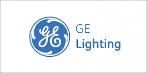
BLUE
Trustworthy, Inviting and Serene
Blue is the most commonly liked color in web designing. Blue is seen in a lot of websites and evokes the feeling of trust. The color is associated with being calm and inspiration to feeling secure/safe. If you notice Blue is commonly used by banks for example: Capital One, Chase, and Citibank. It is also a color that is attractive in an inviting manner – therefore used by Twitter and Facebook.

Darker blue shades are sober and transmit a feeling of professionalism and security. It evokes a feeling of trust.
The lighter blue due to its connect with the air and water has a refreshing feel to it. It has an energizing effect on the human mind when one looks at a blue colored logo.
One should remember never to use blue in food related websites or products. As per studies blue color makes people loose their appetite.
PURPLE
Romantic, Mysterious and Luxurious
Purple is a color associated with luxury, royalty, and decadence. It evokes a sense of expensive and high end or elegant.
![]()
If the shade of purple is lighter is brings to mind the flower lavender and a sense of spring and romance. The moment the purple shade is darker it brings about a sense of mystery and adds creativity.
PINK
Innocent, Young and Feminine
Pink is a typical color and works only on some logos and websites. Pinks fits in best if used for the right audience. It has a feminine association with it and is used to target females. Pink also has many connotations like – sweets, childlike innocence.
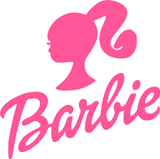
Traditionally pink was used for themes that were romantic or soft with purple and red on the side.
If you happen to use pink in a non-feminine logo – do not overdo the pink – take care not to appeal to the users and contradicting the traditional gender association with Pink.
WHITE
Healthy, Virtuous and Lean
White is the opposite of black and it is good when paired with any color and acts as a secondary color. White if kept along with other colors brings out their stimulating element. It will make your target customer get attracted to your logo if used wisely.
Even though white is a primary color – it imparts the impression of being chaste and clean. It is a color almost as good as sterile and gives a spotless feel to it. When one sees white the association one has is of holiness, virtuous and pious feelings. That’s is why it is used widely for hospitals and nurses so that it elicits a feeling of good health.
Sometimes off white and cream are used in place of white to wade off the stark feel of white.
BLACK
Edgy, Powerful and Sophisticated
It is one of the strongest colors yet used sparingly. It is used as a primary color element like backgrounds. Similar to purple it adds elegance and mystery with a much boldness and sophistication.
Look at the Amazon Logo with Black letters with a huge impact on its millions of users across the world.

If color black is used too heavily in a logo design it can be scary. One can use the rainbow outlines on the outside of the black color letters so that the logo easily fits into the colorful pages where it may be used.
Look out for our next article on Logo design …coming up tomorrow!
Keep your suggestions coming in …Would love to receive topics from you on Brand and Logo design written on your requests…!

Leave a Reply
Want to join the discussion?Feel free to contribute!