
The Utterly Butterly Delicious Story Of Amul Logo
As its slogan says, Amul has become the taste of India over time. It is one of the most loved names in our country. An all-Indian teen has heard the brand’s many dairy product ads since they were kids, and the polka-dotted Amul girl icon has become a symbol that makes people feel nostalgic. Since its founding in 1946, Amul has grown a lot.
Brand name and Amul Logo
Amul is a dairy cooperative with its main office in Anand, Gujarat, India. It is also known as Anand Milk Union Limited. It is a group that was founded in 1948. With the help and backing of Sardar Patel and Verghese Kurien, Tribhuvandas Patel led the white revolution. Because of this, Kaira District Milk Union Limited was formed in 1946.
Tribhuvandas was made the group’s first chairman and stayed in that position until he died. It was three years after the white revolution that he hired Dr. Kurien. The success of Amul can be traced back to Kurien, who started and led the GCMMF for more than 30 years, from 1973 to 2006. Amul, India’s most famous food brand, has begun selling its products in other countries. Currently, you can find Amul goods in more than twenty countries.
The start
Amul was started as part of a cooperative movement against Polson Dairy in Anand, Gujarat. This movement paid a lot of money to local farmers in the Kaira District for milk, which it then gave to the Bombay government.
Everyone who took part in this trade gained something, except the makers. The farmers went to Sardar Patel, who has supported farmers’ unions since 1942 and begged him to help them. Because of this, the Kaira District Cooperative Milk Producers’ Union Limited was set up in Anand. For the Bombay Milk Scheme, the union first pasteurized milk from a few farmers.
By the end of 1948, 432 farmers were pasteurizing milk for the scheme. Unmanageable extra output grew because of the fast growth, and the Bombay Milk Scheme couldn’t handle it. To solve this problem, a place was built to turn the extra milk into butter and powder.

The late Dr. Verghese Kurien was the real founder of Amul and was often called the “Milkman of India.” His time at Amul began in 1949 when the government sent him to Anand as a dairy manager.
He changed the dairy industry in India. He helped farmers fix their equipment and led the White Revolution (Operation Flood), the world’s most extensive dairy growth program. The newly built dairy and milk production plant opened for business in October 1955. This year also saw a big step forward in dairy technology: buffalo milk was turned into food items for the first time. The name “Amul” comes from the Sanskrit word “Amulya,” which means “precious” or “priceless.” It served to market a line of milk products made by the Kaira Union.
It also stands for Anand Milk Union Ltd. Dr. Kurien had good luck. At that time, there were significant problems in the dairy business, so his goal was to fix them by giving small dairy farmers centralized marketing and quality-control units. Because of this, the Gujarat Cooperative Milk Marketing Federation (GCMMF) was created in 1973 to promote milk and all milk products made by the state’s six district cooperative groups.
Acclaim, Awards, and an International Presence
Introduction of Amul Logo
There have been many awards given to Amul and GCMMF since they started. There are many awards, such as the World Dairy Innovation Award (1999), the Rajiv Gandhi National Quality Award (1999), the Golden Trophy for Outstanding Export Performance (2009–2010), and the Best Marketing Campaign (2014). Amul became famous worldwide after GCMMF put it on the Global Dairy Trade (GDT) platform, which only shows goods from the six biggest dairy companies worldwide.
Rather Than Just a Slogan
Shri Kanon Krishna, an advertising firm in Mumbai called Advertising and Sales Promotion (ASP), created Amul’s famous slogan, which is now part of the Amul logo. This happened in 1994.
Amul says that the Taste of India slogan is more than just advertising language or a way for the company to place itself. This slogan shows that the brand is always committed to giving people in rural areas cheap, high-quality food and goods, which would not have been possible otherwise.
The Butter Girl
It wasn’t always the round-eyed moppet that stood for Amul. The idea for The Butter Girl came from Sylvester daCunha, MD, of the advertising agency in charge of Amul Butter’s account at the time. The dull corporate ads the previous firm had made were not as good as this one.
As an experienced marketer, Dr. Kurien gave daCunha complete creative freedom to create and spread the ads without needing permission from the company. Even after thirty years, The Utterly Butterly Girl still makes people fall in love wherever she appears, whether on a sign or a butter packet.
Amul is more than just a brand; it’s also a cause that stands for the economic freedom of farmers. People will never forget the name, and the Amul girl with the round lips will continue to charm them.
Background and History
India’s social and economic history is woven into Amul’s life in a very complex way. It was started in 1946 in Gujarat as a response to the unfair business methods of many local merchants. Instead of doing business with each other, farmers formed Amul through the Kaira District Cooperative Milk Producers’ Union Limited.
Dr. Verghese Kurien and Amul led the White Revolution, which started in the 1970s and made India the most significant milk producer in the world. By using his “Anand pattern” cooperative system, dairy farmers came together with a focus on autonomous operations and going straight to the market.
Normally, no “change” existed in who owned what. The producers decide what the company does and get a cut of the income.
Over time, Amul added cheese, butter, and candies to its range of products in addition to milk. They were very creative because they devised ways to make tetra-packed milk and milk powder from cow milk.
Amul goods were sent to more than fifty countries around the world. In India, the Amul lady became a brand icon by making funny comments about current events.
Amul has grown from a simple dairy brand into a movement that supports quality goods, community work, and empowering people.
Present Day
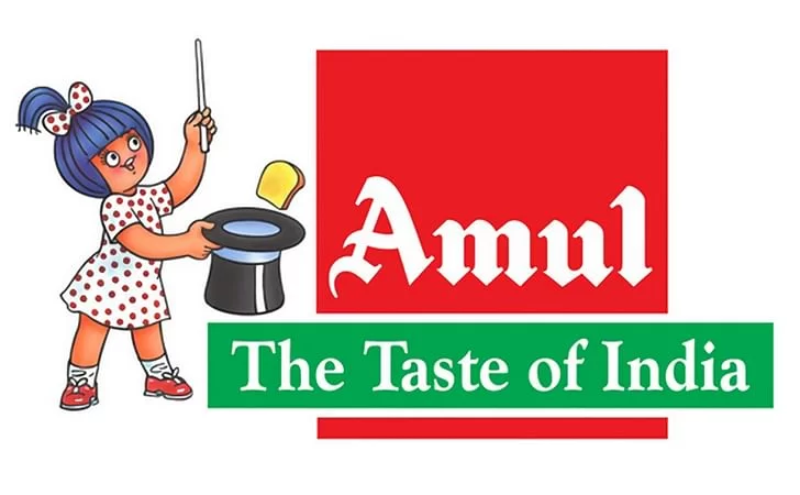
The letter “Amul” is shown on the bold, bright red symbol. An interesting thing about the font is that each letter has its look, with long, curved tail ends. The letter “A” begins with a precise, undulating shape that looks like a stylized wave. The “m”, “u”, and “l”, on the other hand, end in a downward direction with shorter extensions. With its clean white background, the design gives off a sense of life and humour.


Leave a Reply
Want to join the discussion?Feel free to contribute!