
7 Top Logo Design Mistakes
“Creativity is allowing yourself to make mistakes – Design is knowing which ones to keep.”
By Scott Adams (Creator of the Dilbert comic strip)
Are you a Logo Designer?
Are you looking for a Logo Design for your company or yourself?
It is always good to retrospect – but greater to learn before you make mistakes. All designers tend to make mistakes. The ones listed below will give you an idea if your logo has also committed the Most Common mistakes.
This will help you make sure – How to AVOID these common mistakes!
7 Top Logo Design Mistakes – Made by Logo Designers
1. Failing to Understand the Client’s Brief
A brief is the single most important guideline used as a huge tool to design any Logo. If you end up misunderstanding the needs of the buyer and what the brand’s motto is – you will loose the plot even before you start.
Hours of working and research will go down the drain – if you do not read, understand and brainstorm the brief given to you by your client. Always make notes and also make a mood board for your logo design right in front of you – as you start logo design to know the broad areas of the brand image to be projected through the logo design.

Let us take a look at what should be included in a Design Brief:
- Introduction: To describe the company in one short paragraph.
- Emotions and feelings: The aesthetics that you are targeting through the Logo.
- Brand Positioning: are you a GAP or a Primark.
- Creative Considerations: Any particular guidelines in terms of color, typography, font, shape, infographics.
- How are you different from Competitors: Who are your competitors. What is your USP and how are you Unique?
- Target Audience: Who and what are the audience looking for in your Brand.
- Specific Requirements: At the end of the project what is it that the client needs.
- Timeline: When is the deadline for the project. Is it practical?
- Budget: How much is the Budget ($) that is assigned to the project?
Always be in touch with your client. Keep discussing and showing them what is your progress and take feelers from them so that you know you are on the right track.
2.Use of Incorrect Typography
The Internet is buzzing with free fonts to be downloaded. There are huge pitfalls if you fall prey to their usage in terms of legalities. Be upfront and pay for a font like a true professional.
There are fonts that are overused and may look like a copy- especially if used in similar kind of brand. Choose the typography carefully. It can change the face of your Logo design completely.
Can you imagine looking at Pizza Hut written in any other font? The font has become synonymous to Pizza Hut.
What if you design a New Pizza logo design using the same FONT?
It will surely be a disaster!
![]()
3.Unfriendly Across Various Mediums
Have you ever noticed see that a Popular Logo is changed even though there doesn’t seem to be any reason to do so?
Here is Why?
No matter how famous you are or how fast you grow – Logo and Branding is a huge cost for any company. In today’s day and age be it a logo, an icon, a design element – it should be easily transferrable across different mediums – both digital and analog.
Therefore, if the fact that the design should be printable on various surfaces and should be friendly to mobile devices, web, hoardings, letter heads, visiting cards, signage – is overlooked by the designer – Logo could turn out to be a disaster.
Do you know that the multi-colored rainbow APPLE logo was changed because of this very reason!
Read to know the REAL reason behind the much talked about change?
The present Monochrome Logo – 1998 to present: When Steve Jobs returned to Apple in the year 1997 – he realized that the logo of APLE could easily be used to the advantage of the company. The company was bleeding money at that time.
![]()
Steve Jobs realized that the face of the APPLE Logo is the most recognizable and yet it cannot be placed everywhere as it is costly to print the multi-colored rainbow colors. It was also childish and out of place if placed on top of the Bondi Blue iMac. Therefore he suggested changing the rainbow colored logo to a monochrome logo.
Apple monochrome Logo started getting placed in sizeable style – on the original iMac and on the side of the Powermac G3 Tower, iBooks. Big hoardings and signage were seen everywhere – transforming the image of Apple to a company being able to churn out sleek products with cutting edge technology.
Read our detailed article on Evolution of the Apple Logo Design and What we learn?
4.Overuse of FONTS in a Logo design
Logo design requires consistency – as a good company is rated if they are consistent with their quality products or services. The customer gets confused if you give them too many font types.
As a design rule – try and use two font types to be used in different font weights in order to highlight and demarcate areas.
Next time you log into your Facebook account or watch a Disney Movie – take out time and use the psychology behind their typeface selection. Typefaces always communicate messages in a subtle manner. There are subliminal messages conveyed to the users that have to be kept in mind while creating or redesigning a Brand.
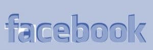
If you look at the facebook logo above has always remained basic. In 2015 when Facebook changed the font of its logo, all it did was to type it in even less distinctive fashion. The ‘a’ changed form double- story to be replaced by a single-story ‘a’. There is a white space and the letters became thinner so that the Logo is more legible when read in lower resolutions while using it on mobile devices.
Josh Higgins said that Facebook “set out to modernize the logo to make it feel more friendly and approachable.” The old wordmark was chosen after widely being explored. The large F logo and favicon remain the same.
Read our Blog post to know how to Select Best Logo Fonts
5.Overuse of Stock Images
Cannot hire a professional photographer?
Looking for stock images to use in your design.
Avoid getting trapped by overuse of stock images. What you think is excellent – will be found attractive by others as well. It is very shameful if you come up with a design and then find that exactly the same image is used in another design.
Everyone wants to be Unique!
6.COPY others People’s design
Paul Rand famous Graphic Designer once said: “Don’t try to be original, just try to be good.”
Do not think plagiarism will not be detected. Originality is the best gift a designer can give to his work. You may spend time looking at great work for inspirations – yet copying other’s work is a big ‘NO’.
With more and more exposure to the Logo and Brands due to social media – the chances of people detecting a non-authentic design have become faster and rather embarrassing.
“When you find an idea that you can’t stop thinking about, that’s probably a good one to pursue.”
When companies who belong to the same industry have very similar looking logo – it is eerie. ‘Chanel’ established in 1909 as a design company has hardly changed its Logo since its inception. ‘Gucci’ a younger design company was founded in 1921.
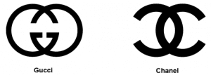
If you see the two logos are alarmingly similar. They look so similar on a visual level. Being the wealthiest designer brands in the world – there are few who could question them. Since Gucci – is the one that was founded much later – they are the ones on whom fingers can be pointed.
The above happened when a designer blindly follows the current Design trends. When you rely on design trends – your logos start looking similar.
Design trends have a tendency to change in a year or two. Logos should be timeless and should look trendy even after decades of it being designed.
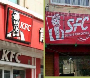
Here is another Cheap Copy of an iconic food chain that needs no introduction. Check out the picture to know yourself.
Stick to your creativity while designing a logo and never COPY a logo – no matter what!
7.Inappropriate Color of the Logo
Colors illicit feelings and emotional responses. It is tricky to think any color that takes your fancy can be used for any brand.
Read our blog post What does Logo Color reveal about a company? To know the significance of colors and how they make your customer feel.The
The very color if appropriate can repel your audience by triggering signals and reactions no liked by them. Color also denotes the company’s brand image. Therefore, the selection of the right color is paramount to successful Logo design.
Let us try a simple experiment and see what we mean when we say that colors change the look of a Logo and brand image.
We have swapped the colors of two World famous Logos and watch how disastrous they look:


Its important to realize the mistake and not to repeat. So thanks for sharing this informative post!