Select Best Logo Fonts
The impact of any text is enhanced and deteriorated by the way it is written. Selection of Best Logo Fonts is a requisite process. Depending on the behavior of the business, out of the thousand font styles, typographers use font that matches perfectly for your brand.
A psychology goes behind the selection of the font. It may be a less known fact that font style could convey your story in the right way. It could amplify the strength of your logo.
One of the foremost thing to be kept in mind while choosing fonts for any industry is to be distinctive. Incorporate those font styles that are rarely used but can deliver the purpose of the brand perfectly.
The font family used in the brand identity depends on the nature of the trade.
Take the example of Coca-Cola. It is a brand dealing in soft drinks which are definitely not a serious profession.

There is nothing in the brand identity except the brand name which is enhanced by the font style used. This has given the logo a striking appeal and has made it one of the most popular logos.
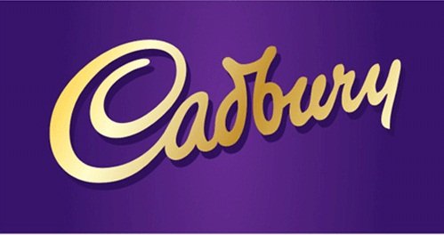
Similarly for the logo of Cadbury, a playful, fluent and flowing font to indicate a friendly and informal nature.

E-commerce industry involves the use of such font styles which focuses on the name of the brand. Since the competition is high in this field, it is essential for the customer to recognize the brand easily.

Bold and evident font styles like teen bold or mandatory focus on making the text evident.
Devnagri fonts like sam arkan are used in cases where we talk about art, culture, and heritage. Using these fonts where a traditional touch is required can be really effective.

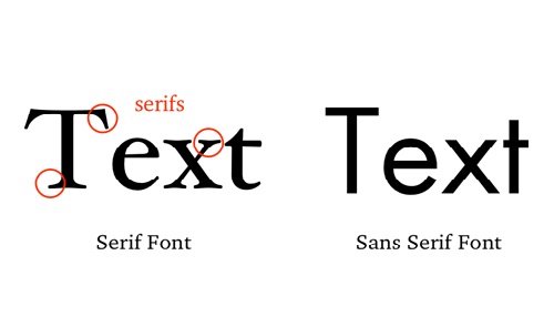
One of the most commonly used fonts which make the text easily readable are serif fonts. This font focuses on each letter with proper space between each alphabet. This makes the text easily identifiable for the viewers.
There is a fine line of stroke between serif and sans serif fonts.

Sans serif with stroke is serif.
While selecting fonts always consider the fonts between each alphabet. Too much of the space can make it disjoint while too little can make it congested.
Mixing fonts can be a risky attempt. The focus splits and creates a confusion. However, in case you wish to use multiple fonts be sure each font convey a separate message.


Leave a Reply
Want to join the discussion?Feel free to contribute!