Unilever Logo Meaning And History
Let’s know about Unilever Logo in detail.
Unilever is one of the leading British multinational consumer companies.
Many design critics have noted the current Unilever logo as one of the most acclaimed and unique corporate designs of recent years.
The current Unilever logo was presented and planned by the brand consultancy Wolff Olins in the year 2004.
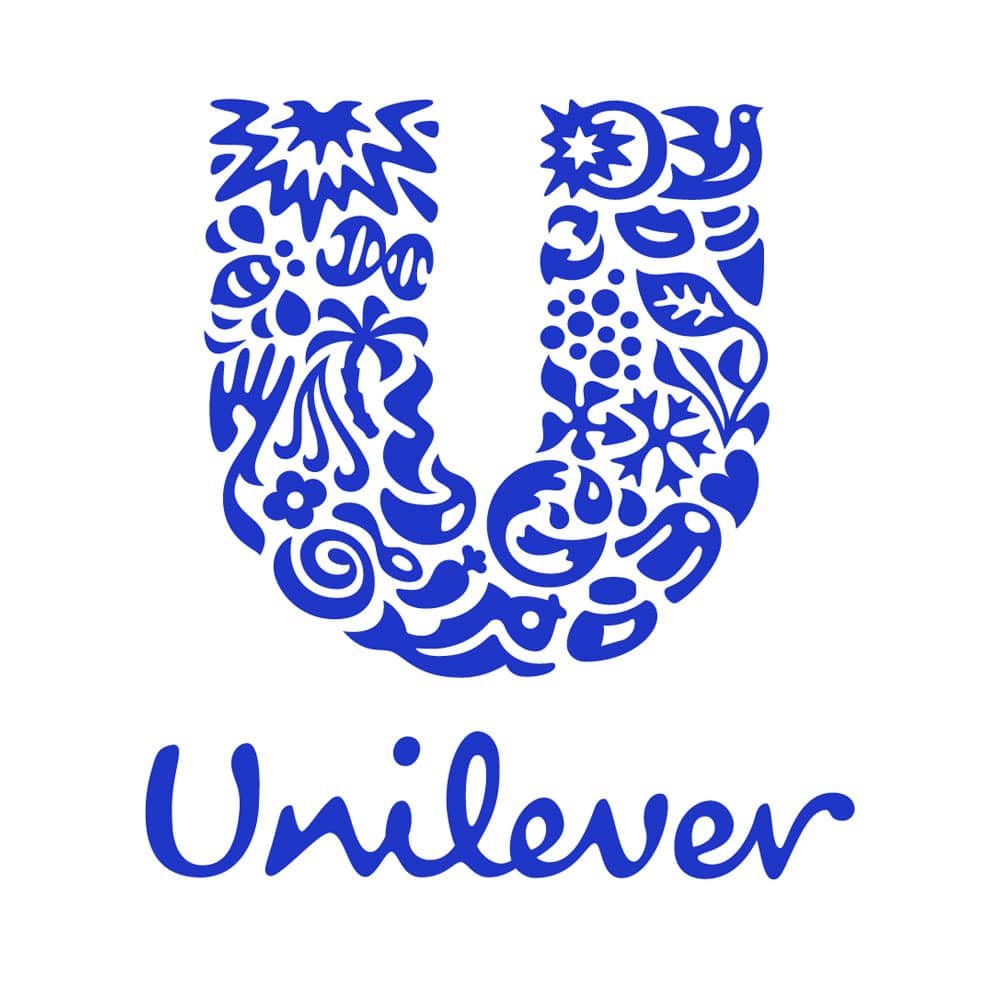
- The logo of Unilever is designed to include twenty-four icons that come together to form a U shape.
- Unilever’s core values are expressed by their logo which is their identity because all the twenty-four icons present in the logo symbolise the unique meaning behind all the products provided by the company.

Unilever Logo Design Elements
The Unilever logo is mainly composed of 24 icons and each icon represents certain aspects of the business.
All the icons in the logo signify the important and unique elements of the company and also represent their connection with the business.
Current Logo (2004- Present)
Unilever revealed its new logo in May 2004, which was redesigned by Wolff Olins.
The new logo visually expresses its commitment to making sustainable living commonplace.
- The only thing that remained untouched in the redesigned logo was the structure – the enlarged “U” shape above the wordmark.
- All the other elements of the logo were redrawn.
- The new logo was drawn keeping in mind the company’s portfolio of well-known brands within hygiene, personal care and nutrition.
- The new logo clearly expresses the vital mission of the company which is to create a new platform and brand for the various consumable products provided by the company.
1. Shape
- The “U” above the wordmark in the logo was redrawn with rounded contours.
- The body of the “U” letter was formed by twenty-four small icons or images denoting all the directions the business works in.
- From a lock of hair that represents their shampoo brands to ice cream, a spoon, a hand, a tea leaf and many more all of the little icons have different meanings.
- The reason why the “U” shape is made up of 24 distinct symbols is that each of the symbols represents one of its corporate values or the sub-brands.
The Unilever logo consists of 24 icons, and each has its unique meaning:
- Sun: The sun represents Unilever’s origins in Port Sunlight.
- Bee: The bee represents pollination, creation, bio-diversity and hard work. Bees signify both environmental opportunities and challenges.
- Hair: The lock of hair symbolises good looks and beauty. It also represents confidence.
- Swirl: The swirl represents the passion for great flavours and taste. It also suggests blending and adding flavours and tastes.
- Spoon: The spoon is a symbol of tasting, nutrition and cooking.
- Fish: The fish symbolises food, fresh water or sea and nature’s resources.
- Dove: The dove represents freedom. It symbolises a break from daily chores and getting the most of life.
- Lips: The lips are a symbol of beauty, taste and looking good.
- Virtuous cycle: The virtuous cycle is a commitment and a promise for sustainability.
- Transformation: The plant in the transformation is a symbol of freshness whereas, the snowflakes represent freezing.
- Heart: The heart represents love, health and care.
- Wave: The wave represents freshness, cleanliness and vigour.
- Hand: It symbolises care, need and sensitivity and represents both skin and touch. It also symbolises their commitment to helping people improve their daily lives.
- Flower: The flower represents fragrance and respect for beauty.
- DNA: It is a symbol of bio-science and the genetic blueprint of life. It also represents Unilever’s strong heritage of positivity.
- Palm Tree: It symbolises respect for forests, environments and growth.
- Bowl: It symbolises their promise of healthy mealtimes and great ingredients.
- Chilli pepper: Chilli pepper symbolises their commitment to sourcing the agricultural raw materials for their products sustainably.
- Spark: The spark represents the company’s role as a catalyst for change and aim of growth and improvement in the livelihoods of the people they work with.
- Plant: The plant is a symbol of the environmental world we all inhabit.
- Ice cream: The ice cream is a symbol of pleasure, treat and enjoyment.
- Particles: Particles represent a connection to science and innovative ways to improve the lives of consumers.
- Packaging: The packaging symbolises the dedication of their consumer experience.
- Clothes: Clothes symbolise fresh laundry, looking good and feeling brave.
Colour
- The colour palette of the new redesigned logo was raised.
- The blue, which was initially present in the logo, now gained a brighter and darker shade.
Logo Font
A handwritten, sophisticated custom typeface sits beneath the big U in the Unilever logo, complementing it with its classy elegance. The two complement each other perfectly with the consistency of the font making up for the apparently random patterns of the logo, with the convoluted patterns making up for the straightforwardness of the font.
- The current Unilever logo uses Olivier Regular font.
- The logotype is executed in handwritten cursive with smooth and rounded lines.
Logo Influence And Trivia
Although the main history of Unilever started in 1929, the first logo was introduced only in 1967. The twin tower, previously introduced in the first logo represented the twin towers of the World Trade Centre and evoked certain trustworthiness for the company’s products. Unilever released a new logo that exchanged the out-dated looking 1967 logo. Unilever had decided to promote their corporate image more conspicuously on their products and felt that the old logo was too commercial and not welcoming enough.
- The previous logo was rarely present on the label of any of its products.
- However, the logo did make its appearances at the end of commercials in some countries around the world such as in Malaysia and the Philippines throughout the era.
- Throughout the 2010s, the current logo appears at the end of the television ads in the form of a white ribbon tag on the top corner and the 3D white box since 2020.
Slogan
Unilever’s has since quite a while ago held the slogan “Feel better, look great, and get more out of life”. This trademark identifies with the organization’s incredibly expansive item portfolio, which incorporates Degree, Axe, Lipton, Ben and Jerry’s, and Vaseline.
Unilever Logo 1967-2004

- The logo was a combination of an eye-catching and bold emblem and a gentle traditional logotype was placed under it.
- The emblem portrayed a well-styled letter “U” which has the edges of its vertical lines triangular which looked similar to arrows.
- The logo featured a charming and pleasing blue and white colour palette.
- The logotype was written in the title case of a slightly extended and sleek serif typeface.
Reason: The vertical bars of the letter “U” looks like two towers that looked elegant and powerful. Hence the logo gives off a sense of power and reliability.
Hence, the current version of the Unilever logo is a fun way to show the consumers that they have their hands in a variety of fields and also gives the observer something to piece together.


Leave a Reply
Want to join the discussion?Feel free to contribute!