Porsche logo history and the Porsche emblem meaning
Introduction
Even if unfamiliar with Porsche logo history, you could likely identify the Porsche emblem
among a group of prestige vehicles. The Porsche emblem, one of the most recognizable
automobile emblems in the world, is synonymous with luxury and performance.
Automobile enthusiasts venerate the Porsche symbol, which almost serves as a stamp of
approval for some of the world’s most coveted vehicles. From jackets to mittens, you can
even purchase merchandise bearing the image.
Today, we will honor the enduring strength of the Porsche logo by providing you with a
deeper understanding of its design and significance.
Porsche history: Today’s Porsche logo
The Porsche logo is a symbol of luxury and sophistication. Utilizing one of the more
conventional approaches to vehicle emblems, the Porsche emblem resembles a coat of arms.
The image consists of four red and four black stripes on a golden background (History of Porsche) with a separate
shield bearing the Porsche horse.
In addition, three antlers are on each side of the Porsche logo. The image is divided into four
sections, with the Porsche wordmark in a sans-serif, all-capital font at the top. The word
“Stuttgart” is inscribed above the horse in the same gilded font.
Occasionally, the image is accompanied by a separate wordmark, which is a slightly flatter,
more contemporary variation of the Porsche sans-serif font in the shield.
Porsche brand overview
The Porsche prestige automobile brand was founded 1931, nearly a century ago. The
company’s name was derived from the name of its progenitor, Ferdinand Porsche, as is the
case with many other well-known automobile manufacturers of the present day.
Ferdinand, Anton Piech, and Adolf Rosenberger founded the brand in Germany, where the
company is still domiciled.
Currently, Porsche is a subsidiary of Volkswagen and manufactures a variety of high-
performance sports cars, sedans, SUVs, and other incredible vehicles. The brand is renowned
for its commitment to superior quality and luxury, and it currently services customers
worldwide.
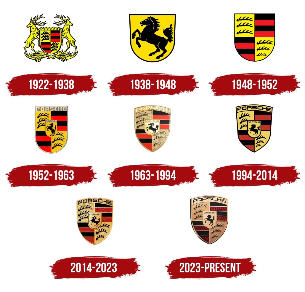
Porsche crest evolution: Porsche logos through the years
The Porsche automobile logo exemplifies the company’s reputation as a historic and enduring
brand in the automobile industry. Even though the old Porsche logo differed significantly
from the image most people recognize today, many symbol elements have remained constant.

1922
The initial Porsche logo voyage began before the establishment of the company. Because the
company was founded in Stuttgart, it incorporated the existing Wurttemberg crest as its
official emblem.
Stuttgart, the metropolis of Wurttemberg, was renowned for its horse farms. This factor
influenced subsequent variants of the Porsche logo.
The coat of arms of Wurttemberg was a massive crest shield with two deer on each side, one
on each side. You’ll note that the central protection contains the same red-and-black-striped
elements and sections with three antlers that appear in modern Porsche logos.
1938
In 1939, a new coat of arms for the Stuttgart region was adopted, further inspiring the
Porsche logo. In 1945, this was introduced alongside a coat of arms for the state of
Wurttemberg.
The Stuttgart shield depicts a black horse rearing on a yellow background, a symbol that most
people today associate with Porsche.
The shield of Wurttemberg consisted of a simple quartered design with red and black lines
and a set of three antlers divided into two sections. Notably, the antlers in the lower left
corner of the emblem become progressively smaller from top to bottom.
1952
In 1952, the initial concepts for the new Porsche crest emerged. A design of the potential
Porsche logo, which resembles the current logo, was created. The same Stuttgart coat of arms
shield was superimposed on top of the Wurttemberg coat of arms in this image.
At the summit of the shield, the name “Porsche” was written in sans-serif capital letters.
In 1952, the official Porsche emblem was updated and reintroduced with a much more regal
gold, red, and black color scheme. Gold replaced the yellow color in earlier versions of the
Porsche logo.
The decision to replace yellow with gold makes the current Porsche logo appear more
contemporary and expertly crafted, evoking notions of opulence and luxury.
Porsche’s current logo also includes the name “Porsche” in sans serif capital letters and the
word “Stuttgart” to call attention to the company’s origins.
Porsche symbol meaning: The Porsche emblem
There are numerous elements to unpack when identifying the meaning of the Porsche
emblem. The logo is a four-segmented golden insignia with a smaller crest in the centre.
The four crests are divided into contrasting images, with a section on the left featuring a
gilded background and three black antlers. Underneath this are the four red and black stripes.
The stripes are at the top of the right side of the crest, while the antlers are at the bottom. The
antlers in this shield section diminish in size as they approach the base. This image depicts
the Wurttemberg crest of arms as a reference to Porsche’s history.
The image’s antlers emphasize the brand’s strength and power while highlighting the
company’s natural resources. The red and black patterns combine knowledge of tradition with
color psychology principles, symbolizing the union of passion and design.
In the center of the larger Wurttemberg shield is the Stuttgart coat of arms, which is depicted
in gold (rather than the traditional yellow) and includes the word “Stuttgart” in sans-serif
capitals. In the shield’s center is a horse prancing, representing tremendous strength and
elegance.
The name “Porsche” is written in black sans-serif font with a gilded outline at the peak of the
Porsche crest.
Porsche logo colors
In addition to the distinctive depiction of the deer and horse in the Porsche logo, the emblem
colors are among the most memorable. The Porsche team utilizes the colors red, black, and
gold.
These hues are derived from the shades of the region where Porsche was first developed.
However, each has its significance.
Red is commonly associated with power and enthusiasm, whereas black is associated with
grit and originality. Gold is excellent for communicating luxury and affluence.


Leave a Reply
Want to join the discussion?Feel free to contribute!