Advice and tips from experts on how to draw a logo that looks good
Logo design is the basis of business identity. It combines creative expression with strategic thinking. Sketching is a simple but essential step in the graphic design process. That starts the process of making a memorable logo. During this part of planning, ideas are explored, concepts take shape, and the brand’s core qualities begin to show. There’s more to sketching than just drawing. It’s the process of turning ideas into visual symbols that effectively explain a brand’s mission, values, and voice to its target audience.
Start with simple shapes.
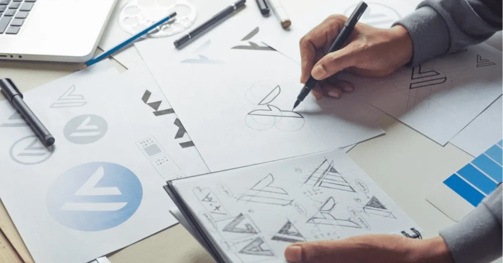
When it comes to logo design, you can’t say enough about how important simplicity is. This is especially true when you are drawing. It is essential to start with simple forms when making logos that stand out and are easy to remember. Even the most complicated patterns can be built on simple geometric shapes like circles, squares, triangles, and more. By creating a clear framework, they make the logo easier to recognize and aid memory recall.
Beginning the logo sketching process with basic shapes lets you focus on the balance and general composition of the design. With this method, designers can simplify complicated ideas down to their most basic form. As an example, a circle can stand for unity and openness, a square for dependability. And security, and a triangle for movement or direction. By putting these shapes together, crossing them over, or changing them, you can make logos that are unique and interesting.
Let the space go.
White space is an integral part of logo creation that is often overlooked, especially when sketching. When it comes to logo design, white space is not just “empty” space. It’s a powerful element that makes a design more effective as a whole. For the logo to have more effect and be more accessible to read. It helps make the design look cleaner and more straightforward.
By adding empty space to a name sketch in an intelligent way. You can make the design look much better and be easier to read. It’s about getting the right balance between the different parts of the image. By adding or taking away white space around logo features. You can draw attention to certain parts of the design, helping the viewer focus on the most critical factors. In addition, it makes the image more flexible by making sure that it works well. And can be read on a lot of different platforms and backgrounds.
Try your hand at typography.
Typography is more than just picking out a font when it comes to brand design. It involves making a typeface that goes well with the general design and gets the brand’s message across clearly. When drawing a logo, it’s essential to try out different types of fonts so that the name stands out and has an impact.
The typeface used for a business’s logo can have a significant effect on how people think of that company. For example, people often think of sans-serif fonts as modern and easy to use, while serif fonts can make people feel of tradition and reliability. Script fonts can add a sense of sophistication or creativity, while custom typefaces can make your brand stand out and increase brand recognition.

Intelligently use symbols.
Using symbolism in logo design is an art that, when done right, can give a name deep meaning and make it easier to remember. By adding symbols to the sketching stage of logo design in an intelligent way, a simple graphic can become a powerful representation of a brand’s personality.
For logos to effectively represent something, they need to be both subtle and relevant. Symbols should show what the brand stands for and what it says. A tree can represent growth and stability, a rock to represent strength and determination, and a wave to express creativity and change. The brand’s philosophy and the people it wants to reach should guide the choice of images.
Make a lot of different sketches.
An essential step in the logo design process is making multiple sketch versions. This method is necessary to look into different artistic paths and, finally, find the best logo design. Design professionals shouldn’t be limited to a single idea during the drawing stage. Instead, making a lot of different drawings might lead to methods that are more unique and creative.
Design professionals can try out different ideas, styles, and layouts by making a lot of different designs. By going through this process, you might find unexpected combinations or pictures that would have stayed quiet if only one design path had been taken. It’s not enough to just come up with different versions of the same idea; you need to look into entirely new ideas and ways of doing things.
Use the Correct Tools
In logo creation, it’s essential to use the right tools during the sketching phase so that creative ideas can come to life. The choice between traditional drawing methods and digital tools can have a significant effect on the design process and the result.
For traditional drawing, you need good pencils, markers, and paper. Different types of pencils let you use different line weights and tones, which makes the logo more complicated. To draw more accurate lines, you can also use pens with a variety of nib diameters. High-quality paper is also important because it changes how the design feels and looks.
Balance out simplicity and complexity.
For logo design and drawing to work well, there needs to be a balance between being complicated and being straightforward. This balance is essential because it determines how memorable, adaptable, and meaningful the logo is. A name should be easy to recognize and remember, and it should also have enough unique features to set itself apart from other designs.
In logo design, you can show how complicated something is by using lots of different colors, patterns, or images with lots of small details. These kinds of elements may make a logo look better, but they can also cause visual disorder, which makes the name more challenging to read, significantly when it’s shrunk down. On the other hand, a logo that is too simple might become bland and unremarkable, failing to capture the unique personality of the brand.
In the end,
Logo design and drawing that works well involve a lot more than just making something that looks good. There is a systematic process that includes creativity, strategy, and a deep understanding of the business and the people it wants to reach. Starting with the rough sketches and ending with the final design, each step is essential for creating a logo that not only gets people’s attention right away but also represents what the group is all about. As artists, our goal is to make symbols that are easy to remember, can be used in different situations, and have a deep connection with the people they are meant for. By following these rules consistently and constantly improving your skills, you can make logos that really capture the spirit of a brand and last for a long time.


Leave a Reply
Want to join the discussion?Feel free to contribute!