Famous Logo Designs Hidden Meaning
The world is submerged under the power of brands. The strength of these brands is represented in the very first look through their logos. Here are some of the famous logo designs hidden meaning.
Baskin Robin
Baskin Robin is an international brand of ice cream established in 1953. The brand has been serving the world with its massive range of scrumptious ice cream flavors for almost 63 years.
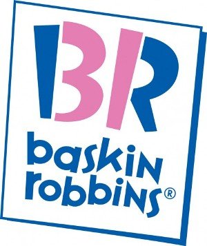
The logo is completely text based. If you look at the highlighted pink color in the logo, it reflects 31.This hidden number in the logo represents the number of flavors that the brand provides in terms of ice cream.
Amazon
The e-commerce industry is one of the most money making industries at the global platform. Amazon has stood unrivaled as the most-trusted brand in retailing.

The absolute diversity of products that this online organization deals in is represented by the arrow which moves from a to z.This clearly shows that it sells everything from A to Z.
Google has evolved its logo in terms of color and font since its year of establishment. From the computerized logo of 1997 to a modern product serif typographic identity, the company has witnessed a number of modifications in its logo.
No matter how big the organization is, its uses the four primary colors along with the secondary color in alphabet L(in current logo) to show their strength of not playing by rules and still being playful.
Hindustan Unilever
Seven out of ten has at leat one Hindustan Unilever household product around the globe. The brand’s power and trust among the customer can be very much identified from this statistics.
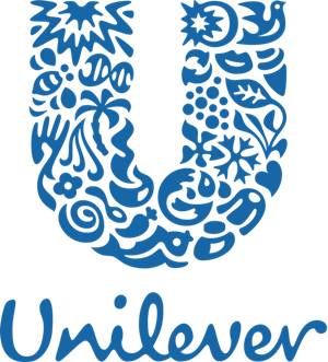
Do you know what are icons in the logo of the company? The twenty-five small icons in the graphical U stands for the products it directly or indirectly deals. From the flock of hair symbolizing its shampoo to the tea leaf representing the tea products.
Coca-Cola
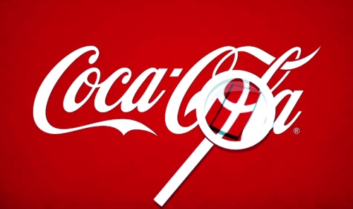
It is definitely a less known and an unnoticeable fact. Your favorite soft drink Coca-Cola has the symbol of happy flag embedded in it. I am sure you had completely no idea about this.
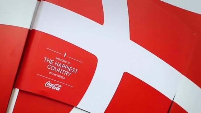
Take a magnifying look at the alphabet ‘o’ in Cola.It represents the Denmark flag which is considered to be the happiest country in the world.
LG
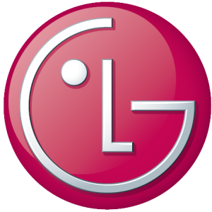
The logo of LG has the hidden smiling face to denote the friendly approach towards their customers. The logo contains a dot (eye of the face) which is the eye of focus of the company concerning their work.
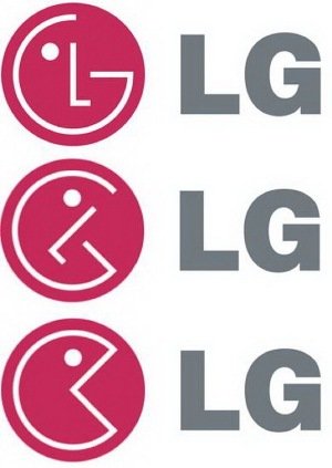
The nose of the face resembles like alphabet L and the curved outline appears to be alphabet G.


Leave a Reply
Want to join the discussion?Feel free to contribute!