Famous Dubai Logo Designs
Dubai is a city where dreams come true. Dubai is not only a favorite tourist destination but also heaven to live in.
Known as the hub of all businesses, Dubai has made its name in the world in all trade and business. So much that the first words that come into your mind after listening to the name of DUBAI are ‘luxury, glam, and charm’. The glamourous life in Dubai will exceed your expectations. The beauty of Dubai does not just lie in its tall buildings, exquisite beaches, and skyscrapers, but also the extravagant lifestyle. The city is full of invigorating cultures and exhilarating traditions adopted from different nations as people from all parts of the world live and celebrate their lives in Dubai. It gives people a chance to grow and explore their persona and enjoy themselves to their full extent.
Dubai is the city that has transformed itself from a barren desert to the hub and home for billionaires. It is one of the most prominent travel destinations.
Dubai Municipality logo:
Dubai Municipality logo represents a bird and shows new possibilities. It gives the message that the sky is the limit and proclaims that Dubai is a modern and responsible society. The colors red, orange and yellow declare growth and prosperity. It is a show of Dubai’s affluence and success. The sharp upward turn shows that Dubai is headed towards new possibilities in the future and is willing to innovate in new areas of development to reach newer, better heights. The logo gives out a positive vibe through its colors and unique shape. Midway, the logo turns yellow-orange to show competitiveness and participation, and at the top, it turns red to show power, strength, and passion.
Dubai Healthcare City:
The Healthcare city is a free economic sector for the residents of Dubai. The green lily denotes hope and renewal for the sick. It makes the patients get a positive and hopeful message in their sickness to make them feel more optimistic. Dubai is written in Bold to highlight the free services provided by the Government of Dubai for the common citizen. Overall, the logo is created to give out an optimistic and promising message to the patients.
Government of Dubai:
Traditions, power, and love for the Arabic language are the three messages that are shown in the Government of Dubai logo. The logo is red, which shows the power and strength of the country. It is written in Arabic to denote the partnership and union between the United Arab Emirates. It shows that the Government of Dubai values its traditions and culture more than anything else.
Dubai Civil Aviation Authority:
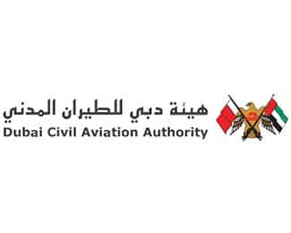
The logo for Dubai Civil Aviation Authority contains an eagle, to denote the fact that they overlook the development of the air industry with eagle sharp senses. The eagle shows its power by holding the flag of the United Arab Emirates in the right hand and the flag of Dubai in the left hand. In the middle, a bold cut curved D can be spotted to denote ‘Dubai’
Dubai Ambulance
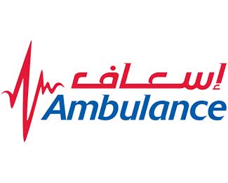
The Dubai ambulance logo is crafted carefully, including three components. First, a heartbeat symbol denoting the lives that depend on the ambulance service. The heartbeat is in red to show danger. In addition to that, Ambulance is written in Arabic and English both in cursive to impart alarm and awareness of the life that is in danger. In the end, the ambulance written in blue color makes sure to give out a calm and soothing feeling and to lessen the panic. The Blue color under the Red also gives out a strong message to patients that ‘after difficulty comes ease’
Dubai International Boat Show
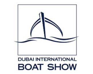
The logo is written in capital letters, in bold to show the grandeur and majestic splendor of the Boat Show. A drawing including the sea and hook further complements the logo and delivers the image of luxury yachts, fishing boats and a premium sales platform for the marine industry. The logo of Dubai International Boat Show is made in blue color which shows the water waves and the cool breeze of the sea.
Dubai Sports World:
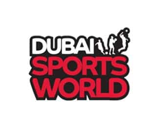
Sports provide rejuvenation to the body and makes us active and that is exactly the message being provided in the logo of Dubai Sports World. The icon shows a person playing with a football and a basketball. The bubbly font makes the event look exciting and fun. The color black shows the strength and red show power and energy utilized in sports.
Dubai Fitness Challenge:
The Dubai fitness challenge is all about exercising for 30 minutes every day for a complete 30 days. This is to make the city commit to a healthy and stimulating lifestyle. The logo is based on a circle indicating the circle of 30 days. The colors lime green and light blue show freshness and positivity the participants will gain after completing the challenge. DUBAI is the hub for all social activities, which is denoted by colorful mashed up lines indicating the buildings of Dubai. The logo is creatively showing the activity and life in Dubai, encouraging people to take part in the 30×30 fitness challenge.
Global Village:
Global Village is a multicultural festival park and its logo is signifying the same by including bold colors in a globe. The colors red, green, blue and yellow denote diversity and multiculturalism. The colors are shaped in spikes, indicating fireworks and merriment. It indicates the coming together of many countries and cultures, branding inspiration and happiness for the people of different nationalities.
Smart Dubai:
Smart Dubai is a technology initiative by the Government of Dubai to revolutionize Dubai into the world’s happiest and smartest city. The logo is a perfect example of minimalism in design. It contains a circle and a curve inside the circle to denote a smile and gives out a message that through technology, SMART DUBAI is spreading happiness in the citizens of Dubai.
Dubai Opera:
Dubai Opera is one of the best-known arts center offering a variety of performing arts such as ballet, theatre, music, comedy shows. The logo is Burgundy, denoting the class and excellence of the Opera. Wavy lines in the logo are a symbol of music waves that makes a person whirl and twirl as a response to music and ballet.
The Dubai Mall:
The largest shopping mall in Dubai, with over 1200 shops and entertainment centers. It the home of fashion and luxury. Everyone in the world is familiar with the glamour and aura of Dubai Mall, hence its logo shows that the Dubai Mall needs no introduction. THE DUBAI MALL is in black to show class and magnificence of the Dubai Mall, written in a way to denote the 3 floors of Dubai Mall.
City Walk:
Citywalk is an outdoor destination in Dubai, providing premium lifestyle choices to people. The logo signifies the massive boulevards of the City Walk where you can shop till you drop!
Island Dubai Desert Safari:
Island Dubai desert safari is the most acclaimed tourism company in Dubai that has a repute of such exhilarating experiences that people genuinely enjoy even in hot, sunny weather. There are supreme details in its logo. The camel and sun denote the scorching heat and camel rides. The font and color of ISLAND DUBAI signify one in a lifetime, adrenaline-charged experience. In the end, Desert Safari written in red shows energy and excitement for the audience of all ages.
Amer Dubai:
Amer gives a chance to the residents of Dubai to complete their visa and residency transactions hassle-free. The logo is shaped like a man who is standing under one roof. The different colors denote the many facilities that are available at Amer, hence helping people save time and they no longer will have to visit the residency department and can complete all transactions easily. In three words, this logo shows power, simplicity, and ease for the citizens.
Dubai Airports:
Dubai Airports are one of the busiest airports in the world. The ‘A’ in the logo signifies a fast flight. The yellow denotes serendipity and blue denotes awaiting adventures. The main objective of this logo is to let people know that Dubai Airports are the fastest for connecting flights and provide the best experience.
Omega Dubai Desert Classic:
The Omega Dubai Desert Classic is a golf resort in Dubai. The logo is text-based, with an Omega symbol at the top. In every kind of logo, the name DUBAI has been highlighted and has the biggest font size, and so is the case in this type of logo.
Expo 2020:
Expo 2020 is the main hub for business and invention, hosted by Dubai. Its logo is exceptional, showing how strings are interconnected to build a flower that has light at the end of the tunnel. The message behind the logo is that many businesses are interconnected to build and succeed in an economy, which is the main purpose of Expo 2020
Dubai Festival City:
The logo of Dubai Festival City denotes exactly what it stands for; fun, excitement and festivity. The use of a Cursive font and blue color in the text are giving out a signal of a relaxed environment for the citizens and the tourists. The colorful logo is another message towards the excitement that awaits the tourists in Dubai Festival City.
Dubai Holding:

Dubai Holdings manages the portfolio of investment companies. The logo of Dubai Holding looks as professional as the company itself. The font is sharp and well crafted. An arrow above the A is beneficial to show the influence of Dubai Holding. It is an extremely simple, yet powerful logo.
Dubai Properties:
Dubai properties are the right arm of Dubai Holding. It is a branch of Dubai Holding. The logo is the same to signify the union of Dubai Holding and Dubai Properties.
Riverland Dubai:
You can see the theme of a company through its logo. And the Riverland Dubai proves it by using the font that denotes everything that is excitement and fun. Riverland Dubai is a themed destination for tourists. Under close observation, different buildings and themes can be seen. The use of different warm colors denotes unmatchable entertainment.
Dubai Racing Club:
The first thing in this logo that catches the eye is a reflection of the racing horse that shows the swiftness and speed of horses at the Dubai Racing Club. Next, the colors used are calming to the naked eye and give out a sense of freshness and serendipity to people. This helps to gain customers as more people are convinced to join the club to get a fresh sense of life, as conveyed in the logo.
Roads and Transport Authority:
Simple and to the point message is given through this logo. Red denotes danger, trouble, and risk. A sharp line, including the color white, denotes that RTA takes care of it all through their quick ability to judge the speed of the traffic, hence avoiding any kind of danger for the citizens.
Dubai Sports City:
Dubai Sports City is a multicultural residential and sports complex in Dubai. The logo screams the message “Play, Learn or Practice”. The logo is carefully crafted in Red color to portray energy and zeal to the tourists and the potential customers. Straight, sharp lines coming out from the logo indicate speed and sports.
Dubai White:
The theme of the logo shows ‘rave, festivity, and excitement’. The color palette purple and red is chosen to give out a message that WHITE is an upscale party spot, which would provide you with an experience that you will remember.
Dubai University:
The logo for Dubai University is not glamorous, rather it is quite ordinary because it is an educational institution. To comply with the theme of the organization, brown and navy blue colors are chosen. The logo also contains a rising sun to show positivity surrounding the life of students who are the future.
Dubai Accreditation Centre:
Since Dubai Accreditation Centre is a governmental organization, the logo is grim. It has an eagle on it like the Dubai Aviation logo to show power and farsightedness.
Dubai du:
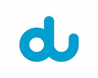
Du is a telecommunications company in Dubai. Its logo design shows how simple it is to use this network by utilizing one alphabet to create another one. It’s that simple!
Dubai Autodrome:
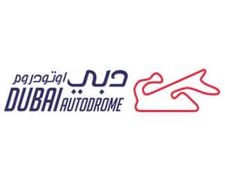
Dubai Autodrome’s logo is slightly bent as it shows the speed of the autos. The logo’s font and color are also focusing more on energy and speed. The logo gives out a message of thrilling experiences to its customers.
Dubai Grocery:
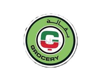
Dubai Grocery logo is denoting the grocery store aisle in its logo, making sure it has two billing counters. The theme of the logo is black, red and green to attract attention from the customers and increase customers by making their logo impact full.
Dubai tourism:
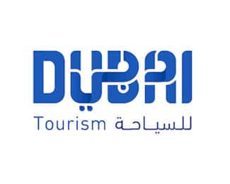
Dubai Tourism logo has two solid colors, a dark and light blue gradient texture and is a mixture of Arabic and English. By careful observation, it can be seen that DUBAI tourism logo is connecting consumer as a partner. The logo is captivating users by evoking a sense of connection between different cultures.
I am glad to know about the famous logo design in Dubai. Can you please share famous logo design in New York?