Evolution of KFC Logo
Kentucky Fried Chicken, commonly known as KFC is the world’s second largest food chain, which was established in 1952 by Colonel Sanders with its headquarter’s in Kentucky, United States.
As unique its quality so is its brand identity. The KFC logo has undergone a number of changes from its year established in 1952, till present.
1952
The very first logo of KFC contained the full version of the brand’s name, Kentucky Fried Chicken with a man with glasses and bow.
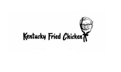
Who is that smiling face in the logo is a commonly asked questioned from the viewers which have been included in the badge from 1952 till present.
He is the real man behind the Kentucky Fried Chicken,or the founder of the largest food chain in the world, Colonel Sander.
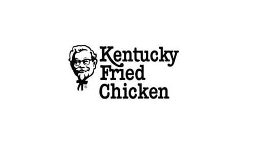
1978
This identity remained for almost 26 years when the next modification was done. This was the first modification in the brand identity of KFC. However, it was only a minor change in the face and font used.The idea was to make the brand’s name more evident.
In 1987, the restaurant chain of KFC experienced a drastic expansion in its restaurant’s chain around the world. It was the first Western restaurant which was opened in China with the name Tricon Global Restaurants, later known as Yum!Brands.
1991
For the first time, the abbreviation in the KFC logo was used rather than its full form Kentucky Fried Chicken. This alteration was made to remove the word “fried” from the logo as it signified unhealthy food.
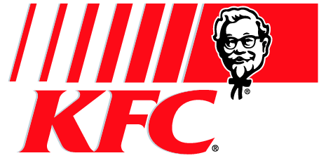
A vibrant color, red was dominant in the logo to give a brighter appearance to the identity with the face of Colonel Saunder and red strips to enhance its visuality. This was the brand identity of KFC from 1991-1997.
1997
The mansard roof from the logo was reduced to square shape badge. The sketch of the face became more prominent. Colonel Sander was shown in bow and coat with KFC inscribed on the coat.
2006
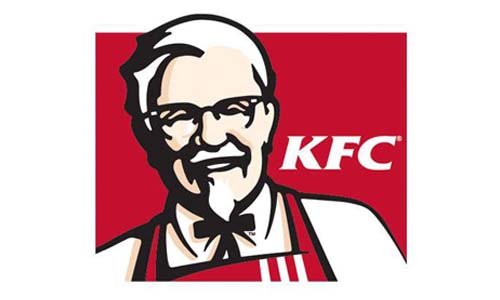
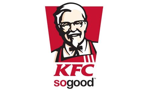
2006 experienced a modification which continues to be the “attention grabber” for KFC till present. The symbol of Colonel Sanders was updated with the coat replaced with the apron in red with white strips.
The wrinkles were removed to uplift the image of the face.A bloody shade of red was used which the sketch in thick black outline. The square shape was changed to an oval one.
The tagline “It’s finger lickin’ good” polished the logo from 2006-2010 and is even used presently in advertisements.
The slogans were changed from time to time. However, the basic symbol remained almost unchanged except some minor modifications in shape.
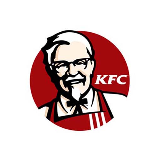
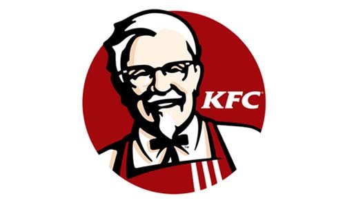
2010 – Today
In 2010, the shape was changed to trapezium with brand name KFC placed boldly under the trapezoid.This is till now the latest brand identity of KFC.

Leave a Reply
Want to join the discussion?Feel free to contribute!