What is Brand Identity – A case study
“Brand is just a perception, and perception will match reality over time. Sometimes it will be ahead, other times it will be behind. But brand is simply a collective impression some have about a product.”
By Elon Musk.
Brand identity is what and how the business wants consumers to perceive them.
What do the consumers perceive?
The consumers often look at the brand name, logo, tagline, tone, typeface – mostly created or outsourced by the business. All of these reflect the value the company will bring to the market and what is there that appeals to the customer.
Do not confuse Brand Image with Brand Identity (Brand Image is the general impression of a product or service held by real or potential consumers).
Breaking down the meaning of Brand Identity
In daily lives, we often say something with an ‘intent’ which is ‘perceived’ by others in a totally different manner. Brands also face similar instances.
A company’s brand identity creates the perception in the minds of the consumer by the following method:
- The products and services they deliver or make you experience.
- The quality of the product or service.
- It’s advantage over competitive brands.
The biggest challenge being the marketing team to make sure that the identity of the brand matches its image.
Do you remember a brand which went through rebranding and lost its appeal and saw a huge dip in sales? Here is one such example.
Tropicana Brand Identity – An analysis
You all must have drunk Tropicana Juice at some pint or the other in your lives.
PespsiCo’s brand stories are case studies for students who are studying Branding all over the world. A brand they own is Tropicana.
On January 09, 2009 PepsiCo who were already failing in rebranding their cola drink thought of rebranding their brands like Tropicana and Mountain Dew. The rebranded Mountain Dew did not have as bad an effect as Tropicana.
Tropicana was a brand associated with world class juice. A brand people loved to keep at juice counters and at bars almost synonymous with High Quality.
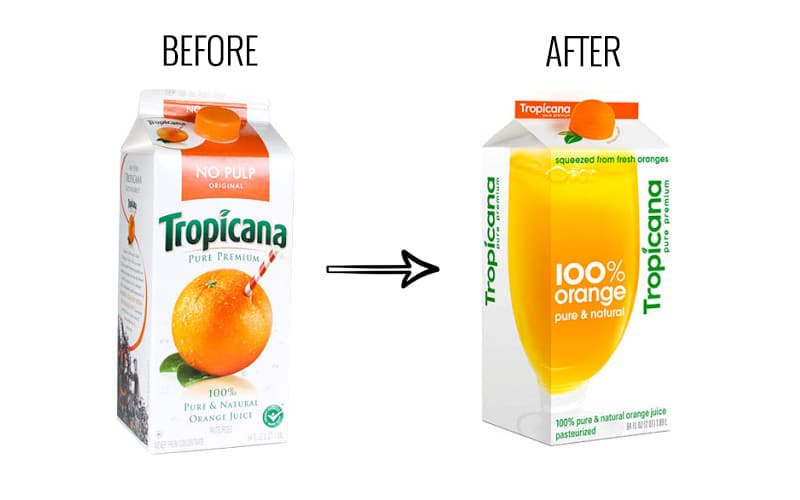
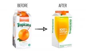
With the rebranding efforts of Tropicana – the brand lost its identity.
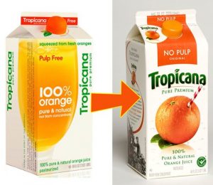
The familiar picture of orange printed on its juice box went missing. The most significant change was that the orange with the straw went missing and in its place was the glass full of orange juice.
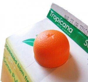
The orange was moved to convert into a lid of the bottle. It was an innovative effort as we can notice that the lid actually looks like the texture and shape of an orange. It also felt as if you can squeeze the orange lid to take out the juice. The ad said, “Squeeze, it’s a natural.”
The Lid looking like an ORANGE:
The liquid inside was visible inside the transparent container. The curved Tropicana typeface was gone as well.
The new packaging design was instantly rejected by Tropicana consumers. It did look cleaner but was very bland and lost the look that made it stand out in the crowd.
Another big change was the Tropicana Logo. The original logo had horizontal letters with the description Pure Premium. The new logo was vertical with a simpler modern font. The logo size got reduced because the line 100% Orange Pure and Natural required space to fit in.
It was not only the above changes. Tropicana also launched a new advertising campaign with the message ‘Squeeze, it’s a natural’ as the main message. This was to connect with the functional connect people had with Tropicana.
Let us study – What Went Wrong?
Reason A: Lack of Emotional Bond
The emotional bond their loyal customers had with the brand went missing. Mr. Campbell president at Tropicana North America in Chicago said in his explanation “We underestimated the deep emotional bond they had with the original packaging.”
“What we didn’t get was the passion this very loyal small group of consumers has. That wasn’t something that came out in research. Those consumers are very important to us, so we responded.”
It was not only the emotional bond the consumers had with the old packaging.
Whenever brands change their packaging there is an initial loss in sales which is soon recovered as the consumers get used to the new packaging. There has never been such a huge loss in sales as Tropicana recorded a 20% dip in sales.
Reason B: How packaging influences purchasing decisions
The reason was that the consumers could not identify the brand with the changes made in the packaging. They even felt that maybe it is not the same juice at all – since the words ‘Pure Premium’ that were highlighted earlier were replaced by ‘100% Orange.’
Why could the consumers not recognize the Tropicana:
The original Logo Design
The orange with the straw
The words – ‘Pure Premium’ missing and replaced by the confusing term ‘100% Orange’
Reason C: Consumer perception dropped
Consumers perceived the brand to be a ‘Premium’ brand and suddenly could not relate to it as the look made it look like any other brand on the shelves almost invisible and insignificant.
What are the lessons learned from the Tropicana Rebranding saga:
One can never be sure of the consumer’s reaction to brand strategic changes – it is extremely difficult to predict.
Lesson A: Consumers have a huge emotional connect with the outer packaging of the product. Therefore, one must be very careful while changing it.
They can start feeling disappointed and betrayed if they cannot locate or identify the brand they have grown to love.
Lesson B:
While rebranding if one changes too many elements and makes the brand look altogether new- the consumer gets confused. In the case of Tropicana, they changed five main elements all at once.
These are the areas where the changes were made:
Logo Design
New Typeface
New Image
New Lid
New Slogan

This is the case with brands that are already successful like Tropicana. With brands that are not doing successfully, a total rebranding and creating a new image is sometimes more profitable than one can imagine.
Lesson C:
Packaging and advertising have two different set of rules to communicate.
A packaging design is a tool through which companies communicate clearly, directly and silently. Packaging comes in play when the consumer is at the stage of a final purchase decision.
Advertising is a tool where a company can communicate with emotions and value systems. They elicit sensations that remain for a long time.
These two tools – should be aligned at all points of time through communication codes. In Tropicana’s rebranding efforts the packaging codes were not aligned with the advertising codes.
As a result – PepsiCo had to reverse their decision to rebrand. They went back to the carton design they had originally.
Approx Cost:
Just so that you have an idea the estimated cost was around $137 million in sales between the time period of 1st January to 22nd January 2009.
Since we are talking about real world – we will continue to discuss real world examples of Brand identity:
The Big Question is: What does a brand identity reflect – if it is effective in communicating the personality of the company, it’s value by the prospective or existing customers?
Brand identity helps to build:
- Brand loyalty
- Brand recognition
- Brand Association
If you ask people walking in a shopping arcade what does a company like Johnson & Johnson sell. They may say Baby Oil or baby cream.
That is correct!
It is not only a few above-mentioned product lines that are sold by the brand – it sells arrange of products such as medications, first aid supplies, band aid, baby products, skin and beauty products and facial wash.

What are the words that come to mind when we look at the brands like these?
Nike: Fast, athletic, dependable, classy
Apple: Sleek, technologically savvy, world renowned, trust
Starbucks Corp.: Morning coffee, stylish, faithful, easily available
Coca-Cola: Refreshing, positive, happiness association

Brand Value
The brand value of a company is its most prized asset and is often seen on the company’s balance sheet.
Brand’s monetary value often gives brand managers the much-needed metric to understand and gauge the performance of the company in terms of goodwill and name. This value can be calculated by the cost it would take if one builds a brand similar to the one you are gauging and the cost of the royalties used for the brand name.
What should one do when creating one’s own brand identity:
USE the following devices:
LOGO: Is the face of your business – design it with care. It is that one thing that defines your business to the consumer.
A TAGLINE: Sets the value of your Brand and literally defines it to the consumer.
SIGNAGE: Is to make the office headquarters or branches, cars, placards stand out as being identifiable.
PRODUCTS AND PACKAGING: Is an emotional connect that people identify with.
STATIONERY: Business cards, Envelopes, letterhead, card holders etc are used by employees and also adored by brand loyal customers.
EMAILS: The communication we have should be branded through emails or newsletters.
Creating Brand Identity is a fundamental part of one’s business and should be given in the hands of people who are efficient and have knowledge and expertise on the same.

Well stated and easy to understand the relevance of Brand Identity and the Tropicana example was excellent.
Candace, I am glad to hear that.