2020 Tokyo Olympics logo
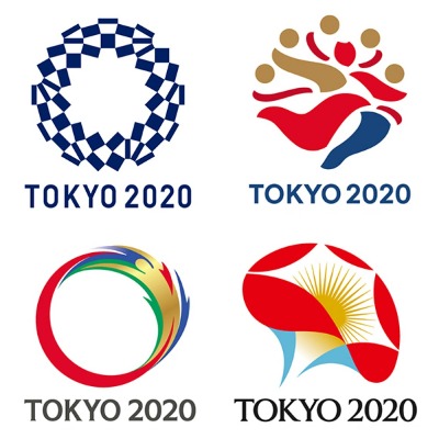
Tokyo unveils the 2020 Tokyo Olympics Logo. Initially, four designs were shortlisted but even they failed to meet the standard of Olympics and had Plagiarism issues. The designer Kenjiro Sano had replicated from the previous campaign and used images from the internet.

After so many hardships a blend of simplicity and originality was considered to be best for the Olympics.
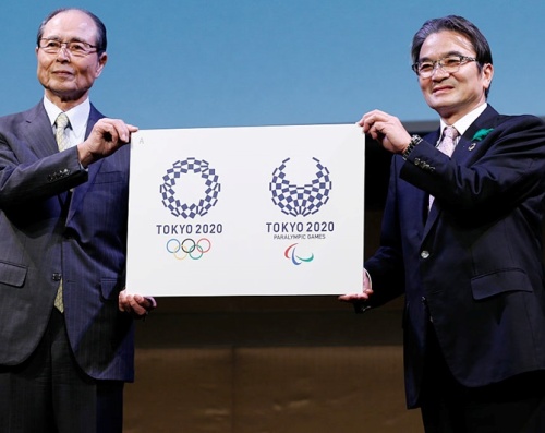
Asao Tokolo, the designer of the new logo of Olympics has used a circular shape with 45 connecting rectangles in the design which formed a circle.
The blue and white rectangles symbolize the different countries taking part in the Olympics.
Also, there are different types of a rectangle which symbolize different countries, culture and thinking of people. The variety of shapes combined to form a circle. This clearly is an indication of “unity in diversity” which is what Japan believes in.
“I was thinking of something like a coloring picture that everyone can add their own color to. White against indigo blue — it’s a very clean-cut expression. The games will also be held during summertime and I wanted to add some coolness into my design”. This is what Tokolo has to say about his design.

After facing so many challenges in selecting the logo, finally, the Asao Tokolo was chosen for the logo of Olympics among 14599 submissions.
A voting was carried on to select the final design in which Tokolo’s design won with the maximum number of votes 13, while the others received one, two and five.
About the cheque design (also known as ichimatsu moyou), the Tokyo 2020 Emblems Selection Committee has expressed his views as, “refined elegance and sophistication that exemplifies Japan.”It also expresses that the Olympic and Paralympics Games seek to promote diversity as a platform to connect the world.”
A voting was carried on to select the final design in which Tokolo’s design won with a maximum number of votes 13, while the others received one, two and five.


Leave a Reply
Want to join the discussion?Feel free to contribute!