Story behind 2020 Tokyo Olympics Logo – Scraped and Redone
It is not easy to find a logo that truly represents the Olympics. The Tokyo Olympics preparation committee found that out the hard way.
It all began in July 2015, when the Japanese Olympic organizing committee released the first logo for the 2020 Olympics. This abstract and minimal logo was designed by graphic designer Kenjiro Sano. It incorporated a ‘T’ for Tokyo and the red sun of the Japanese flag and was released in both static and animated form.
![]()
However, it hit a roadblock, within a month Belgian designer Olivier Debie filed a plagiarism lawsuit. He claimed the Tokyo Olympics logo design copied key elements of a T-shaped logo he created in 2011. This design striking similar to the one developed by Olivier Debie for Belgium’s Theatre de liege. To prove his point designer Olivier Debie published the two designs side-by-side online to make the similarities clear. The image broke the internet on the day. It was a major cause of embarrassment for the government.
Initially, the Japanese Olympic committee officials defended the logo against Debie’s claims. They even went as far as releasing to the press, Sano’s original blueprint. However, that became a further embarrassment for the Japanese authorities because soon German typographer Jan Tschichold claimed that Sano’s initial submission resembled an earlier typographical work by him.
In order to save face, the organizers withdrew Sano’s logo and announced a national design competition to create a new logo for the 2020 Olympic Games in Tokyo. Nearly 15,000 submissions were received and the four finalists were unveiled in April 2016, and the public was invited to vote for their favorite logo.
Finally, after tabulating the vote, the winning design was announced 2 weeks later. The winning 2020 Olympic Games logo was designed by a graphic artist Asao Tokolo, a 46-year-old Japanese artist who is renowned for his design work using mathematical motifs.
Speaking to the Press upon his design being chosen as the official logo of the 2020 Olympic Games in Tokyo, Tokolo expressing joy explained where the inspiration for the logo had come to him, he said, “my mind has gone blank as I just found out my design won… I put a lot of time and effort into this design as though it was my own child.”
The Olympic committee refers it to as the harmonized checkered emblem that consists of three different indigo blue quadrilaterals.
![]()
According to a press release by the Olympics Organizing committee, the geometries in the graphic drawing are said to represent different countries, cultures, and ways of thinking. As far as the choice of color goes the ‘Tokolo’ blue is traditionally Japanese and is said to express a refined elegance and sophistication of hue. The new, indigo-blue logo features an ancient traditional Japanese pattern known as ‘Ichimatsu Moyo’ that was very popular during the ‘Edo’ period from the 17th century to the 19th century in Japan and is also associated with traditional ‘Kabuki’ theater in the country. The new logo is in fact way cooler than the designer is taking credit.
For the last couple of months, the design community has been going gaga over a hidden trait in the new Olympic Games Logo. On looking closely at the two logos, the one for the Tokyo Olympic Games and the one for the Tokyo Paralympics Games, both can actually morph into each other just by moving some of the rectangles around.
![]()
Did Asao Tokolo do this on purpose or was it just a happy coincidence.
Could it be that there a bigger message of “unity in diversity” in the Olympic Games and the Paralympics Games as well?
Is this a statement that actually unifies the two events?
It is an excellent initiative because in both the Olympics the message is to strive for human excellence far beyond and above what we think we a capable of.
Since the logos are made up of the exact same parts but look a little different, so too do the athletes for both the Tokyo Olympic Games and the one for the Tokyo Paralympics Games.
Speaking of unity and diversity in 1894, a French aristocrat Pierre de Frédy, Baron de Coubertin, a champion of sports and physical education in schools convened a meeting of like-minded leaders from neighboring countries in Europe for a congress in Paris, his goal to propose the revival of the ancient Olympic Games. The group of leaders enthused by Pierre de Frédy unanimously agreed to the proposals for a modern Olympics. The same body was then officially morphed into the first International Olympic Committee and they were given the task of planning and executing the first modern day Olympics in Athens in 1896. It was here that the ancient Olympics were held.
While the Olympics were in place and running like clockwork there was no unifying symbol for the games until much later in 1912.
This year the Stockholm Olympic Games featured athletes from all five inhabited parts of the world. It was after the games that that Baron de Coubertin in a letter to a colleague of the Olympic organizing committee used the design of five interlocked rings, drawn and colored by hand, at the top of the letterhead.
Later Coubertin used his ring design as the emblem of the IOC’s 20th-anniversary celebration in 1914.
A year later in 1915, the Organizing committee of 1916 adopted the symbol as the official Olympic logo. The rings were to be used on flags and signage at the 1916 Games, but those games were canceled because of the ongoing World War I. It was later in 1920 that the logo of the rings made a belated debut at the 1920 Olympic Games in Antwerp, Belgium.
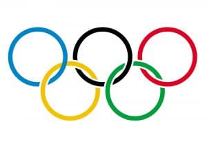
However it was much later in 1931 that Coubertin actually explained his inspiration and meaning of this design, he said, “a white background, with five interlaced rings in the centre, blue, yellow, black, green and red is symbolic and represents the five inhabited continents of the world, united by Olympism, while the six colors are those that appear on all the national flags of the world at the present time.”
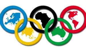
In this way Pierre de Frédy, Baron de Coubertin used a loose interpretation of “continents” that included Africa, the Americas, Asia, Europe, and Oceania.
At no point in time through no communication official or otherwise did he assign any specific ring represents a specific continent as has been later interpreted by many publication and scholar.
It is also interesting to note here that in reality Baron de Coubertin may never have thought of the relationship between the official logo o f the Olympics and the represented continents. In fact according to British historian David Young, that Coubertin originally thought of the rings as symbols of the five Games already successfully staged.
Interestingly there is a very popular myth attached to the modern day Olympic games logo that has been doing the rounds for decades now it is believed that Pierre de Frédy, Baron de Coubertin’s five rings were inspired by a similar, ancient design found on a stone at Delphi, Greece
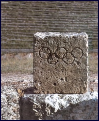
Upon investigation by private agencies it was discovered that in fact, the “ancient” design is not as old as has been made out in certain sections of the press from time to time. In fact, the logo in Delphi is actually just a modern prop that was subject to an aging process to make it look ancient for the purpose of creating pictures for one of the Olympics. This was later turned into a full blown story on the discovery and unearthing of the ancient logo.
So, is the Olympics logo different to the games logo of a particular year?
The answer to that is a firm, yes!
Today over and above the official 5 rings Olympic symbol, each Olympic Games has its own Olympic logo. This is designed by the host country keeping in mind local sensibilities and design aesthetic while integrating the same into a world sports scenario.
The Games logo as it is referred to is designed and created by the Organizing Committee of the Olympic Games at a local level or the National Olympic Committee of the host country.
This logo or emblem is then forwarded to the world Olympic body or the International Olympic Committee (IOC) for its approval. Once that is done the Games logo for a particular year and country is adopted to symbolize that particular Olympic Games. The official games logo is then used in all promotional materials for that year across sponsors of the Olympics.
That apart, it adorns the uniforms of every Olympic competitor and is widely used at every venue of the games.

Another interesting bit of information, the Olympic logo has forever been the subject of controversy before the Olympic games. Take for instance the logo for the 2024 Paris Olympic games. The Olympic committee of France has already been accused of plagiarizing the logo for the games from British consulting agency 4 Globa.
However, for now, let us rest happy that the Tokyo 2020 Olympic games have a logo, that symbolizes the unity in diversity that we stand for.


Leave a Reply
Want to join the discussion?Feel free to contribute!