World’s Top 10 Logos and their Personalities
“There are three responses to a piece of design – yes, no and WOW! Wow is the one to aim for” said Milton Glaser, world-renowned graphic designer who designed logos like I love NY, Brooklyn Brewery, and Bob Dylan poster.

Logos are designed so that they are memorable for centuries to come. Much has been spent on logo designing by business giants yet either logos click with the audience or not. Logos always evoke a strong reaction in customers. There have been several studies around more than 100 logos that included the world’s top logos – have analyzed that even if logos have huge advertisement budgets that their owners may have spent on them – they may not be as memorable as the others. Therefore, one can easily say that it Is not brand power that makes or breaks a logo or its treatment.
The most memorable logos in the world are:
Coca-Cola
McDonald’s
Apple
Nike
So, the question arises that what is the actual reason/s for the logos to be memorable. The logos that are memorable are essentially simple in nature and are “organic’ along with having “illustrative custom wordmark.”

“Design is moving an existing condition to a preferred one.”
World’s Top 10 Most Memorable Logos:
As per study, U.S. rated the Top 10 memorable logos as:
NIKE
APPLE
McDonald’s
Coca-Cola
Microsoft
Pepsi
Amazon
Target
Starbucks
However, if we see the study in the UK the selection of the Top 10 Logos varies from that of the U.S.:
Apple
McDonald’s
Nike
Coca-Cola
Virgin
Microsoft
Amazon
BMW
What is the personality of your LOGO?
With increased importance of digital medium and brand recall being a very crucial factor to the success to any business – it is important to study and gain the knowledge of the personality your logo has. Logos have a mixed kind of personality with traits like – simple and luxurious, modern and fun, classic and feminine. It is imperative that Logos evoke emotions and take shape of a personality as users watch them over the passage of time.
Lets look at the personalities of logos that are most commonly recognized:
A good graphic designer will make sure that logo personality matches with the values of the brand. Remember that Logo is the face of your brand. There are innumerable values and innumerable personalities that are displayed by logos of these brands.
Warm
Caring Luxurious
Economical
Simple
Feminine
Masculine
Innovative
Loud
Fun
Quiet
Stylish
Friendly
Traditional
Modern
Fresh
Classic
There is certainly an ingredient that varies from brand to brand that makes the most memorable logo. Make sure that the personality of your logo matches the values of your brand for people to connect with it.
The best logos in the world have a wide range of design aesthetics like simple. Linear to geometric and gradients. They could be heavy in text and include the names of their company, however, others use a singular shape rather simple and clear.
One thing that is common to most of them: the logos are recognized instantly – even if one doesn’t read the name of the brand. Logos is all about recognizing because they are memorable.
Why do some logos become memorable?
“Your logo is a visual cornerstone of a company’s brand. Your company’s identity is visually expressed through its logo, which along with your company’s name, is one of the main things that makes your business memorable.”
MsDonald’s
In 960’s McDonald’s expressed his wish to change the design of the logo, however, Louis Cheskin psychologist and design consultant insisted that the Golden Arches “M” should remain. Some even say that the customers recognize the ‘M’ because of its “symbolism of a pair of nourishing breasts.” – we do not know how much of this is true – yet we all know that McDonald’s logo is one of the most memorable and recognizable logos in the world.
Pepsi
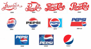
Yes, Pepsi is one of the most memorable logos in the world. The new logo design of Pepsi cost $1 million. Pepsi appointed Peter Arnell of the Arnell Associates to design their new Logo. With the launch of the new logo, Pepsi spent millions of dollars in rebranding everything.
The new Pepsi Logo Globe is iconic and looks like a swirl of ‘red, white and blue’ in a sphere like a shape. It is one of the world’s most memorable and recognizable trademarks. Some say that the new design has hidden meaning as it represents magical secrets. Due to the Arnell’s’ 27 page memo that leaked and referred the logo of PepsiCo to the relativity of space with time, magnetic fields, Feng shui, Mona Lisa, the Parthenon many a speculation has been heard about the hidden meaning
BMW
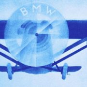
There are different versions of the origin and meaning of the BMW Logo. Some say that the BMW logo is a tribute to the brand’s aviation history where the sign represents a propeller in motions where the blue part is a symbol of the sky. BMW originally built aircraft engines during the Word War II for the German Military.
Another theory opposes the fact by stating that the blue and white logo is directly borrowed by the colors of the Bavarian flag ( do check it out and come back and check out the BMW logo).
BMW did start as a company that manufactured engines for air crafts however the Treats of Versailles during the end forbade the manufacturing of the engines. After that BMEW moved on to manufacture motorcycle and eventually they were allowed to restart the aviation department.
In an advertisement in 1920’s BMW logo represented the spinning propellers of an aircraft – but only in the ad – not in the Logo. Around the same time of the ad, BMW’s first motor car was launched – therefore the confusion.
After almost a century later people assume to think that the design and colors of BMW Roundel have origins in aviation.
Check out a still from the BMW advertisement in 1920’sthat sparked the controversy surrounding the origin of the logo:


Apple:
Apple Logo is one of the most iconic symbols of today’s times. It is connected to the Biblical story of Adam and Eve and the forbidden fruit from the “Tree of Knowledge.”
Check out our story on Evolution of Apple Logo http://animationvisarts.com/evolution-apple-logo-design-learn/
FedEx
FedEx – one of the logos that is recognized around the world instantly due to its simplicity and statement of being creative. Look closely – you will spot an arrow between the letter E and X – representing the feeling of looking forward and creative outlook for future growth.

Mercedes-Benz
The moment you see the Logo of Mercedes Benz – the feeling that you have for the brand is that it is confident. The tri-star on the logo is a representative of the commanding quality of the brand and its style over all things seas, land and air.
When the logo was first launched the word Mercedes was surrounded by an ellipse. After a while, the new brand logo was introduced in 1909 where the glorious star of three points was introduced. It was designed by Gottlieb Daimler the Technical Director.
Adidas
The word ‘Adi’ (Adolf) + ‘Das’sler = Adidas. If you recall the original Adidas logo (1967) had three stripes that came from the 3 striped shoe design. It was in 1971 that the trefoil logo was unveiled when it was changed to a slant that resembles a mountain symbolic of obstacles that an athlete faces and overcomes.The logo is memorable due to its simplicity and the association that everyone has obstacles in their lives – be it an athlete or not.

IBM
Did you know that the International Business Machine ‘IBM’ logo has a hidden message? Similar to a nation’s flag representing the identity of a country – so is the logo of IBM. The white lines passing through the logo appear as a sign of equality, speed, and dynamism. The blue color represents the color of the corporate. The current 8 – bar logo was redesigned in the year 1972 by Paul Rand Graphic Designer when he replaced the 13-bar logo – since it was hard to print on low-resolution printers.

AUDI
The moment you look at the AUDI logo – you think simple and plain. Some think that the 4 hoops represent the tyres of a car. Actually, the four hoops represent the 4 companies that were the part of Auto-Union Consortium in the year 1932. They were named DKW, Horch, Wanderer and Audi.
Amazon
The Amazon ‘s main mission as a brand is to keep their customer’s happy. The arrow under the letter Amazon looks similar to a smile. Yet if you notice the arrow points from the letter A to Z where the brand wants to tell its customers that they have a wide variety of products under one roof and they cover everything from A to Z.

Logos help a brand create a unique identity. A sign of a good logo is that it is memorable and it also creates a good feeling in the customer’s mind. Human always get attracted to symbolization – be it the Apple. Humans do not think in letters – we think in pictures and have mental associations with them. The moment a logo design has an association in the minds of the people the very first time they see it – it is surely going to be memorable.
Has it ever happened to you that you have been traveling to a distant country and see a familiar logo and feel good just by the comfort the sight of the logo provides to your senses?
Do share which is your favorite logo in the comments below and tell us if you have a story associated with a logo design.



Leave a Reply
Want to join the discussion?Feel free to contribute!