Some of the Common Logo Misconceptions
Taking into account startups and small scale companies, they generally regard logos as a sheer wastage of money and time. They fail to understand the actual importance of logo as a weapon of branding and a reflection of ethics.
Therefore here are some common logo misconceptions which the faster if removed the better it is for the organization.
“There is no need of a logo. We are doing well without it also”
It is one of the most common logo misconception observed among the customers. The brand identity reflects the standard of your company.
Generally, a very casual approach is observed in the people when asked about the logo for their company. You need to know that it is identity which distinguishes your products from the other.
“The design is too simple”
Normally, the business owners are not much aware of the technicalities involved in the design. They feel that the design is not worth for the money they are paying to the designer/ design studio. This makes them compel the designer to include unnecessary elements in the logo making it complex.
The idea is to convey the message in the simplest rather than making it confusing and intrinsic for the viewers. Since the customers do not know the trends of logo design they have a misconception that a simple design is a bad design.
The designer should, therefore, make him aware of the latest design techniques and also explain him every element used in the logo.
“The cost is too high”
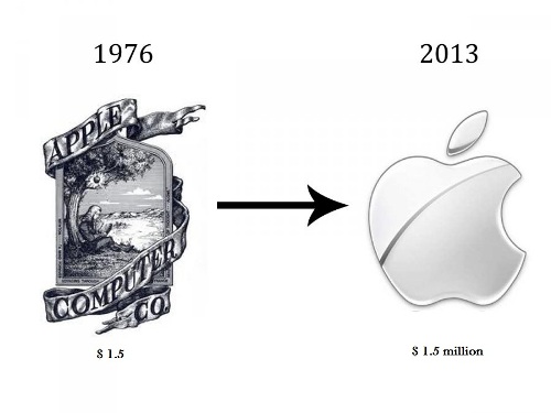
It is not about the cost, it is about the concept and idea that a designer puts in the logo. A logo pays its price over the time. It may sound weird but there are companies and brands which have millions of dollars in getting the perfect and most appropriate logo for their brand.

Compare the logos below. The difference of $1.5 and $1.5 million logo is in the quality. Apple spent $1.5 million on its brand identity which has become a global icon now giving the brand the identification it deserves.
“It appears like a clipart”
Clipart is mostly premade images and if the owner feels that your design is a clipart it is definitely not a good impression left by the designer. Broaden your thinking, include quality in your design so that the logo matches with the purpose of the organization and reflects the values and ethics.

Broaden your thinking, include quality in your design so that the logo matches with the purpose of the organization and reflects the values and ethics. It is good to first to get to know the suggestions of the customer before designing in order to meet customer’s expectation.


Leave a Reply
Want to join the discussion?Feel free to contribute!