Typographic Logo Designs
Typographic or commonly known as Wordmark logos are one of the most desired and demanded logos by the brands of the present time.
The organizations want to focus on the name of their brand in their logo and hence typographic logos suits them best. Since the logo has only the brand name in it, the font and color are selected intelligently so that the logo emerges out in a creative and impressive manner.
Script typography does not include any other element other than the brand name. Designing typographic logo designs may seem to be the simplest of all, but the reality is something different.
It has been rightly said, “to be simple is the toughest”. Including or removing or rearranging some of the letters may result in something that is truly extraordinary.
Creativity is involved in designing a typographic logo. You have to make use of letters present instead of using other elements. This increases the difficulty of the designers.
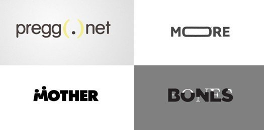
It is a simple process but simplicity requires maximum creativity. Combining different elements to create a logo is an easy approach. Nevertheless, typeface designing demands thought process

Typographic Logo Designs require cleverness. Remarkable solutions arise when you choose a definite font for the logo.
Food and drinks, cafes, fashion stores, boutiques are industries which do not require any professionalism. Retro fonts can be a clever selection here.
While designing such types of logos, designers efficiently use negative space to design the logos while maintaining its simplicity.
Each and every minute detail has to be taken into account so that the designer can brilliantly use each alphabet.
However, here since the entire focus in the logo is on the name of the organization, therefore it becomes essential to write the brand’s name in such a manner that is both innovative and easily readable for the viewers.



Leave a Reply
Want to join the discussion?Feel free to contribute!