7 Top Logo Designs and their Hidden Meaning
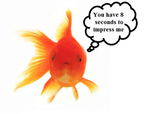
Do you know that the attention span of an average human being is 8 seconds?
That is even smaller than that of a Goldfish…..
A Goldfish has an attention span of 9 seconds.
As per scientific data, the attention span for average human beings has dropped drastically from 12 seconds in 2000 to 8 seconds.
The World over Logo and Brand designers are struggling to keep up with the attention span of Human being to sell their products or create a Brand recall value in the Human Brain.
Here is a study of the Biggest Logo Designs and how they have a Hidden meaning designed to catch your attention span.
JIO
Do you wonder why did Mukesh Ambani decide to design the ‘Jio’ sim with no traces of the name ‘Reliance’ in it?
Well, it is not only you alone, but millions have also been wondering this ever since Jio sim was launched in 2016.
It all started with rock bottom prices when the Jio sim became a household name with Rs50 charged for 1 GB data.
Unbelievable!
In a country where crowds gather around anything and everything that is provided to them free or cheap. The novel concept took the telecom industry by storm and a new experiment never tried or tested before by other big players like Vodafone or Airtel.

As Mukesh Ambani introduced Jio to the world he said “Demand for digital oxygen, data, is increasing… The Mission of Reliance Jio is to take India from data shortage to data abundance. Jio makes India the highest quality, lowest price data market in the world.”
It was unknown that there was a hidden message in the Jio logo. J-I-O was not just three letters put together. The meaning was much deeper than one could have imagined.
Any guesses?
Don’t pull your hair by thinking too hard. We are here with the answer.
JIO and OIL are a mirror reflection of each other.
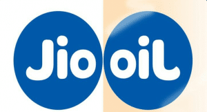
Now you will ask why is OIL used for JIO?
You all know that Reliance is essentially an OIL company. In the new Jio Logo, they have added a ‘dot’ over the ‘J’ and taken a mirror image of the Oil. Jio and Rcom are both subsidiaries of the Mother company ‘Reliance’.
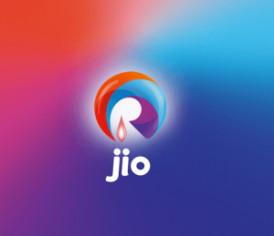
The logo throws light on the journey of Reliance from a huge Petroleum and Oil Company to a new world of Telecom & Data.
Baskin Robbins
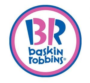
Baskin-Robbins is owned by Dunkin Brands and is the largest chain of ice cream speciality store in the world. They are typically known for 31 flavours with their famous blue and pink logo that has the number 31 hidden in initials ‘BR’ introduced in 2005.
Take a close look again!
Are you telling me that you never noticed this before?
As per Carol Austin Vice President of marketing for Baskin-Robbins, the Basking Robbins Logo is “meant to convey the fun and energy of the Baskin-Robbins brand. The 31 stands for our belief that our guests should have the opportunity to explore a fun, new ice cream flavour every day of the month.”
In 2006 Baskin Robbins revamped their brand and logo so that they decorate their worldwide stores. The current version was designed and launched in the year 2007.
Significance of Colors in the Baskin Robins Logo
There are three main colours – White, Pink and Blue. Blue and white colours stand for elegance, reliability, excellence and purity whereas the pink colour denotes the spoon which is pink in colour given to the customer to taste the ice cream samples.
Formula One
Formula One or Formula 1 or F1 (Federation Internationale de l’Automobile) is a unique International Brand officially the FIA Formula One World Championship that stands out for its innovation is taking the core values of sports to embed them in its logo design.
Formula One World Championship is a premier form of racing since its inception in the 1950s. The term ‘Formula’ stands for the set of rules to be conformed by all participants in the race. They comprise of a series of races the well-known world over as Grands Prix (in French means Grand Prizes) held on the F1 Circuits and also on public roads.
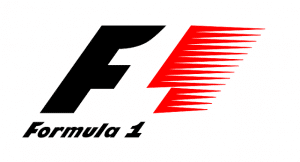
The race depicts energy and passion – so does the red colour in the Logo whereas the black colour in the ‘F’ signifies the colour for determination and power. The negative space is where the hidden meaning is there between the bold black ‘F’ and the racing red colour lines. Nestled in between these two colours is the number ‘1’ as the focal point of the logo.
Toblerone
Owned by Mondelez International formerly Kraft Foods – Toblerone was started in Switzerland in Bern city famous for its bears.
I know what you are wondering?
What do ‘Bears’ have got to do with the logo of ‘Toblerone’.
If you spot the bear in the Logo you surely deserve to get a Toblerone after you finish reading this blog.
Did you ever think as you grew up munching on these chocolaty delights of Toblerone – how could one come up with a name so difficult to pronounce and yet so popular?
Let us break this Logo down into understanding it step by step.
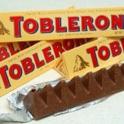
You all know by now that the Logo has a hidden bear. For those who were not able to spot that look carefully at the mountain emblem on the left-hand side of the logo – you will spot a bear climbing a mountain.
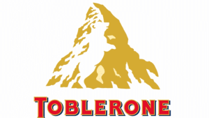
Toblerone was created in 1908 by Theodor Tobler. The name ‘Tobler’ is combined with the Italian word ‘Torrone’. Torrone is a cake, sweetmeat or confection made of almonds or other nuts. The name Toblerone is a typical ‘Portmanteau’ – which is a combination of two or more words together to form a new word. The city where this originated was named ‘Bern’ is known to be the “City of bears.” The words Tobler, Torrone, and Bern are all combined together to form the word ‘Toblerone’.
Hidden in the name is ‘Blern’ the city where the chocolate originated. Check out the picture below to know how.
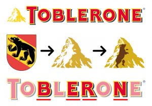
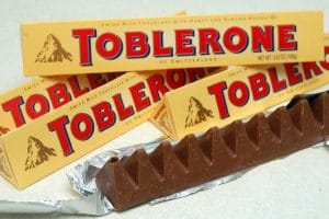
The symbolic Matterhorn mountain is where the bear is hidden – symbolizing the town in the logo. The pointed shape of the mountain is what inspired Theodor Tobler to make the chocolate the shape of a triangular prism. However, Theodor’s sons say that the triangular shape of the chocolate appears in a pyramid shape because Theodor saw a show where the dancers at the Folies Bergeres created this pyramid shape during the finale.
Beats
Beats by Dre has a simple yet hidden meaning in its logo.
Beats is a world famous manufacturer of audio equipment, headphones, and accessories. The Beats company was founded in 2006 by hip-hop icon Dr. Dre and recording executive Jimmy Lovine.
The famous’ b’ is encased in a circle that is followed by the brand name. It is not actually a circle alone. It represents the head of a human and the ‘b’ stands for the brand’s headphones. The red color is for excitement, passion, and intimacy whereas the black color represents power and prestige.
The presence of the headphone in the Logo make it personal as customers see themselves in the logo.
Hope for African Children Initiative (HACI)
When you look at the logo it appears that it is a simple geographical map of Africa.
Look at it closer and there – you see the outline that is actually designed to take the shape of the contours of two people’s faces. One of the contour is that of a child and the other of an adult.

Hope for African Children Initiative was founded in 2000 to address the huge challenge millions of African children face. The challenges are either being orphaned by AIDS or living with parents who are extremely sick or dying from AIDS-related illnesses.
Kolner Zoo
Kolner Zoo was founded in 1860. It is a zoological garden in the northern district of Cologne-Riehl and is the third oldest zoo in Germany.

How many objects can you find in the Kolner Zoo logo?
It is a logo that features optical illusion and has hidden meaning in its negative space.
To begin with, it has an elephant. A giraffe is hidden in its contours between the trunk and forelegs. Between the legs under the tummy area are the contours of a rhino. Hidden in the back legs of the elephant are the two spires of the Cologne Cathedral – that is a world famous landmark.
Conclusion:
After having a look at the above seven logos and their hidden meanings don’t start thinking that a logo is good only if it has negative space and a hidden meaning or meanings.
It is not right to think that logo is all about hidden spaces. The logo designing is a wide topic and once you understand the history of the brand it becomes easier for a logo designer to understand what are the concepts or inspirations that can be taken for the logo to be designed.
Always remember while designing a logo that negative space is as important as visible and marked space. Take due precaution not to unintentionally create shapes that might be even near to offensive in any manner – that is unless your client wants to do so.



I want to start quartz manufacturing company can you suggest some good name and company’s logo
Yeah sure, Please email me details.