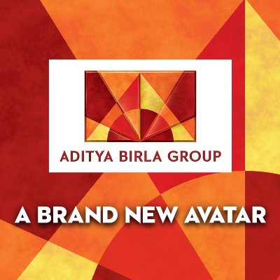
Aditya Birla Group Logo Transformed
With more vibrant colors, Aditya Birla Group has refreshed its brand identity. Expanding its recognition to 36 countries and 42 nationalities with a turnover of $41 billion, a need was left to celebrate this phenomenal journey of transformation.
Aditya Birla Group is one among the Fortune 500 companies in the world dealing in retail, fertilizers, metals, insurance, asset management and what not. The new avatar of the brand is reconstructed from its previous symbol.

Although the previous logo has undergone three changes in these 20 years, it has taken the brand to where it is. The brighter and darker shades to represent the multi-faceted and the vivacity of the brand.
The company is the perfect combination of simplicity and zest .Its versatile nature and the diverse feature is clearly reflected by the sunbeams of the logo.
So has the name been selected as Aditya which is a synonym for the sun (energy -donor) and also linked with the leader of the brand, Mr. Aditya Vikram Birla, who is the man behind the positivity and success of the brand.
“Our new mark, for new milestones – It’s all about us, our glorious past, our unmatchable legacy, our ongoing success, and our exciting journey into the future. The Aditya Birla Group Logo in its brand new avatar crystallizes our fascinating story of change and transformation.”
“We have changed and how. These 20 years have seen us evolve and scale new heights. It has been truly a transformative journey”, says the chairman of Aditya Birla, Kumar Mangalam Birla
Keeping the basics of Aditya Birla Group Logo intact, the company has experienced a lot of vibrancy in terms of colors and typography thus enhancing its visual appeal.
The logo is a blend of evolution and achievements. With 1, 20,000 employees, this small change are sure to stimulate the brand to great heights helping it meet its business objectives.


Leave a Reply
Want to join the discussion?Feel free to contribute!