Top 5 Automobile Logos and their History
A friend of mine once said a rose is a rose is a rose! But a Mercedes without the 3 pointed star is just another car ! Well said, I say! Because the automobile logo is what sets a car apart . It tells us about the luxury quotient of the car and its owner, it has a certain cool factor to it, it has a recall value and most of all it is an owners delight.
Here are the coolest Automobile Logos of all time and their history:
Rolls Royce
Start at No 1 and you will always be a winner. The lady that glides atop the bonnet of the Rolls Royce is by far the most recognizable symbol of ultimate luxury in the world and why not. The Rolls Royce automobile logo is as recognizable in Rwanda as it is in Rio and Rotterdam. The Rolls Royce automobile logo is officially named the “Spirit of Ecstasy” and it sits atop the front grille of the British super luxury car manufacturer. In its current form it is the figure of a woman leaning forwards with her arms outstretched behind and above her. She is leaning into the wind and a billowing cloth runs from her arms to her back, resembling wings.
![]()
The figure itself is believed to be inspired from an earlier sculpture called “The Whisperer,” modeled on leading British actress Eleanor Thornton from the early 1900’s. The Lord John Montagu commissioned sculptor Charles Sykes to create a logo for his Rolls-Royce. Sykes originally crafted a figurine of Eleanor Thornton in fluttering robes, with a forefinger against her lips – to symbolize the secret love affair she is believed by some to have shared with Lord John Montagu.
In a parallel at the Rolls Royce was being urged by their customers to get automobile logo that stood out in the crowd for their brand of cars. It was then that RR commissioned Sykes to design a similar logo as he had for Montagu’s car. And thus the “Spirit of Ecstasy” was born.
Bentley
Bentley is among the top 3 most luxurious car brands in the world the Bentley logo is in the wings and yes it does give us a feeling of flying in comfort and luxury and none of this is by chance Did you know that the wings in the Bentley logo date back almost a century to 1919 when Bentley was a manufacturer of aero plane engines.
What is really interesting is that amount of feathers, and also the coloration used, would vary according to the particular version of car in the olden days. For instance, vintage cars typically possess thirteen hackles or cuts in the feather on the left, fourteen are on the right. The Derby class of Bentley cars have ten and eleven hackles. And the Crewe brand of Bentley’s had 10 each side. In its modern avatar the Bentley automobile logo has eleven and ten hackles.
The wings were part of the logo on the aero engines and when the company made a foray into car manufacturing the logo stayed. Here is a little interesting trivia the logo on the wheels of any Bentley car is self-leveling and stays upright at all times when the car is in motion or stands still.
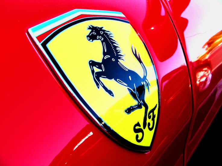
FERRARI
Every Automobile fan is familiar with the prancing horse logo. An iconic automobile logo symbolic of both speed and luxury that the auto manufacturer Ferrari has come to represent. The famous Ferrari Automobile logo which comprises of a black prancing horse on yellow background, usually with the letters S F for Scuderia Ferrari etched below has an interesting story of how it came to represent the car manufacturer.

Legend has it that the prancing horse symbol was originally pained by Count Francesco Baracca on the side of his aircrafts, he was an Italian air force ace pilot who lost his life in World War 1. On June 17, 1923, Enzo Ferrari won a race at the Savio track in Ravenna in Italy. After the race he met the Countess Paolina, mother of Baracca. The Countess asked that he use the horse on his cars, suggesting that it would grant him good luck. Much later in 1929 when Ferrari founded the Scuderia Ferrari racing team he kept the horse emblem, adding bright yellow to the background symbolic of his home city of Modena.
MERCEDES-BENZ
To understand how the Mercedes Benz logo came about first lets go back in time. It all began in 1901 when the 1st Daimler automobile rolled off the assembly line manufactured by Daimler-Motoren-Gesellschaft or the Daimler Motors Corporation. Later Karl Benz and Gottlieb Daimler together formed the Daimler-Benz company and the Mercedes-Benz brand came into being , however the 3 star automobile logo had come into being much earlier.
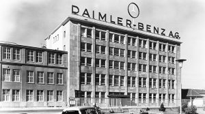
Way back in 1872 Daimler Technical Director, Gottlieb Daimler, drew this badge on a postcard, which he mailed to his wife as far, vowing that one day this image would become the symbol of a car giant. Daimler at the time envisaged that the three points of the star stood for the car’s dominance over land, air and sea. It was registered as a trademark in 1909 and one year on, it was taken as the logo for Daimler cars. Later in 1916 the emblem was put into a circle with four little stars above the circumscription “Mercedes” on its border.
![]()
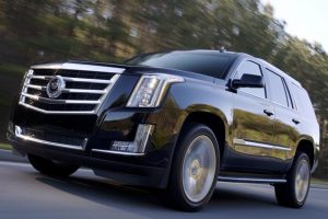
CADILLAC
If there is one brand that represents the American luxury car industry it is Cadillac. For over a century now Cadillac is recognized as producer of powerful luxurious American cars. The company was founded in Detroit by Antoine de la Mothe Cadillac in 1902. It is about the same time that the brand got its official name and automobile logo.
However there are many versions of how Cadillac automobile logo came about . In one version it is believed that the badge has actually been designed before Christopher Columbus made his sensational discoveries including new land that is America. Another legend has it that the father of luxury car brand Antoine de la Mothe Cadillac was royal blood and his gene tree has been associated with the house of Toulouse in France and therefore he was royalty and this was his official badge.
However there is little truth in that version as well. Some sources say that the Cadilliac logo was actually designed in 1687 when Antoine de la Mothe Cadillac got married. Few people know that Antoine de la Mothe Cadillac is not the real name of the brand’s founder. He took it during his military service at the age of 24 in order to make everyone believe that he belonged to noble blue-blooded society. Such things being rather common among young French officers at the time.
Moreover this name turned out to be rather useful after he decided to move to America from France. Of course, no one there could check his true origins. With a new name he also decided to borrow coat of arms la Mothe noble family in France. Speaking about the meaning of the logo, it is represented as Cadillac logo contains wide range of colors including black, red, grey, yellow, sliver and blue. Every color has its own special meaning. They symbolize creativity, excellence, passion, grandeur and business responsibility established by the automaker.
A automobile logo is like a sort of autograph of a car manufacturer. By just looking at the emblem I can tell a lot about the car’s history, origins and the type of car whether it’s a sports car or luxury. Every automobile logo has a history to it and a reputation that the automobile company strives hard to protect. Speaking of protection I will leave you with this very interesting story on how one of the largest most reputed luxury racing car manufactures actually fought tooth and nail for their logos.
This tale is from Italy the land of the exotic racing car and it involves two of the biggest most reputed race brands in the history of Italian automobiles. In case you have not guessed the names of the two auto manufacturer yet I suggest press your auto refresh button. So we all know what the Ferrari automobile logo looks like and we also know what the Lamborghini, logo looks like. Legend has it that when the founder father of Lamborghini, Ferruccio Lamborghini was zeroing in on the brand logo for his car he decided to have the bull located in the center of the emblem as it was associated with his astrological sign which is Taurus the bull. All was as per plan so far. Then came the question, what would the background look like. Here founder father Mr. Lamborghini purposefully copied the Ferrari shield, then reversed that company’s yellow and black color scheme. He did this as a poke in the side so to speak of his arch rival Ferrari’s founding father Enzo Ferrari who had a black emblem of a prancing horse on a yellow background. So while Ferrari is black on yellow Lamborghini is yellow on black. An interesting twist in the automobile logo tale.


Leave a Reply
Want to join the discussion?Feel free to contribute!