
Rhode Island – Mixed reactions to New Logo Design
We all know Milton Glaser is famous for designing the iconic ‘I Love NY’ Logo.
The next question is:
Did he design the Rhode Island Logo as well?
Yes, he did!
Milton Glaser designed the new logo for Rhode Island as a part of the state’s campaign on tourism released in March 2016. The state chose Havas for its new tourism campaign in 2016 because the agency has deep roots in Rhode Island to take the social media and creative work forward. The campaign was an effort by the state government to boost the local economy.
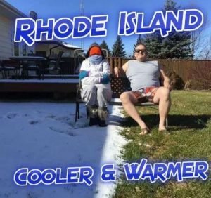
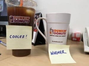
The new slogan: “Rhode Island: Cooler and Warmer”
What is the Logo all about?
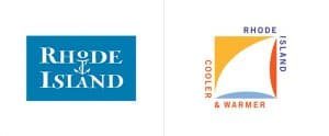
The Rhode Island Logo is part of a $5 million campaign. The square logo contains a white sail – created by negative space by strokes of colors – yellow, red and blue. Blue signifies ‘water’, Red – stands for ‘warmer’ and yellow stands for ‘cooler.’ On the outer side of the logo is the slogan ‘cooler & warmer’ and ‘Rhode island’ on the other two sides.
As per Glaser “There’s something about the idea of a billowing sail full of the wind an idea of a sunny sky.” Glaser said that he believes “something in repetition that people will feel positive about, and once they saw it, they would remember it.”
![]()
In the slogan the word ‘warmer’ was ‘to fight against the idea of New England being standoffish and unfriendly” and the word ‘cooler’ denotes the new things happening within Rhode Island. “It creates a little puzzle in the mind of the viewers. That’s what makes it stick in the mind.”
Glaser added, “What seems to be obvious is that you can’t deny the intrinsic quality of the place – in this case, the idea of water, sailing and the blue sky – is really characteristic of your experience (of Rhode Island).”
“I was trying to amplify something that people experience as truthful when they went there and also in a way that’s memorable, which is to say that once you see it, it doesn’t look like all other sails. It looks different by virtue of its form and the arrangements of colors.”
Rhode Island
Rhode Island is a punch of beautiful scenery laced with culture. Rhode Island is iconic due to its historic landmarks along its borders, boasts of pristine coastline, pulsating arts and culture, most sought after dining experiences.
Newport is undoubtedly the sailing capital of the world. Rhode Island with its natural beauty has everything you can dream of – from pristine beaches of South County, Blackstone Valley’s historical significance, Shopping in Warwick, biking on the magnificent East Bay. It’s a tourists delight due to its elaborate river walks, award winning theaters, rich culture and arts enhanced by Providence’s most famous restaurants.
Why Milton Glaser?
Betsy Wall – CEO of Rhode Island Corporate Corporation revealed the reason why they appointed Glaser because they wanted some “inspired design brought to this. We were not just looking for some corporate logo that – nothing against anonymous art directors – but then an anonymous art director was doing at their computer, but something that really spoke of Rhode Island’s passion for design, nautical history and history of original thought. We wanted to make sure the mark (logo) reflected that.”

Milton Glaser in his East Side Manhattan Studio
Wall added: “The Milton Glaser art, that is not your typical state (Logo). If you look at what other states have on their websites, it isn’t usually true art like that, it isn’t usually so thought provoking and inspiring.”
“I can’t think of another state, besides obviously New York, that would think to bring in somebody like Milton Glaser. This is a place where art and design are in the DNA.”
Rhode Island Logo – People’s REACTION
Rhode Island’s Logo launched in 2016 got mixed response. The local designers and marketers went about criticizing the government to go out and hire an outsider for the Logo Design work.
Jason Clampet:
“Considering all the political fights over who was going to pay for Rhode Island’s tourism rebranding, we’re surprised this logo looks good as it does.”
Alec Beckett:
Who is a creative partner at an ad agency based in Providence called the campaign “Solid” with the exception “Cooler and Warmer” tagline “violates a fundamental rule of marketing, which is if you want people to think your brand is cool, don’t’ say your brand is cool.”
John Caserta:
Head of Graphic Design Department at Rhode Island School of Design founder of The Design Office said “As a singular form, as an object, it’s trying to do a lot of things and kind of doing nothing at the same time. It’s generic, and it’s packing a lot of words in, and it’s neither clear nor enigmatic. It doesn’t make me want to understand the state more. It’s building on a sailboat view of a state, which I don’t think is necessarily why people would come.”
He stated that the image wasn’t strong enough to pass the message across without using the text – “Rhode Island” however if we see the ‘I Love NY” logo – both text and image is integrated.

John Caserta was full of praises for Milton Glaser as a renowned 20th-century designer, however, criticized the state for not contacting or approaching anyone at RISD for ideas on which designer should be selected – one of the top design schools in the world.
Matt Luckhurst:
From the Collins design firm in San Francisco who designed Facebook’s M app and rebranded Airbnb’s campaign said:
“There’s a positive, summer breeziness to it. It’s beautiful in how minimal it is. Most other tourism logos tend to be some terrible script that feels very polite.”
Luckhurst feels that Glaser’s work is aesthetic, adds character by being hand drawn with the use of vibrant colors.
Emily Rye:
from Providence-based Design Agency said that the campaign was weak due to its use of the words ‘cooler’ and ‘warmer’.
She said: “Almost already it’s being sidelined. There may be a reason for that. I don’t know how long that slogan is going to stick. It doesn’t say much.”
Even the residents of Rhode Island did not take to the Logo and said words cooler and warmer are literal antonyms. They even posted memes on Twitter mocking the Logo.
While other Rhode Islanders had some creative ideas as suggestions for the logo.
It was not just the Logo – along with it, the campaign released a tourism video as well. The video featured shots that were slowed down of birds flying, narrator speaking statements like “We are an ocean of possibility. A rising tide of determination.” As the video was released it went viral and broke the Internet a first for Rhode Island – especially when people saw that the promo’s fourth shot was a buy doing a trick at the harbor was not filmed in Rhode Island. The footage was filmed in Reyjavik, Iceland in front of the Harpa Concert Hall. People wondered if this is what ‘cooler’ meant?
Rhode Island tourism could not take the criticism and fun people made and took off the YouTube video as soon as they posted it.
The big question loomed in everyone’s mind was – will the campaign be reworked on?
Will the Slogan ‘cooler & warmer’ be replaced?
For those of you who have never seen the Rhode Island Old Logo – Check it out:
Glaser said “When I did the ‘I Love New York’ identity, I had no idea it would be so durable. One of the reasons it’s durable, curiously, is that it makes people feel good when they look at it. So here I was trying to do that in effect by creating a sense of pleasure with the association with Rhode Island.”
Things got escalated when other than the footage from Iceland, the website also featured statistics that was incorrect and stock photos that were out-of-state. CBS Evening News anchor said on air “Rhode Island officials did not blame the error on providence—they blamed the editing company.”
Something that stood out in the video as missing was the 50th Anniversary of Gaspee Days, Rhode Islanders burning a British Ship during the Revolutionary War Era and its Annual Celebration.
Was it a Case of Hiring Out of Town?
Chris Mickey said “Everyone is really proud of the state they’re from … but sometimes it’s nice to have that outside input because that’s who you’re marketing to.”
Out of town designers is a good idea especially if it is for tourism work since it is meant for outside tourists. “You’re not marketing to people who live in your state and are proud of it; you’re marketing to people who may be interested in visiting one day or may not even know a single thing about your state.”
Mickey even said “It really brings a nice, fresh perspective from these folks who are out of state because they know more of what an out-of-state consumer is looking for, what appeals to them. And that might not be what we know of Wyoming to be true ourselves.”
To support Mickey, Mark Romig CEO of New Orleans marketing Tourism Campaign run by 36oi in New York said that it is important to hire out of state agency to lend a fresh perspective. He said, “The out-of-town agencies, there were several that competed, (and what they offered) was the visitor perspective—what they would be looking for visiting the city.”


dummy comment.