Logo Redesigning
There are a number of times when you look at the logo of your brand and think why did you opt this symbol as the brand identity.
Just ask yourself some of the following questions while looking at your logo
Does this logo actually define and represent your brand?
Does it convey the message and vision you want to tell your audience?
Is it trendy enough to match the quality and crowd of the present time?
If your answer to all these questions is no, your brand definitely requires logo redesigning.
It is a well-known fact that logos have been the prime elements of branding and to neglect it will not at all be a good thing for your brand.
There are a number of brands which have eventually redesigned their logo depending on the trend as well as according to the enhancement in their products and services.
Mc Donald’s –Since the year it was established long back in 1940, the largest food chain restaurants in the world, Mc Donald’s has undergone a number of changes.
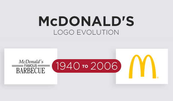
From the “famous barbecue” to the “golden arcs”,the brand has experienced logo redesigning in according to the taste of its customers and also to make its brand evident.
KFC–KFC was founded in 1952 with the symbol of “Kentucky Fried Chicken” along with the face of the founder, Colonel Sanders. Years passed and in 1991, the brand reduced it logo to KFC because it felt fried represented”unhealthy food”.
![]()
Modifications in the face of the founder and color in the logo(presently red as it has the power of being visible more than other colors) has been going on.
Instagram– The camera of the Instagram has recently been updated with a vibrant colored logo since the company felt there was no requirement of that camera in the logo.It did not signify anything about the brand.
![]()
The new rainbow colored retro camera was actually designed to make the logo trendy and reflect the vibrancy of the brand.
Coco-Cola— Coco Cola has one of the most popular logos in the world. It has experienced a number of alteration in its logo from the year of foundation in 1886. From a bold font logo to a stylish and casual logo, the symbol has received changes for betterment.
![]()
It was 2007 when the brand got its most impactful logo which has continued to grab the attention of people through its vigorous look till now.
Mercedes–From the oval-shaped symbol to a tri-starred circular logo, the journey of Mercedes logo has been really interesting. The concept of the star was introduced in 1909 but was changed abruptly to a shield shape symbol.
![]()
However, 1916, the star imbibed in the circle was again included but it was much like an emblem. Further changes were done and in 2008, the brand emerged out with its new identity of tri-star surrounded by a sphere.

Leave a Reply
Want to join the discussion?Feel free to contribute!