Famous Graphic Designers you should know about
Out to study Graphic Designing to start a career as a designer? Looking for inspiration to design your logo? Here are the designers who you should definitely know about. The designers who are mavericks – deep thinkers – who changed how we see graphic design in today’s world. The designers who made a difference are right here waiting for you to know all about them.
Massimo Vignelli
Massimo Vignelli was an Italian designer who designed packages to house ware to furniture to public signage to name a few. He died in 2014 leaving a legacy of some of the most iconic design work. He designed Ford, IBM, Bloomingdale’s (‘Brown Bag’ as being used till today) , American Airlines, Saks and many more brands.
Vignelli had a modernist tradition he use for his work, with a focus on simplicity with the use of geometric forms in almost all his work.
His legacy lives on in the most prominent New York City Subway Map designed by Vignelli in 1972 that became a landmark by appearing on subway stations. Vignelli had high regard for the map and considered it as one of his best creations. The map was ahead of its time as Vignelli said “created in B.C. (before computer) for the A.C. (after computer) era.” His original economical format is perfect a perfect example of Web accessibility.

Vignelli was the co-founder of Vignelli Associates with his wife Lella. He said “If you can design one thing, you can design everything.”
Chip Kidd
Chip Kidd is the best graphic designer for innovative book covers. He received the national Designer Award for Communications. His Ted Talk has been watched over 1.3 million times.
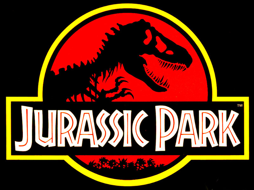
Kidd is based in New York and is known all over the world for the stunning book jackets like Jurassic Park. In 2005 in his monograph he even explained the thought behind the Jurassic Park iconic logo “When trying to recreate one of these creatures, all anyone has to go on is bones, right? So that was the starting point… Not only was the drawing integrated into the movie poster, it became the logo in the film for the park itself. I think it’s safe to say that the Jurassic Park T-Rex became one of the most recognizable logos of the 1990s.”


Chip Kidd is educated at Penn State and started working for Knopf in 1986 by designing covers for them. He designed 75 book covers in a year. He is still employed at Knopf and an art director at Random House. He over sees the pantheon book covers also a subsidy of Random House. His work has been a very huge influence due to his interest in graphic novels, pop culture and comic books – sometimes his work is imitated as well.
He has published two books so far The Learners and Cheese Monkeys – and has designed both himself and his recent book , Go: A Kid’s Guide to Graphic Design is one the first book where kids are taught graphic design.
Kidd’s portfolio consists of over 300 of his best designed cover in an accessible format. He uses evocative imagery with a contemporary feel to it along with inventive use of typography – each of his work is brilliant and attracts and inspires readers.

Rob Janoff
Rob Janoff – is the designer who designed the Iconic Apple logo – do I say anything more about him? He designed the most memorable logo of Apple in 1977 – although the design has been changed a bit – the basic apple form remains the same. Do you know this logo was created within a span of just two weeks. In 2013, Janoff said that “If you have a computer named after a piece of fruit, maybe the image should look like the fruit? So I sat for a couple of weeks and drew silhouettes of apples. Bite is also a computer term. Wow, that was a happy accident. At that point I thought ‘this is going to have a wink and a nod with it, and give it personality.”
![]()
He also added his thoughts on the colored stripes on the Apple logo that used to be “The big deal about the Apple II was that it was the only computer that reproduced color images on the monitor, and it was the only computer that you could plug into your home color TV. Also, a lot of it had to do with the aesthetic origins of both Steve (Jobs) and I, which was a kind of hippy aesthetic and The Beatles and Yellow Submarine.”

Michael Beirut
Michael Beirut is a graphic designer , a design critic and an educator. He is a partner in the respected agency Pentagram that is the ultimate design dream for every graphic designer. He has been a partner for 27 years and in these years won many design awards. Michael Beirut is said to have worked with Vignelli Associates for 10 years. Michael Beirut is a well known Senior critic at the Yale School of Art.

He won hundreds of design awards over the years and his work is many permanent collections such as : National Design Museum New York, The Museum of Modern Art (MoMA) and the Cooper-Hewitt, the san Francisco Museum of Modern Art (SFMOMA), the Denver Art Museum to name a few.
His projects with Pentagram include brand design for New York Jets, Benetton, Walt Disney and Billboard magazine just to name a few.
His famous monograph – How To – was published by Thames & Hudson in 2015.

Carolyn Davidson
No other single line – a swoosh is more iconic than the Nike’s logo. Graphic designer Carolyn was a students at Portland State University in the year 1971 when she designed the logo and was paid a mere $35 by Phil Knight founder of Nike. Phil was in a class teaching when he met Carolyn Davidson.
The actual meaning behind the tick like symbol of positivity is that it is the outline of the wing of a Greek Goddess of Victory – Nike is named after this God.
Carolyn Davidson said in 2011 “it was a challenge to come up with a logo that conveyed motion”.
After the growth of Nike in 1983 founder of Nike – Phil Knight invited Carolyn Davidson to a company lunch. Phil gifted her a diamond ring with the Swoosh engraved in it and 500 shares of Nike stock in an envelope . On receiving the ring Carolyn said “this was something rather special for Phil to do, because I originally billed him and he paid that invoice.” She was later known as the “The Logo Lady”.

For those who do not know Nike removed the work Nike from the log in 1995 and the swoosh is what now stands as the brand Logo.
Saul Bass
Saul bass was one of the most iconic graphic designers of the 20th century that one ever saw. Bass was an Academy Award winning film maker known for his motion picture like sequences , film posters and corporate logos.
His most memorable work is the opening sequences of Hitchcock. He died in 1996 and some of his last work was Casino, Goodfellas and Scorcese.

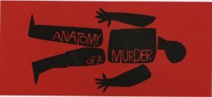
In an article for the Telegraph Scorcese said about Saul Bass’s genius “I had an idea of what I wanted for the (Goodfellas) titles, but couldn’t quite get it. Someone suggested Saul, and my reaction was: ‘Do we dare?’ After all, this was the man who designed the title sequences for Vertigo, Psycho, Anatomy of a Murder… and so many other pictures that defined movies and movie going for me. When we were growing up and seeing movies, we came to recognize Saul’s designs, and I remember the excitement they generated within us.
They made the picture instantly special. And they didn’t stand apart from the movie, they drew you into it, instantly. Because, putting it very simply, Saul was a great film-maker. He would look at the film in question, and he would understand the rhythm, the structure, the mood – he would penetrate the heart of the movie and find its secret.”
Bass designed logos like Kleenex, United Airlines, Minolta and At&T .
Lindon Leader
Lindon was Leader by name as well as his actions – he designed one of the most creative logos by using negative space as never done before. Lindon Leader was the senior design director at Landor Associates in 1994 when he designed the FedEx Logo. The logo was subsequently used for 600 aircraft and 30,000 ground vehicles.
In 2013 Landor spoke in an interview revealed that he did around 200 designs for the Fedex logo before he shortlisted 10 – to be shown to the FedEx Brand manager. Regarding the white space and the arrow hidden in the logo he said smilingly “I cannot tell you how many times I fight with a client who says ‘I’m paying an enormous amount of money to pay for an ad in a magazine and you’re telling me you want 60 per cent of it to be empty space?
“On the one hand I can understand where they’re coming from, but basically the average client does not have a sophisticated enough appreciation of white space to understand that it can be a strategic marketing tool.”

Who is your favorite Graphic designer of all time, do let us know in the comments section for us to bring to you stories around their success to you


Leave a Reply
Want to join the discussion?Feel free to contribute!