Evolution of Mc Donald’s Logo
Mc Donalds has the largest restaurant’s chain in the world. Since its year of establishment in 1940 by Richard and Maurice Mc Donald’s, it has been continuously contributing in the industry of food and drink.
The appetizing yellow colored ‘M’ is an eye-catching symbol which is believed to be the attention grabber for the customers. Here is the journey of Mc Donald’s Logo.
1940
When Mc Donalds was founded, it was named as Mc Donald’s Famous Barbecue.
![]()
The brand identity of Mc Donald’s was designed for the first time in 1940. It was a simple text based logo with a sleek black font inscribing the name of the brand.
1948
McDonald’s Famous Barbecue was renamed in 1948 as Mc Donald’s Famous Hamburgers.
The founders reorganized their business particularly selling hamburgers, french fries, chicken products, wraps and soft drinks.
![]()
This led to the modification of the brand identity with the fresh new name of Mc Donald’s Famous Hamburgers.
1953
The brand name was reduced to only Mc Donald’s in 1953. A sketch of a mascot with a banner labeling “I’m Speedee.” This was basically inscribed to convey the message of first fast delivery service by the brand.
![]()
1960
This year the golden arcs came into existence. A complete new identification was given to the brand. Richard Mc Donald’s had no philosophy behind the designing of these arcs.
![]()
He only wanted it to get noticed.The arcs formed a structure resembling the alphabet ‘M’.
The golden color in the identity is the symbol of happiness, appetite, and joy. In order to reflect zeal and vigor, the red color was used in the text for the name of the brand.
1968
The golden arcs remained as it is but the bow at the center was replaced by the brand name in bold letters “Mc Donald’s.”
![]()
Further changes were done in the symbol. A dancing mascot was used for some time in the advertisements of Mc Donald’s.
1975
Few color changes were done. A red square shape box encircled the arcs. The color of curves was changed to yellow with a red background.
![]()
Yellow and red are two colors which have the capability to attract viewer’s attention more than the other colors.
The black font color of the brand name was replaced by the white color blending perfectly with the other two colors.
1992
As time progressed, the identity experienced a number of changes which was basically in the colors.
![]()
In 1992, the red square box was removed and instead a trapezium was included under the arcs which read “Mc Donald’s”.
2000
The red box appeared again but with the golden colored arcs.
![]()
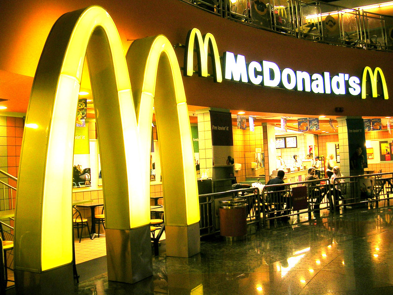
2003
2003 became a year of celebration for Mc Donalds. The most successful campaign I’m Lovin’ it was launched. This was a turning point for the brand.
![]()
2006
Only the golden arches remained in the logo of Mc Donald’s. However, the campaign “I’m Lovin’ it” is used in the commercial advertisement of the brand.
![]()

