Evolution of Instagram Logo
Instagram is a social networking media which allows you share images,GIF-like Boomerangs,videos. Keeping this in mind, an evolution in the logo of Instagram was done.
Since its year of the establishment by Kevin Systrom in 2010, the identity of Instagram has been one of the most popular brand identities.
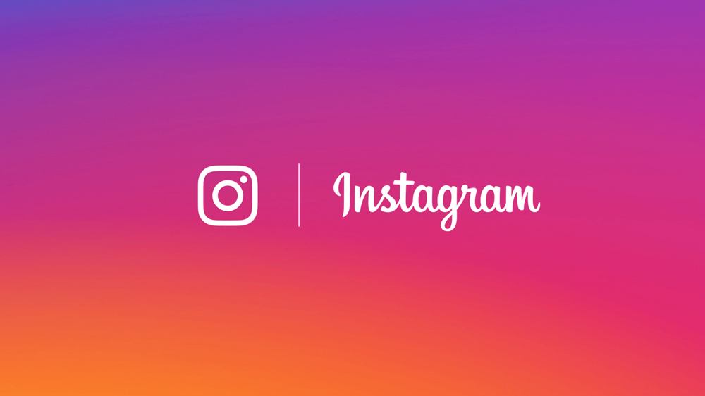
However, the founders recently redesigned their logo which can be a crucial change. A rainbow colored background with an outline of the camera.

If you look at the Instagram logo, it has curves in it which give the logo a more friendly and informal approach
According to the founder, there was no use of including the actual camera in the logo which compelled them to change the identity to a retro camera.
The design of the logo is quite simple. The basic evident change in the logo is the removal of the “camera” and use of exciting colors.
Colors have always played a vital role in logo designing. It looks similar to the sunset colors. Shades of purple,orange and pink have been used in the brand new identity of Instagram to give a more stylish look.
The colors are vibrant and blends with the latest trends.
If you notice, there are no dull colors used. Vibrant colors reflecting vivacity and energy with the white outlines makes the logo eye-catching .
The few things were inherited from the previous brand identity like the camera lens and the rainbow colors.
A proportional design has the capability to convey more. The new symbol has a high proportional density which makes the logo easily recognizable and understandable for the viewers.
Changing the brand identity of Instagram can be a risk factor for the owners. According to a research, the following were the results analyzed for the new brand identity.
53% negative
33%neutral
15%positive


Leave a Reply
Want to join the discussion?Feel free to contribute!